Tuesday, February 8, 2022

Data Update 4 for 2022: Risk = Danger + Opportunity!

In the first few weeks of 2022, we have had repeated reminders from the market that risk never goes away for good, even in the most buoyant markets, and that when it returns, investors still seem to be surprised that it is there. Investors all talk about risk, but there seems to be little consensus on what it is, how it should be measured, and how it plays out in the short and long term. In this post, I will start with a working definition of riskt that we can get some degree of agreement about, and then look at multiple measures of risk, both at the company and country level. In closing, I will talk about some of the more dangerous delusions that undercut good risk taking.

What is risk?

In the four decades that I have been teaching finance, I have always started my discussion of risk with a Chinese symbols for crisis, as a combination of danger plus opportunity:

Over the decades, though, I have been corrected dozens of times on how the symbols should be written, with each correction being challenged by a new reader. That said, thinking about risk as a combination of danger and opportunity is both healthy and all encompassing. It also brings home some self-evident truths about risk that we all tend to forget:

  1. Opportunity, without danger, is a delusion: If you seek out high returns (great opportunities), you have to be willing to live with risk (great danger). In fact, almost every investment scam in history, from the South Sea Bubble to Bernie Madoff, has offered investors the alluring combination of great opportunities with no or low danger, and induced by sweet talk, but made blind by greed, thousands have fallen prey. 
  2. Danger, without opportunity, is foolhardy: In investing, taking on risk without an expectation of a reward is a road to ruin. If you are investing in a risky project or investment, your expected return should be higher to reflect that risk, even though fate may deliver actual returns that are worse than expected. Note that this common-sense statement leaves lots of details untouched, including how you measure risk and how you convert that risk measure into a higher "expected" or "required" return.
  3. It is uncertainty about outcomes, not expected outcomes, that comprise risk: In investing, we often make the mistake of assuming that risk comes from expected bad outcomes, when it is uncertainty about this expectation that drives risk.  Let me use two illustrations to bring this home. In my last point on inflation, I noted that a currency with higher inflation can be expected to depreciate over time against a currency with lower inflation. That expected devaluation in the high-inflation currency is not risk, though, since it can and should be incorporated into your forecasts. It is uncertainty about whether and how much that devaluation will be, arising from shifting inflation expectations or market-induced noise, that is risk. In posts spread over many years, including this one, I have also argued against the notion that badly-managed firms are riskier than well-managed ones, and the reason is simple. If a firm is badly managed, and you expect it to remain badly managed, you can and should build in that expectation into your forecasts of that company's earnings and value. Thus, a badly managed firm, where you expect that to be the status quo, will be less risky than a well managed firm, where there is much more uncertainty about management turnover and quality in the future.
  4. Risk is in the future, not the past: Risk is always about the future, since the past has already revealed its secrets. That said, many of our perspectives about, and measures of, risk come from looking backwards, using the variability and outcomes of past data as an indicator of risk in the future. That may be unavoidable, but we have to be clear that this practice is built on the presumption that there have been no structural changes in the process being examined, and even if true, that the estimates that come from the past are noisy predictors of the future. 
  5. Upside versus Downside Risk: If risk comes from actual outcomes being different from expectations, it is worth noting that those outcomes can come in better than expected (upside) or worse than expected. Since the entire basis of investing in risky assets is to benefit from the upside, it is downside risk that worries us, and in keeping with this perspective, there have to been attempts to derive risk measures that focus only on or more on downside risk. Thus, rather than use the variance in earnings or stock prices as a measure of risk, you compute the semi-variance, drawing on those periods where earnings and returns are less than expected. I think a more sensible path is to measure all risk, upside and downside, and think of good investing as a process of finding investments that have more upside risk than downside risk.
As someone who works in, and teaches finance, I am grateful for what the discipline has done to advance the study of risk, but I would be remiss if I did not point out that it has come with some not-so-desirable side effects. One is the tunnel vision that comes from thinking of risk purely in terms of statistical measures, with standard deviation and variance leading the way. Risk is not an abstract statistical concept, but a feeling in the pit of your stomach that emerges when you helplessly watch your portfolio melting down, as markets move in the wrong direction. The other is the dangerous notion that measuring risk is the same as managing that risk and, in some cases, the even more insane view that it removes that risk.

Risk and Hurdle Rates

    In investing and corporate finance, we have no choice but to come up with measures of risk, flawed though they might be, that can be converted into numbers that drive decisions. In corporate finance, this takes the form of a hurdle rate, a minimum acceptable return on an investment, for it to be funded. In investing, it becomes a required return that you need to make an investment; you buy investments if you believe that you can make returns greater than their expected return and you sell investments if not. In this section, I will begin with a breakdown of risk's many components and use that structure to develop a framework for assessing the risk-adjusted required return on an investment.

The Components of Risk
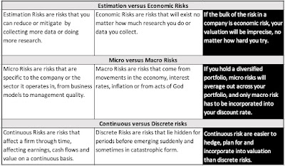
    In any investment, there are multiple sources of risk, and listing all of them in a list, with no organization, can be not only overwhelming but directionless. Once you have identified the risks that you face, it is useful to break that risk down into categories, on three dimensions:
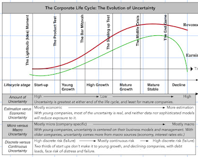
As you can see from this table, not all risk is created equal, and understanding which risks to incorporate into your required return, and which risks to ignore/pass through, is the first and perhaps the most important part of analyzing risk. While you will face almost every type of risk, no matter what company that you choose to value, the risks that you are most exposed to will vary across firms, and one way of looking at this variation is to look at firms through a corporate life cycle lens:
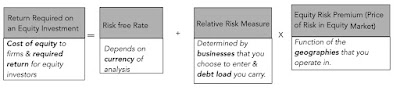
Note that you are more exposed to more risks, when you are looking at young companies, with growth potential, than when analyzing older, more mature firms, and that a greater proportion of risks at young companies are likely to be economic, micro and discrete risks. It is no wonder that investors and analysts who collect more and build bigger models, to value young companies, expecting that they will get better valuations, find frustrations instead. To get from these general risk categories into explicit risk measures and required returns, I adopt a simple structure (perhaps even simplistic), where I accept that I am a price taker when it comes to some risks (interest rates and risk premiums) and focus on the components of risk that companies can change through their choices on business, geography and debt load:
Note that in this structure, which yields costs of equity for companies and required returns for equity investors, each component is designed to carry a single burden, with the risk free rate reflecting the currency that you analyzing the company in, the measure of relative risk capturing the risk of the company's business mix and debt load, and the equity risk premium incorporating the risk of the geographies of its operations.

1. Relative Risk Measures

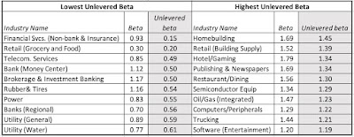
    Before we embark on how to measure relative risk, where there can be substantial disagreement, let me start with a statement on which there should be agreement. Not all stocks are equally risky, and some stocks are more risky than others, and the objective of a relative risk measure is to capture that relative risk. The disagreements rise in how to measure this relative risk, and risk and return models in finance have tried, with varying degrees of success, to come up with this measure. At the risk of provoking the ire of those who dislike portfolio theory, the most widely model for risk, in practice, is the capital asset pricing model, and beta is the relative risk measure. Embedded in its usage is the assumption that the marginal investors in a stock, i.e., those large investors who set prices with their trading, are diversified, and that you can estimate the "non-diversifiable" risk in a stock, by regressing returns on a stock against a market index. I believe that a company's regression beta is an extremely noisy measure of its risk, and mistrust the betas reported on estimation services for that reason. I also believe that it is healthier to estimate the beta for a company by looking at the average of the regression betas of the companies in the sector that it operates in, and adjusting for the financial leverage choices of the company, since increasing dependence on debt also increases the relative risk of the company. As in prior years, I report industry-average betas, cleaned up for debt, at this link, for US companies, and you can sector-average beta for regional and global companies as well. At the start of 2022, the ten sectors (US) with the highest and lowest relative risk (unlettered betas),  are shown below.
Download sector average betas (US, Global)
Note the preponderance of financial service firms on the lowest risk ranks, but note also that almost all of them are substantial borrowers, and end up with levered risk levels close to average (one) or above. Technology and cyclical companies dominate raw highest risk rankings.

2. Geographical Risk

Beta measure the macro risk exposure of the businesses that a company operates in, but they are blunt instruments, incapable of capturing either country risk (from operating in the riskiest parts of the world) or discrete risk (from default, nationalization or other events that truncate a company's life). For measuring country risk, I fall back on an approach that I have used for the last three decades to estimate equity risk premiums for countries, where I start with the equity risk premium for the US and then augment that number with a country risk premium, estimated from the default spread for the country:


The equity risk premium for the US is the implied equity risk premium of 4.24%, the process of estimating which I described in an earlier data update post this year. The sovereign ratings for countries are obtained from Moody's and S&P, and the default spread for each ratings class comes from my estimates for the start of 2022. To illustrate, at the start of 2022, India was rated Baa3 by Moody's and the default spread (my estimate) for this rating was 1.87%. I scale that default spread up to reflect the higher volatility in stocks, relative to bonds, and I use 1.16, estimated from as the ratio of historical volatilities in S&P's emerging market stock to the volatility in an emerging bond indices. This approach yields a country risk premium of 2.18% for India, and an equity risk premium of 6.42%, to start 2022:

India's ERP at the start of 2022 = Mature Market ERP + Default Spread for India * Rel Vol of Equity
                                                  = 4.24% + 1.87% (1.16) = 6.42%

Using this approach to the rest of the world, here is what I get at the start of 2022:

Download country equity risk premiums
It is worth emphasizing the equity risk premium for a company will come from where it operates in the world, not from its country of incorporation. Coca Cola, notwithstanding having its headquarters in Atlanta, has exposure to risk in multiple emerging markets, and its equity risk premium should reflect this exposure. By the same token, Embraer and TCS are global firms that happen to be incorporated in Brazil and India, respectively.

3. Debt, Default Risk and Hurdle Rates

    Almost all of the discussion so far has been about equity funding and its costs, but companies do raise funds from debt. While I will use a future post to talk about how debt levels changed in 2022, across the world, I want to talk about the cost of debt in this one. Specifically, the cost of debt for a company is the rate at which it can borrow money, long term, and today, and not the cost of the debt that is already on its books. The build up to a cost of debt is simple:


A company's default spread reflects concerns that lenders have about its capacity to meet its contractual commitments, and it clearly will be a function not only of the level and stability of its earnings, but even of the country in which it is incorporated.

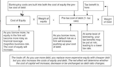
    As companies raise money from both debt and equity, they face an overall cost of funding, which will reflect how much of each component they use, and the resulting number is the cost of capital. The picture below illustrates the linkages between the costs of equity and debt, and how as you borrow more, the effects on cost of capital are unpredictable, pushing it down initially as you replace more expensive equity with cheaper debt, but then pushing it up as the negative effects of debt offset its benefits:
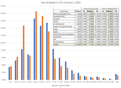
Since both the costs of debt and equity start with the riskfree rate, low risk free rates push down both costs. In my last two posts, I noted that the prices of risk have drifted down in markets, with both equity risk premiums and default spreads decreasing through 2021. It should come as no surprise then that at the start of 2022, companies across the globe were looking at costs of capital that are close to their lowest levels, in US $ terms, in decades.

At the start of 2022, the median global company has a cost of capital of 6.33%, in US$ terms, and the median US company has a cost of capital of 5.77%. (To convert these values into other currencies, use the approach that I used in the last post, of adding differential inflation to the number).

Hurdle Rate Delusions

The two biggest forces that drive corporate financial and investor decision making are me-too-ism and inertia. The former (me-too-ism) leads companies to do what others in their peer group are doing, borrowing when they are, paying dividends because they do and even embarking on acquisitions to be part of the crowd. The latter (inertia) results in firms staying with policies and practices that worked for them in the past, on the presumption that they will continue to work in the future. Not surprisingly, both these forces play a role in how companies and investors set hurdle rates. Both individual investors and companies seem to operate under the delusion that hurdle rates should reflect what they want to make on investments, rather than what they need to make. The difference is illustrated every time an equity investor, in this market, posits that he or she will not buy shares in a company, unless he or she can make at least double digit returns, or a company, again in this market, contends that it uses a hurdle rate of 12% or 15%, in deciding whether to take projects. Individual investors who demand unrealistically high returns in a market that is priced to deliver 6-7% returns on stocks will end up holding cash, and many of them have been doing so for the bulk of the last decade. Companies that institute hurdle rates that are too high will be unable to find investments that can deliver higher returns, and will lose out to competitors who have more realistic hurdle rates. In short, companies and investors, demanding double digit returns, have to decide whether they want to remain delusional and be shut out of markets, or recalibrate their expectations to reflect the world we live in. 

YouTube Video

Datasets

  1. Equity Risk Premiums, by country - January 1, 2022
  2. Betas by Sector (US, Global, Emerging Markets, Europe, Japan)
  3. Costs of Capital by Sector (US, Global, Emerging Markets, Europe, Japan)

Thursday, January 27, 2022

Data Update 3 for 2022: Inflation and its Ripple Effects!

    Inflation numbers have been coming in high now, for more than a year, but for much of the early part of 2021, bankers, investors and politicians seemed to be either in denial or casually dismissive of its potential for damage. Initially, the high inflation numbers were attributed to the speed with the economy was recovering from COVID, and once that excuse fell flat, it was the supply chain that was held responsible. By the end of 2021, it was clear that this bout of inflation was not as transient a phenomenon as some had made it out to be, and the big question leading in 2022, for investors and markets, is how inflation will play out during the year, and beyond, and the consequences for stocks, bonds and currencies.

Inflation: Measurement and Determinants

    As the inflation debate was heating up in the middle of last year, I wrote a comprehensive post on how inflation is measured, what causes it and how it affects returns on different asset classes. Rather than repeat much of that post, let me summarize my key points.

  • Measuring inflation is not as simple as it looks, and measures of inflation can vary depending on the basket of good/services used, the perspective adopted (consumer, producer, GDP deflator) and the sampling used to collect prices. That said, the three primary inflation indices in the US, the CPI, the PPI and the GDP deflator all told the same story in 2021:
    Download historical inflation numbers

    The inflation rate during the course of the year reached levels not seen in close to 40 years, with every price index registering a surge.
  • While news stories focus on reported (and past inflation, it is expected inflation that should drive investment, and measures of these expectations can come from surveys of consumers (University of Michigan) or from the market, as the difference between the treasury bond rate and the inflation-protected treasury bond, of equivalent maturity:
    Download data

    Using the ten-year bond, it is clear that while inflation expectations have inched up in the bond market, but that rise is far more muted than in the actual inflation indices, and consumer expectations of inflation now significantly exceed the bond-market imputed estimate for expected inflation.
  • While the implied inflation in bond rates is low, investors seem to be anticipating higher inflation. Using a measure that the Federal Reserve has developed, I report the percent of investors expecting inflation to be greater than 2.5%, representing one end of the inflation expectation spectrum, and those expecting deflation, representing the other, in the graph below:
    Download data
    As you can see the 93.96% of investors were expecting inflation to be greater than 2.5%, by the end of December 2021, up from 6.74% in December 2020, suggesting a sea change in the market. Conversely, the percent of investors expecting deflation has dropped to a vanishing low number, suggesting that Cathie Wood has little company, in her contention that deflation is the real danger to markets and economies.
The undeniable fact is that inflation came back in 2021, but the question of why it happened, and whether it will stay high, is  hotly debated. To those who believe that it is a spike that will dissipate over time, it is another casualty of COVID, as a combination of virus-driven supply chain issues and government spending to offset shutdowns has driven prices up. In this mostly benign story, inflation will go back down, once these pressure ease, though it is unclear to what level. To others, and especially those old enough to remember the 1970s, it does seem like a return to more unsettled times, with potentially dangerous consequences for the economy and markets.

Interest Rates and Inflation

    Inflation and interest rates are intertwined, and when their paths deviate, as they sometimes do, there is always a reckoning. While we have increasingly given central banks primacy in discussions of interest rates, it remains my view that markets set rates, and while central banks can nudge market expectations, they cannot alter them. Put simply, no central bank, no matter how powerful, can force market interest rates down, if inflation expectations stay low, or up, if investor are anticipating high inflation. 

US Treasuries: A Mostly Uneventful Year

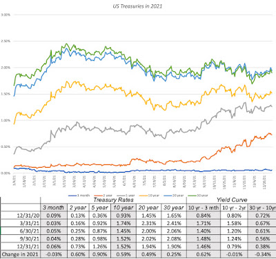
    After a turbulent year in 2020, when COVID shut the global economy down, and interest rates plunged and stayed down for the rest of the year, 2021 was a more settled year, with long term rates rising gradually over the course of the year, but short terms rates staying put:

Treasury Rates Data

While treasury bills continued to yield rates close to zero, rates increased for longer term treasuries, with 2-10 years rates rising much more than rates on the longest term treasuries (20-year to 30-year). For those who track the slope of the yield curve, and I am not one of those who believes that it has much predictive power, it was a confusing year. The treasury curve became steeper, but only at the shortest end of the spectrum, with the slope rising for the 2-year, relative to the 3-month, but not at all, when comparing the 10-year to the 2-year rate. Beyond the 10-year maturity, the slope of the yield curve actually flattened out, with the difference between the 30-year rate and the 10-year rate declining by 0.34%.

Corporate Bonds: No Shortage of Risk Capital

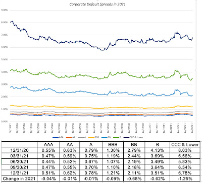
    In my last post, I chronicled the movement in the equity risk premium, i.e. the price of risk in the equity market, during 2021, but the bond market has its own, and more measurable, price of risk in the form of corporate default spreads. Using bond ratings classes to categorize companies, based upon credit risk, I looked at the movement of default spreads during 2021:

Download data

Corporate default spreads decrease across ratings classes, but the decline is much larger for lower rated bonds, with the default spread on high yield bonds registering a drop of 1.25%. Note that the decrease in default spreads, at least for the lower ratings, mirrors the drop in the implied equity risk premium during the course of 2021. Read together, it suggests that private risk capital continued to not just stay in the game, but increased its stake during the course of the year, extending a decade-long run.

Expected Inflation, Interest Rates and Bond Returns

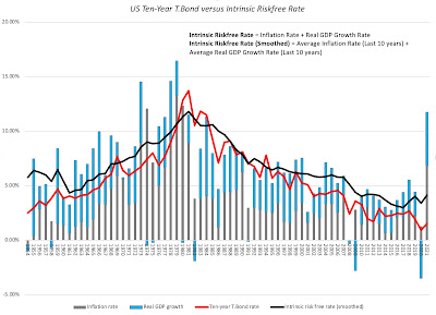
    While day to day movements in interest rates are driven by multiple forces, including the latest smoke signals coming from central banks and investor sentiment, the longer term and drivers of interest rates are fundamental. In particular, if you start by breaking down a long term riskfree rate (like the 10-year treasury bond) into an expected inflation and an expected real interest rate components, you can also reconstruct an intrinsic risk free rate by assuming that the real growth in the economy is a stand-in for the real interest rate and that most investors form expectations of future inflation by looking at the inflation in the most recent year(s):

Download data

In this picture, the actual ten-year treasury bond rate is superimposed against a rough measure of the intrinsic risk free rate (obtained by adding together the actual inflation rate and real growth rate each year) and a smoothed out version (where I used the average inflation rate and real growth rate over the previous ten years). Not only has the intrinsic risk free rate moved in sync with the ten-year bond rate for most of the last seven decades, but you can also see that the main reason why rates have been low for the last decade is not the Fed, with all of its quantitative easing machinations, but a combination of low growth and low inflation. Coming into 2022, though, the intrinsic risk free rate is clearly running ahed of the ten-year treasury bond rate, and if history is any guide, that gap will close either with a rise in the treasury bond rate or a decline in the risk free rate (coming from a recession or a rapid drop off in inflation). 

Unexpected Inflation and Asset Returns

    Note that it is expected inflation that drives interest rates, and that the actual inflation rate can come in above or below expectations. In my post on inflation last year, I drew a contrast between expected and unexpected inflation, arguing that financial assets are affected differently by each component. If expected inflation is high, but it is predictable, investors and businesses have the opportunity to incorporate that inflation into their decision making, with investors demanding higher interest rates on bond and expected returns on stocks, and businesses raising prices on their products/services to cover expected inflation. Unexpected inflation is what catches us off guard, with unexpectedly high inflation leading to a reassessment of pricing (for all financial assets) and an uneven impact across businesses, leaving those with pricing power in a better position than those without that power. 

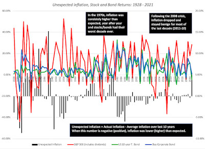
    To assess how inflation has affected asset returns over time, I broke down the actual inflation rates since 1954 into expected and unexpected components each year, using a brute force assumption that the average inflation rate over the last ten years is the expected inflation rate. (In the last two decades, we have had access to more sophisticated measures of expected inflation, including the difference between the nominal treasury bond and TIPs rates, but not in earlier years). In the graph below, I look at annual returns on stocks, treasury bonds and corporate bonds, with the unexpected inflation numbers also shown:


There are a few aspects of this graph that stand out. With my crude measure of inflation expectations, it looks like it takes time for inflation expectations to shift, during periods of higher or lower inflation, as can be seen in the extended stretches of higher than expected inflation, in the 1970s, and lower than expected inflation in the 1980s. 

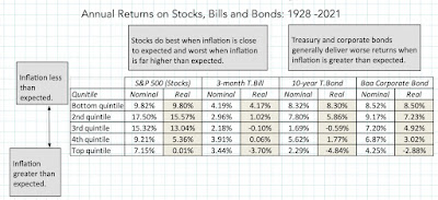
    While it is not immediately visible in the graph, returns on stocks and bonds are affected by unexpected inflation, and to illustrate by how much, I broke the 94 years of data into five quartiles, based upon the level of unexpected inflation, with the lowest (highest) quintile representing the years when inflation came in most below (above) expectations, and estimated the annual returns (nominal and real) for stocks, treasuries and corporate bonds in the table below:

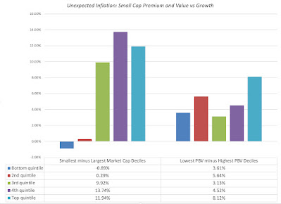
With treasuries and corporates, the returns generally get worse, as inflation comes in above expectations, with real returns showing the damage from unexpected inflation. With equities, the sweet spot in terms of returns is when inflation is at or below expectations, and the worst scenarios are when inflation comes in well above expectations.  I also looked at how inflation plays out on equity sub-groupings, on two dimensions, the first being market capitalization and the second being price to book, with the former becoming a stand-in for the vaunted small cap premium and the latter for the value versus growth question.

Over much of the last century, small cap stocks have done better than large cap stocks, when inflation has come in well above expectations, perhaps providing some insight into why the vaunted small cap premium seems have to disappeared over the last two decades of muted inflation. Similarly, the value effect, computed as the premium (or discounted) return earned by low price to book stocks over high price to book, becomes more pronounced during periods when inflation is greater than expected and much less so, during periods when inflation is lower than anticipated.
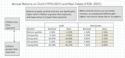
    Using the same approach with gold and real estate, with the caveat that historical data on the former is more limited, I get the following results:
While gold and real estate both do better than financial assets, when inflation is greater than expected, there is also a clear difference between the two investment classes. Real estate operates more as a neutral hedge, delivering returns that are, for the most part, unscathed by unexpectedly high inflation, but gold is a bet on inflation, delivering the highest returns, when inflation is much greater than expected, and negative returns, when it is lower than expected. Much as I would like to extend this analysis to newer investment classes, there is not enough historical data on crypto currencies or NFTs to allow for the analysis. As I noted in my inflation post in 2021, though, the early evidence is not promising for these new investment categories, at least as inflation and crisis hedges, since they have behaved more like risky equities, at least on a day-to-day basis and during the 2020 crisis, than like gold.

Inflation and Currencies
    Much of this post has been about inflation in the US, and by extension, in US dollar terms, it is worth emphasizing that inflation is a currency-specific phenomenon. While inflation in the US dollar, by dint of its status as the currency in which commodities are priced, can sometimes spill over into other currencies, it remains true that you can have high inflation in one currency, while there is low inflation in other currencies. Inflation differences across currencies play out in two domains, with the first being interest rates in different currencies and the other being exchange rate.
    
Interest Rates across Currencies
    I start every one of my discussions of discount rates with a truism, by stating that the riskfree rate that you start with should reflect the currency in which you have decided to do your valuation. That then becomes the springboard for estimating risk free rates in different currencies, following one of two paths. In the first, you start with government bond rates in the local currency, in different currencies, and adjust those rates for default risk in the local currency government bond. (Government bonds in local currencies do default, and account for a significant proportion of sovereign defaults in the last 50 years). My estimates for the start of 2022 for the currencies where local-currency government bonds are available is below:
Download data

Riskfree rates are highest in currencies, like the Zambian Kwacha or Turkish Lira, where inflation is highest, lower in low-inflation currencies and even negative in currencies, where deflation may be the long term prediction. I am using the default spreads based upon the local currency sovereign ratings for the countries in question, with the government bond rate being the risk free rate only for currencies where the issuing government in triple-A rated. If you dislike this assumption, or do not believe that the government bond rate is a market-set number in a particular market, there is a second approach, where you start with the risk free rate in US dollar or Euros, and adjust it for differential inflation, i.e., the difference in expected inflation between the US and the country in question:
Thus, if the US treasury bond rate is 1.5%, and expected inflation rates in the US and Indonesia are 1% and 4% respectively, the approximate riskfree rate in Indonesian Rupiah will be 4.5% (=1.5% + (4%-1%)) and the more precise riskfree rate in Rupiah will be 4.52% (=1.015*(1.04/1.01)-1). While the expected inflation rate in dollars may be an easy get, it is more difficult to get expected inflation rates in other currencies, but the IMF has estimates for the next five years at this link.

Exchange Rates
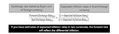
    Just as interest rates in currencies are determined, in large part, by inflation differentials, exchange rates over time are also driven by those same inflation differentials. Drawing on one of the oldest relationships in exchange rates, purchasing power parity, you can extract the forward exchange rate in a currency:

Thus, currencies with higher inflation can be expected currency devaluation over time, relative to currencies with lower inflation. As with interest rates, in the short term, there are forces, ranging from central banking intervention to momentum and speculation, that can cause rates to deviate from the inflation script, but in the long term, it is almost impossible to break the cycle.
    Connecting this linkage to the discussion of US inflation in the prior sections, here are the takeaways. If you believe that inflation will stay high, not just in the US, but across the globe, the exchange rate effects will be muted. If, on the other hand, you believe that the inflation shock will vary across countries, your actions will be more nuanced. For the countries where you believe that local inflation will decrease, relative to the US,  the US dollar will weaken against their currencies, augmenting returns you will earn in their markets (stock or bond). For countries, where you see local inflation surging more than you expect to see in the US, the US dollar will strengthen against their currencies, reducing the returns you make in their markets. As with the discussion of asset returns, it is not expected inflation that is the source of exchange rate risk, since you can incorporate those expectations into exchange rates, but unexpected inflation, which, when extreme, can cause significant revaluations of currencies. 

Conclusion
    As with any historical data assessment, I could give you the standard boilerplate disclaimer that past performance is not always a good predictor of the future, but to the extent that the past provides signals, your expectations of how inflation will play out in the coming year will play a key role in your asset allocation and stock selection decisions. If you believe that last year's surge in inflation is a precursor to a long time period when inflation is likely to stay high, and come in above expectations, you should be shifting your holdings away from financial to real assets, and within your equity holdings, towards small cap stocks,  stocks trading at lower pricing multiples (PE, Price to Book) and companies with more pricing power. If, on the other hand, you believe that inflation worries are overdone, and that there will be a reversion back to the low inflation that we have seen in the last decade, staying invested in stocks, and especially in larger cap and high growth stocks, even if richly priced, makes sense.

YouTube Video

Data Links
Blog Post Links

Wednesday, January 19, 2022

Data Update 2 for 2022: US Stocks kept winning in 2021, but…

Leading into 2021, the big questions facing investors were about how quickly economies would recover from COVID, with the assumption that the virus would fade during the year, and the pressures that the resulting growth would put on inflation. In a post at the start of 2021, I argued that while stocks entered the year at elevated levels, especially on historic metrics (such as PE ratios), they were priced to deliver reasonable returns, relative to very low risk free rates (with the treasury bond rate at 0.93% at the start of 2021). At the start of 2022, it feels like Groundhog Day, with the same questions about economic growth and inflation looming for the year, and the same judgment about stocks, i.e., that they look expensive. In this post, I will begin with a historical assessment of stock returns in the recent past, then move on to evaluate the returns that investors can expect to make, given how they are priced at the start of 2022, and end with a do-it-yourself valuation of the index right now.

The year that was.... 

    If equity markets surprised us with their resilience in 2020, not just weathering a pandemic for the ages, but prospering in its midst, US equity markets, in particular, managed to find light even in the darkest news stories, and continued their rise through 2021. Foreign markets, though, had a mixed year, and that divergence is worth noting, since it may provide clues to what may be coming in the next year.

US Equities, in the aggregate

   US equities had a good year, by any measure, with the S&P 500 rising from 3756 at the start of 2021 to end the year at 4766, an increase of 26.90%. While that followed another good year for stocks in 2020, with the index rising 16.25%, from 3231 to 3756, the index took different pathways during the two years:


In 2020, the market was up, but only after it absorbed the after-shocks of the inception of the virus in February and March of 2020. In 2021, the index had a smoother ride, up in nine of twelve months, with only September qualifying a significant drop (with the index down 4.75%). When you augment this price change with the dividends on the index during 2021, the total return on the S&P 500 for 2021 was 28.47%. I report a dataset containing annual returns on stocks, going back to 1928, and to put 2021 in context, I looked at the historical returns on the index:
Download historical returns on US stocks

Looking at the 94 years in this dataset, the returns in 2021 would have ranked 20th on the list, good, but not exceptional. Note, though, that 2021 is the third consecutive year of very good returns on the index, with 2019 delivering 31.21%, and 2020 generating 18.02%, and that the cumulative return over the three years (2019-21) is 98.95%. If you compute cumulative returns, on a rolling three-year time period (1928-30, 1929-31, 1930-32 etc.), the 2019-21 time period would rank 8th on the list of 92 3-year time periods. The table below provides the rankings for returns over 5-year and 10-year periods, and where the most recent three-year, five-year and ten-year cumulative returns would rank on the list:
Download return rankings

In sum, if you have money to invest over the last decade, and you stayed invested, you should count yourself as lucky to have enjoyed one of the great market runs of the last century. Conversely, if you stayed out of the market, for the last decade, you would have committed one of the great investing mistakes of all time, and blaming the Fed or bubble-talk will not bring you absolution.

US Equities, by sub-group

    It has always true that when markets move, up or down, not all sectors and sub-groups are treated equally. I do believe that too much is often made of these differences, as it is generally more the rule than the exception that markets, when they are up strongly, get the bulk of that rise from a small sub-set of stocks or sectors. Using S&P's sector classification, I take a look at how each one did in 2022, looking at the percent changes in market capitalization:

In contrast to 2020, when technology and consumer discretionary firms ran well ahead of the pack, the best performing sectors in 2021 were energy and real estate, two of the biggest laggards in 2020. That can be viewed as vindication, at least in this year, for contrarians, but as a cautionary note for ESG advocates, who assumed that fossil fuel companies were on a death march, based upon their performance over the last decade.

There is no debate more likely to draw heat than the value versus growth debate, and at the risk of being labeled simplistic by value investors, I looked at returns on companies, in 2021, based upon their PE ratios at the start of 2021:


Unlike 2020, where high PE stocks beat low PE stocks decisively, the results in 2021 were mixed, with no clear patterns across the classes. The results are similar if you break stocks down based upon price to book ratios or revenue growth rates. Finally, and in keeping with my fixation on corporate age and life cycles, I broke companies down by company age (measured from the founding year):

Again, unlike 2020, when young companies delivered significantly higher returns than older companies, the best returns in 2021 were delivered by middle aged companies.

For the rest of the world

   While US equities continued to set new highs in 2021, the picture in the rest of the world was not as rosy, as you can see in the table below (with percent returns in US dollar terms):


In US dollar terms, India had the best-performing market in 2021, following a strong 2020, but China, the best performer in the world in 2020 came back to earth in 2021. North America (US and Canada) outperformed the globe, but Latin America was the worst performing region, down more than 20% in US dollar terms. There are many reasons why markets diverge, but here again the contrast with 2020 is worth drawing. In 2020, the COVID crisis played out across markets, increasing the co-movement and correlation across developed markets, with the US, Europe and Japan moving mostly in sync. In 2021, you saw a return to more normal times, with markets in each country affected more by local factors.

The Price of Risk in Equity Markets

    The allure of having the historical data that we do in financial markets, especially in the United States, is that there is information in the past. The danger of poring over this historical data is that a focus on the past can blind us to structural changes in markets that can make the future very different from the past. To get a measure of what equity markets are offering in terms of expected returns, we are better served with a forward-looking and dynamic measure of these returns, and that is the focus of this section.

Implied Equity Risk Premiums

   To understand the intuition behind the implied equity risk premium, it is easiest to start with the concept of a yield to maturity on a bond, computed as the discount rate that makes the present value of the cash flows on the bond (coupons, during the bond's lifetime, and face value, at maturity) equal to the price of the bond. With equities, the cash flows take the form of dividends and buybacks, and in addition to estimating them using future growth rates, you have to assume that they continue in perpetuity. In computing this implied equity risk premium for the S&P 500, I start with the dividends and buybacks on the stocks in the index in the most recent year (which is known) and assume that they grow at the rate that analysts who follow the index are projecting for the next five years. Beyond the fifth year, I make the simplifying assumption that earnings growth will converge on the nominal growth rate of the economy, which I set equal to the risk free rate

If you set the present value of the expected cash flows equal to the index level today, and solve for a discount rate (you may need to use the solver function in Excel, or trial and error), the resulting number is the expected return on stocks, based upon how stocks are priced today, and expected cash flows. This approach is built on the proposition that the intrinsic value of stocks is the present value of the expected cash flows that you generate in perpetuity, from holding these stocks, but it is model agnostic. Put simply, it does not require that you believe in any risk and return model in finance, since it is based on price and expected cash flows. To the critique that analysts can over estimate future earnings and  growth, the response is that even if they do (and there is no evidence that top-down forecasts are biased), it is the price of risk, given expected cash flows.

The Implied ERP - Start of 2022

I have computed the implied equity risk premium at the start of every month, since September 2008, and during crisis periods, I compute it every day.  Over the course of 2021, as the index rose, risk free rates climbed and analysts got much more upbeat about expected earnings for the next three years, the equity risk premium drifted down, to end the year at 4.24%:

Download spreadsheet

Much as I would love to claim that I have the estimated the equity risk premium to the second decimal point, the truth is that there is some give in these numbers and that changing assumptions about earnings and cash flows generates an equity risk premium between 4-5%. The contrast between the behavior f equity risk premiums in 2020 and 2021 are in the picture below, where I show my (daily) estimates of ERP during 2020 on the left, and my (monthly) estimates of ERP for 2021 on the right. 

Download data on ERP by month from 2008-2021

During 2020, the equity risk started the year at about 4.7%, spiraled to almost 8% on March 23, 2020, before reverting back quickly to pre-crisis levels by September 2020. During 2021, you saw equity risk premiums revert back to a more sedate path, with numbers staying between 4% and 5% through the course of the entire year.

Historical Perspective

    As talk of a bubble fills the air, one way to reframe the question of whether stocks are in bubble territory is to ask whether the current implied equity risk premium has become “too low”. If your answer is yes, you are arguing that stocks are over priced, and if the answer is no, that they are under priced. At least on the surface, the current level of the equity risk premium is not flashing red lights, since at 4.24%, it is running slightly above the long term averages of 4.21% (1960 - 2021).

Download past implied ERP

That said, there are two reasons for concern. The first is that the premium is now lower than the average premium since 2008, a period that perhaps better reflects the new global economy. The second and scarier reason is that the 5.75% expected return that is implied in today’s stock prices is close to a sixty-year low:

Download past implied ERP

A pessimist looking at this graph will conclude that expected returns on stocks have become too low, and that we are due for a correction, but that would be more a statement about treasury bond rates being too low than about equity risk premiums. Even if you belong to the camp arguing that low risk free rates are now the norm, this graph suggests that we all need to re-examine how much we, as individuals, are saving for retirement, since the old presumption that you can earn 8-10% investing in stocks will longer hold. Across the United States, defined-benefit pension funds that have set aside funds on this same assumption will face massive funding shortfalls, unless they reevaluate benefit levels or infuse new funds.

A Market Assessment

  If you look at history, it seems difficult to argue against the notion that market timing is the impossible dream, but that has never stopped investors from trying to time markets, partly because the payoff from being right is immense. I have long claimed that I am not a market timer, but that is a lie, since every investor times markets, with the difference being in whether the timing is implicit (with cash holdings in your portfolio increasing, when you feel uneasy about markets, and decreasing, when you feel bullish) or explicit (where you actively bet on market direction). Rather than just give you just my estimate of whether I think the market is under or over valued, I will ask each of you to make your own judgments, while also offering my own. 

    The process of valuing the index starts with an assessment of expected earnings, and with the S&P 500, there is no shortage of either historical data or assessments of the future, on this dimension. Let's start with a look at S&P earnings over time:

Download historical earnings

While COVID wreaked havoc with corporate earnings in 2020, the comeback in earnings in 2021 has been remarkable, with trailing 12-month earnings (October 2020 - September 2021) at 190.34, and estimated earnings for 2021 of 206.38, both significantly higher than the 162.35 that was earned in 2019  (pre-COVID). At the end of 2021, analyst estimates for earnings in 2022 and 2023 reflect their views that the earnings recovery will continue:

I will use the analyst estimates as my expected earnings for the index for the next two years, but assume that earnings growth rate thereafter will move down over the following three years to a stable growth rate (set equal  to the risk free rate). It is true that analysts are often wrong, and in some cases, biased, but the latter is more of a problem with analyst estimates for individual companies, than for market aggregate earnings. However, if you believe that analysts have overestimated earnings, my valuation spreadsheet gives you the option of haircutting those estimates. Conversely, if your contention is that analysts are still playing catch-up, you can increase their estimates by a factor of your choosing.

    Investors don't get value from earnings directly, but do get value from the cash flows flowing from those earnings. As I have noted in prior posts, these cash flows, which used to entirely take the form of dividends, have increasingly shifted, over the last three decades, to stock buybacks. 

While dividends are stickier than buybacks, insofar as companies are more willing to reduce the latter during crisis years like 2009 and 2020, it is also clear, as the comeback in buybacks in 2021 shows. In my base case valuation, I will start with 77.36%, the percent of earnings that companies have returned to shareholders, in dividends and buybacks, in the last twelve months, but I will increase this over time to a cash payout ratio that is consistent with my estimate of stable growth (risk free rate) and the return on equity of 16.10% that S&P 500 companies have earned, on average, over the last decade. (Sustainable Payout Ratio = 1 - g/ ROE; with a 16.10% return on equity and a 2.5% growth rate, the payout ratio in stable growth is 84.47%= 1 - .025/.161).

    On the risk free rate, I start with 1.51%, the 10-year treasury bond rate on January 1, 2022, but I will assume that this rate will drift upwards over the next five years to reach 2.5%. That reflects my view that inflation pressures will push up long term rates in the year to come and has little to do with what the Fed may or may not do with the Fed funds rate. Finally, I build in the expectation that a fair ERP for the S&P 500 should be 5%, higher than the long term historical average of 4.21%, but closer to the average ERP since 2008. On both these macro assumptions, I encourage you to take your own point of view. With these assumptions in place, my valuation for the S&P 500, as of January 1, 2022, is shown below:

Download spreadsheet to value S&P 500 index

Note that even in the two weeks since I did this valuation, there have been material changes in key inputs, with the treasury bond rate rising to 1.87% on January 19, 2022, and the S&P dropping to 4533, down 3.8% from its level at the start of the year. 

In Conclusion

    As with any valuation, I don't believe that I should try to convince you that my valuation is the right one, nor do I have no desire to do so. In fact, I know that my valuation is wrong, with the question being in what direction, and by how much. I would strongly encourage you to take my valuation spreadsheet, change the numbers that I have used on earnings, cash flows, the risk free rate and the equity risk premium to reflect your views, and come up with your own assessment of value. Good investing requires taking ownership of your investment decisions, and trusting this choice to talking heads on TV, market strategists at investment banks or those market gurus who looked good last year is a dereliction of investment duty.    

YouTube Video

Datasets (to download)

  1. Historical returns on stocks, bonds, bills and real estate: 1928 - 2021
  2. Historical implied ERP on the S&P 500: 1960 -2021

Spreadsheet (to value the S&P 500)

  1. Spreadsheet to compute implied ERP on January 1, 2022
  2. Spreadsheet to value the S&P 500 on January 1, 2022


Saturday, January 8, 2022

Data Update 1 for 2022: It is Moneyball Time!

Happy New Year, and I hope that 2022 brings you good tidings! To start the year,  I returned to a ritual that I have practiced for thirty years, and that is to take a look at not just market changes over the last year, but also to get measures of the financial standing and practices of companies around the world. Those measures took a beating in 2020, as COVID decimated the earnings of companies in many sectors and regions of the world, and while 2021 was a return to some degree of normalcy, there is still damage that has to be worked through. This post will be one of a series, where I will put different aspects of financial data under the microscope, to get a sense of how companies are adapting (or not) to a changing world.

The Moneyball Question

When I first started posting data on my website for public consumption, it was designed to encourage corporate financial analysts and investors alike to use more data in their decision making. In making that pitch, I drew on one of my favorite movies, Moneyball, which told the story of Billy Beane (played by Brad Pitt), the general manager of the Oakland As, revolutionized baseball by using data as an antidote to the gut feeling and intuition of old-time baseball scouts.


In the years since Beane tried it with baseball, Moneyball has decisively won the battle for sporting executives' minds, as sport after sport has adopted its adage of trusting the data, with basketball, football, soccer and even cricket adopting sabermetrics, as this sporting spin off on data science is called. Not surprisingly, Moneyball has found its way into business and investing as well.  In the last decade, as tech companies have expanded their reach into our personal lives, collecting information on choices and decisions that used to private, big data has become not just a buzzword, but also a justification for investing billions in companies/projects that have no discernible pathway to profitability, but offer access to data.  Along the way, we have all also bought into the notion of crowd wisdom, where aggregating the choices of tens of thousands of choice-makers, no matter how naive, yields a consensus that beats expert opinion. After all, we get our restaurant choices from Yelp reviews, our movie recommendations from Rotten Tomatoes, and we have even built crypto currencies around the notion of crowd-checking transactions.

Don't get me wrong! I was a believer in big data and crowd wisdom, well before those terms were even invented. After all, I have lived much of my professional life in financial markets, where we have always had access to lots of data and market prices are set by crowds of investors. That said, it is my experience with markets that has also made me skeptical about the over selling of both notions, since we have an entire branch of finance (behavioral finance/economics) that has developed to explain how more data does not always lead to better decisions and why crowds can often be collectively wrong. As you use my data, I would suggest four caveats to keep in mind, if you find yourself trusting the data too much:
  1. More data is not always better than less data: In a post from a few months ago, I argued that we as investors and analysts) were drowning in data, and that data overload is now a more more imminent danger than not have enough data. I argued that disclosure requirements needed to be refined and that a key skill that analysts will need for the future is the capacity to differentiate between data and information, and materiality from distraction.
  2. Data does not always provide direction: As you work with data, you discover that its messages are almost always muddled, and that estimates always come with ranges and standard errors. In short, the key discipline that you need to tame and use data is statistics, and it is one reason that I created my own quirky version of a statistics class on my website.
  3. Mean Reversion works, until it does not: Much of investing over the last century in the US has been built on betting on mean reversion, i.e. that things revert back to historical norms, sooner rather than later. After all, the key driver of investment success from investing in low PE ratio stocks comes from their reverting back towards the average PE, and the biggest driver of the Shiller PE as a market timing device is the idea that there is a normal range for PE ratios. While mean reversion is a strong force in stable markets, as the US was for much of the last century, it breaks down when there are structural changes in markets and economies, as I argued in this post
  4. The consensus can be wrong: A few months ago, I made the mistake of watching Moneyheist, a show on Netflix, based upon its high audience ratings on Rotten Tomatoes, and as I wasted hours on this abysmal show, I got a reminder that crowds can be wrong, and sometimes woefully so. As you look at the industry averages I report on corporate finance statistics, from debt ratios to dividend yields, remember that just because every company in a sector borrows a lot, it does not mean that high debt ratios make sense, and if you are using my industry averages on pricing multiples, the fact that investors are paying high multiples of revenues for cloud companies does not imply that the high pricing is justified.
In short, and at the risk of stating the obvious, having access to data is a benefit but it is not a panacea to every problem. Sometimes, less is more!

The Company Sample for 2022
When I first started my data collection and analysis in 1990, data was difficult to come by, and when available, it was expensive. Without hundreds of thousands of dollars to spend on databases, I started my journey spending about a thousand dollars a year, already hitting budget constraints, subscribing to a Value Line database that was mailed to me on a CD every year. That database covered just 1700 US companies, and reported on a limited list of variables on each, which I sliced and diced to report on about a dozen variables, broken down by industry. Times have changed, and I now have access to extraordinarily detailed data on almost all publicly traded global companies. I am grateful to all the services that provide me with raw data, but I am cognizant that they are businesses that make money from selling data, and I try not to undercut them, or act as a competitor. That is why almost every variable that you will see me reporting on my website represents a computation or estimate of mine, albeit with raw data from a provider, rather than a regurgitation of data from a service. It is also why I report only aggregated data on industries, rather than company-level data.

Regional Breakdown
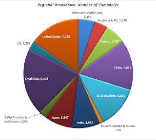
My data sample for 2022 includes every publicly traded firm that is traded anywhere in the world, with a market capitalization that exceeds zero. That broad sweep yields a total of 47,606 firms, spread across 135 countries and every continent in the world:

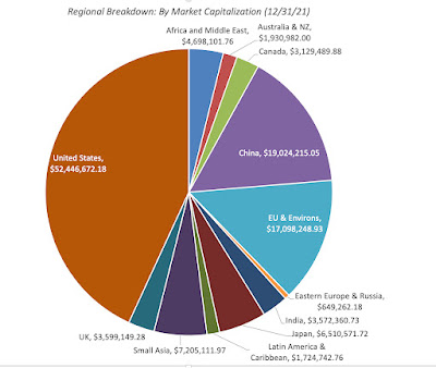
The largest slice is Small Asia, where small has to be read in relative terms, since it includes all of Asia, except for India, China and Japan, with 9,408 firms. It is followed by the United States, with 7,229 firms, and then China (including Hong Kong listings), with 7.043 firms. Since many of these firms have small market capitalizations, with some trading at market caps of well below $10 million, the chart below looks at the breakdown of the sample in market capitalization:

The market capitalization breakdown changes the calculus, with the US dominating with $52 trillion in collective market cap, more than 40% of the overall global value, followed by China with $19 trillion in aggregate market capitalization. 

Sector/Industry Breakdown
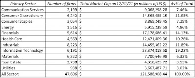
The most useful way to categorize these 47,606 companies is by industry groupings, but that process does raise thorny questions about what industry groupings to use, and where to put firms that are not easily classifiable. To illustrate, what business would you put Apple, a company that was categorized (rightly) as a computer hardware company 40 years ago, but that now gets more than 60% of its revenues and profits from the iPhone, a telecommunication device that is also a hub for entertainment and services? I started my classification with a very broad grouping, based upon S&P's sector classes:
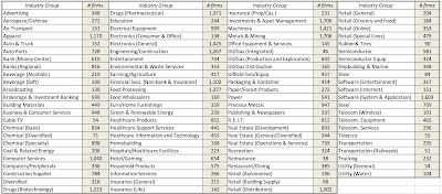
This should not come as a surprise, especially given their success in markets over the last decade, but technology is the largest sector, accounting for 19.22% of global market capitalization, though industrials account for the largest number of publicly traded firms. One sector to note is energy, which at 4.86% of global market capitalization at the start of 2022, has seen its share of the market drop by roughly half over the last decade. Addressing the legitimate critique that sector classifications are too broad, I created 94 industry groupings for the companies, drawing on the original classifications that I used for my Value Line data thirty years ago (to allow for historical comparisons) and S&P's industry list. The table below lists my industry groups, with the number of companies in each one:
I am sure that some of you will find even these industry groupings to be over-broad, but I had to make a compromise between having too many groupings, with not enough firms in each one, and too few. It also required that I make judgment calls on where to put individual firms, and some of those calls are debatable, but I feel comfortable that my final groups are representative.

The Data Variables
When I first started reporting data, I had only a dozen variables in my datasets. Over time, that list has grown, and now includes more than a hundred variables. A few of these variables are macro variables, but only those that I find useful in corporate finance and valuation, and not easily accessible in public data bases. Most of the variables that I report are micro variables, relating to company choices on investing, financing and dividend policies, or to data that may be needed to value these companies.

Macro Data
If your end game is obtaining macroeconomic data, there are plenty of free databases that provide this information today. My favorite is the one maintained by the Federal Reserve in St. Louis, FRED, which contains historical data on almost every macroeconomic variable, at least for the US. Rather than replicate that data, my macroeconomic datasets relate to four key variables that I use in corporate finance and valuation.
  1. Risk Premiums: You cannot make informed financial decisions, without having measures of the price of risk in markets, and I report my estimates for these values for both debt and equity markets. For debt markets, it takes the form of default spreads, and I report the latest estimates of these corporate bond spreads at this link. In the equity market, the price of risk (equity risk premium) is more difficult to observe, and I start by reporting on the conventional estimate of this measure by looking at historical returns (going back to 1928) on stocks, bonds, bills and real estate at this link. I offer an alternative forward-looking and more dynamic measure of this premium in an implied premium, with the start of 2022 estimate here and the historical values (going back to 1960) of this implied premium here.
  2. Risk free Rates: While the US treasury bond rate is widely reported, I contrast its actual value with what I call an intrinsic measure of the rate, computed by adding the inflation rate to real growth each year at this link
  3. Currency and Country Risk: Since valuation often requires comfort with moving across currencies, I provide estimates of risk free rates in different currencies at this link. I extend my equity risk premium approach to cover other countries, using sovereign default spreads as my starting point, at this link.
  4. Tax Rates: Since the old saying about death and taxes is true, I report on marginal tax rates in different countries at this link, and while I would love to claim that I did the hard work, the credit belongs to KPMG for keeping this data updated over time.
I do update my equity risk premiums for the US at the start of every month on my website, and the country equity risk premiums once every six months. 

Micro Data
I am not interested in reported financial ratios, just for the sake of reporting them, and my focus is therefore on those statistics that I use in corporate finance and valuation. You may find my choices to be off putting, but you could combine my reported data to create your own. For example, I believe that return on assets, an accounting ratio obtained by dividing net income by total assets, is an inconsistent abomination, leading to absurd conclusions, and I refuse to report it, but I do report returns on invested capital and equity. 

Rather than just list out the variables that I provide data on, I have classified them into groups in the table below:
Data on my site

With each of these variables, I report industry averages for all companies globally, as well as regional averages for five groups: (a) US, (b) EU, UK and Switzerland, (c) Emerging Markets, (d) Japan and (e) Australia, NZ and Canada. Since the emerging market grouping is so large (representing more than half my sample) and diverse (across every continent), I break out India and China as separate sub-groups. You can find the data to download on my website, at this link.

Data Timing and Timeliness
Almost all of the data that you will see in my updates reflects data that I have collected in the last week (January 1, 2022- January 8, 2022.  That said, there will be difference in timeliness on different data variables, largely based upon whether the data comes from the market or from financial statements. 
  • For data that comes from the market, such as market capitalization and costs of capital, the current data is as of January 1, 2022.
  • For data that comes from financial statements, the numbers that I use come from the most recent filings, which for most companies will be data through September 30, 2021. 
Thus, my trailing PE ratio for January 1, 2022, is computed by dividing the market capitalization on January 1, 2022, by the earnings in the twelve months ending in September 2021. While that may seem inconsistent, it is consistent with the reality that you, as an investor or analyst, use the most current data that you can get for each variable. As we go through the year, both the market and the accounting numbers will change, and a full-fledged data service would recompute and update the numbers. I am not, and have no desire to be, a data service, and will not be updating until the start of 2023. Thus, there are two potential dangers in using my data later in the year, with the first emerging if the market sees a steep shift, up or down, which will alter all of the pricing multiples, and the second occurring in sectors that are either transforming quickly (disrupted sectors) or are commodity-based (where changes in commodity prices can alter financials quickly).

Estimation Choices
When I embarked on the task of estimating industry averages, I must confess that I did not think much of the mechanics of how to compute those averages, assuming that all I would have to do is take the mean of a series of numbers. I realized very quickly that computing industry averages for pricing and accounting ratios was not that simple. To illustrate why, I present you with a slice of my table of PE ratios, by industry grouping, for US firms, the start of 2022:
PE ratio, by industry, for US companies
Take the broadcasting group, just as an illustration, where there were 29 firms in my US sample. The three columns with PE ratios (current, trailing and forward) represent simple averages, but these case be skewed for two reasons. The first is the presence of outliers, since PE ratios can be absurdly high numbers (as is the case with auto & truck companies), and can pull the averages up. The second is the bias created by removing firms with negative earnings, and thus no meaningful PE ratio, from the sample. The last two columns represent my attempts to get around these problems. In the second to last column, I compute an aggregated PE ratio, by taking the total market capitalization of all firms in the group and dividing by the total earnings of all firms in the group, including money losers. In effect, this computes a number that is close to a weighted average that includes all firms in the group, but if a lot of firms are money-losers, this estimate of the PE ratio will be high. To see that effect, I compute an aggregated PE ratio, using only money-making firms, in the last column. You may look at the range of values for PE ratios, from 7.05 to 24.99 for broadcasting firms, and decide that I am trying to confuse the issue, but I am not. It is the basis for why I take all arguments that are based upon average PE ratios with a grain of salt, since the average that an analyst uses will reflect the biases they bring to their sales pitches. 

The other issue that I had to confront, especially because my large sample includes many small companies, listed and traded in markets with information disclosure holes, is whether to restrict my sample to markets like the US and Europe, where information is more dependable and complete, or to stay with my larger sample. The problem with doing the former is that you create bias in your statistics by removing smaller and risker firms from your sample, and I chose to have my cake and eat it too, by keeping all publicly traded firms in my global sample, but also reporting the averages for US and European firms separately.

Using the Data
I report the data on my website, because I want it to be used. So, if you decide that some  of the data is useful to you, in your investing or analysis, you are welcome to use it, and you don't have to ask for permission. If you find errors in the data, please let me know, and I will fix it. If you are looking for a variable that I do not compute, or need an average for a region that I don't report separately on (say Brazil or Indonesia), please understand that I cannot meet customized data requests. I am a solo operator, with other fish to fry, and there is no team at my disposal. As I mention in my website, this data is meant for real time analysis for those in corporate finance and valuation. It is not designed to be a research database, though I do have archived data on most of the variables going back in time, and you may be able to create a database of your own. If you do use the data, I would ask only three things of you:
  1. Understand the data: I have tried my best to describe how I compute my numbers in the spreadsheets that contain the data, in worksheets titled "Variables and FAQ". On some of the variables, especially on equity risk premiums, you may want to read the papers that I have, where I explain my reasoning, or watch my classes on them. Whatever you do, and this is general advice, never use data from an external source (including mine), if you do not understand how the data is computed.
  2. Take ownership: If you decide to use any of my data, especially in corporate financial analysis and valuation, please recognize that it is still your analysis or valuation. 
  3. Don't bring me into your disagreements, especially in legal settings: If you are in disagreement with a colleague, a client or an adversary, I am okay with you using data from my website to buttress your arguments, but please do not bring me in personally into your disputes. This applies in spades, if you are in a legal setting, since I believe that courts are where valuation first principles go to die.
Conclusion
I would love to tell you that I am driven by altruistic motives in sharing my data, and push for sainthood, but I am not.  I would have produced all of the data that you see anyway, because I will need it for my work, both in teaching and in practice, all year. Having produced the data, it seems churlish to not share it, especially since it costs me absolutely nothing to do so. If there is a hidden agenda here, it is that I think that in spite of advances over the last few decades, the investing world still has imbalances, especially on data access, and I would like it make a little flatter. Thus, if you find the data useful, I am glad, and rather than thank me, please pass on the sharing. 

YouTube

Links