It has been my practice for the last two decades to take a detailed look at how risk varies across countries, once at the start of the year and once mid-year. In most years, the differences between the two updates are small, and often ignorable, but this year's update brings significant changes for many reasons. The first is the retreat of risk capital, which I talked about in my last post, not only affects the flow of capital and repricing of the riskiest assets (high yield bonds, money losing companies) within each asset class, but also has consequences for the flow of capital across geographies, with riskier countries feeling the effect more than safer countries. The second is that this has been a consequential year for country risk shifts, with Russia's invasion of Ukraine upending risk not only for those countries, but also in the region, and tumult in Sri Lanka and Pakistan playing out as risk to investors in both countries.
Country Risk: Drivers and Measures
An investment in Nigeria or Turkey clearly exposes a firm or investor to more risks than an otherwise similar investment in Germany or Canada, but why? Some of the differences can be traced to the stability and growth prospects of the underlying economies, some to political and legal structures and some to geography. Rather than provide a laundry list, I attempted to summarize the four key drivers of country risk differences in the table below:
Let’s start with political structure, i.e., the extent of political freedom and democracy in a country, a sensitive topic and one that is open to subjective measurements, and draw on a democracy index score computed by the Economist Intelligence Unit (EIU) every year, with the most recent one mapped below:
As the Economist noted, a third of the world's population lived under authoritarian regimes and only 6.4% lived under full democracy, in 2021, with large differences across regions. From a business risk standpoint, though, the question of whether you would rather operate in a democracy or a dictatorship is a complicated one, with the former creating more continuous risk, as laws and regulations change, as elections often bring in new governments, and the latter more discontinuous risk, since regime changes, though less frequent, are often more wrenching and painful.
Second, a country’s risk profile can also be affected by its exposure toviolence, from war, terrorism or internal strife, and the risks that ensue to businesses that operate in its midst, I looked at differences across countries, in July 2022, drawing on work done by the Institute for Peace and Economics:
Note that the peace scores were updated to reflect the Russian invasion of Ukraine and that the world's hotspots became more violent in 2021 and 2022.
Third, corruption operates as an implicit tax, since business operating in corrupt parts of the world have to build in the associated costs and constraints. Transparency International measures a corruption score for countries, and the results of its 2021 iteration are mapped below:
Northern Europe is the standout, when it comes to being free of corruption, but corruption clearly is a drag on businesses in Latin America, Africa and much of Asia.
Finally, businesses are dependent on legal systems to enforce contracts and property rights, and legal protections vary widely across the world. I have mapped out an overall property rights score (based upon difference in physical, intellectual and legal property rights) below:
Legal protections for businesses are strongest in Australia and North America and weakest in Africa and Latin America.
While country risk has so many dimensions to it, there is correlation across the many dimensions, with corruption, poor legal protections, violence and political instability often moving in tandem. There are several services that attempt to estimate composite country risk scores, incorporating the multiple factors. One of my long-standing favorites is Political Risk Services, which measures a country risk score on a scale from 0 to 100, with lower scores indicating more risk and higher scores associated with safety:
Based on the PRS composite risk measures, Africa remains the most risky region of the world for businesses to operate in, whereas Northern Europe, North America and Australia offer the most safety.
Country Risk: Default Risk and Ratings
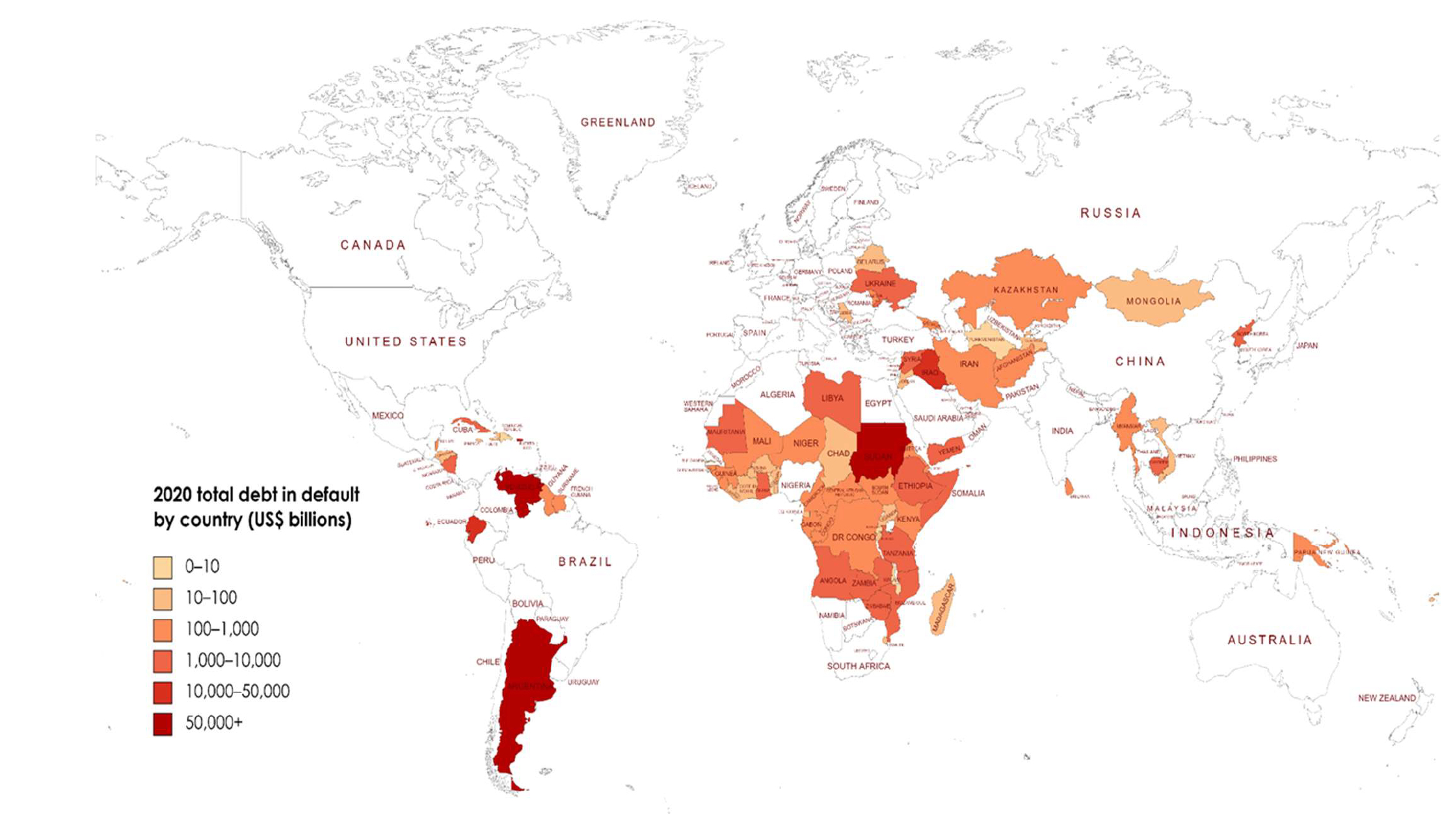
For investors, the most direct measures of country risk come from measures of their capacity to default on their borrowings. At the start of 2022, for instance, there were several countries that were in technical default, on at least portions of their debt, and the Russian invasion of Ukraine has exacerbated sovereign default concerns around the world:
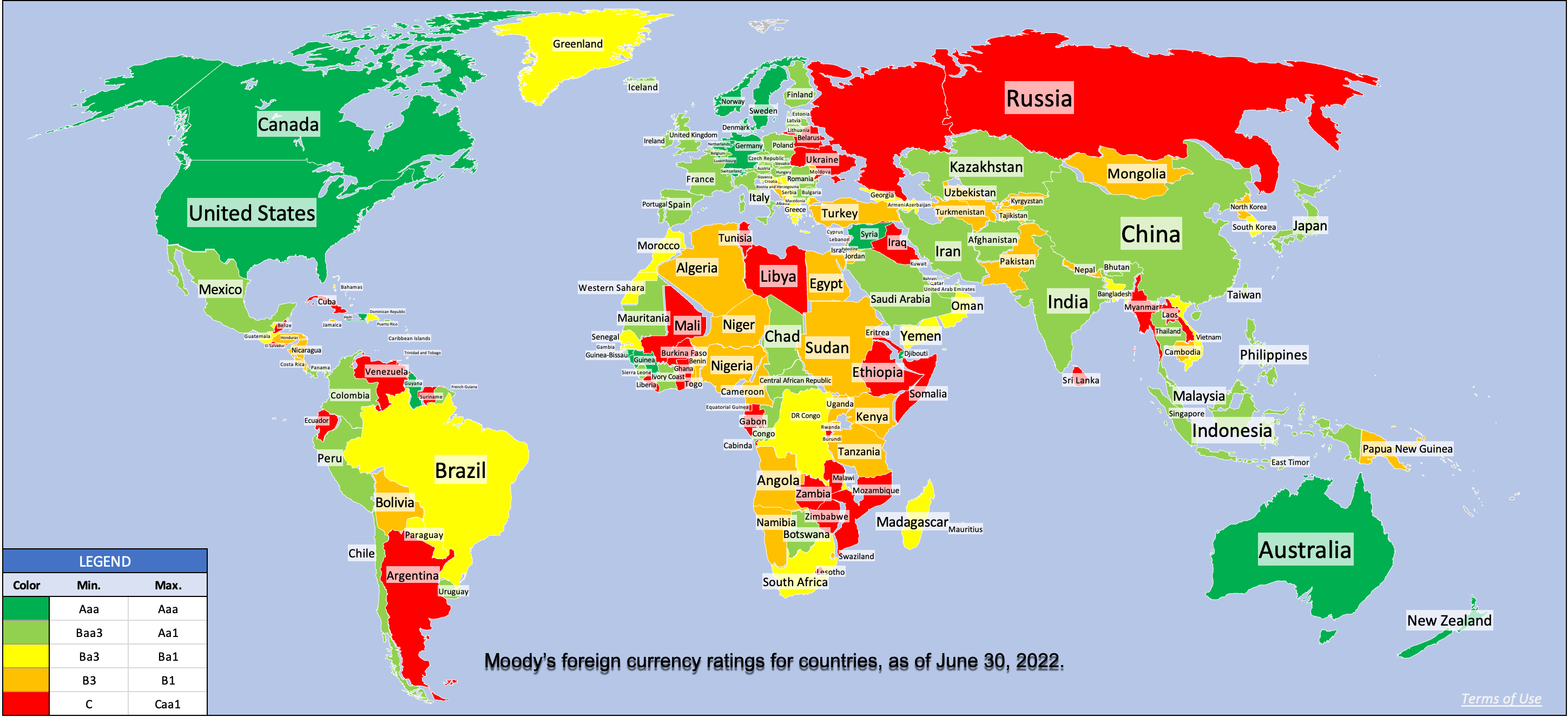
To measure sovereign default risk, ratings agencies (S&P, Moody’s, Fitch) estimate sovereign ratings for countries, designed to capture risk exposure in both local and foreign currency borrowing. The picture below reports on Moody’s ratings, as of June 30, 2022:
Note that this picture has been updated to incorporate Russia’s rating reassessment (downgraded to Ca in early April, before the rating was entirely withdrawn). I know that there are some of you, who distrust ratings agencies, arguing that they have regional and other biases and/or that they do not adjust ratings in a timely fashion. If you are in that group, the sovereign CDS market offers market-based and real-time measures of sovereign default risk, although for only 80 countries, and the map below reports the sovereign CDS spreads, as of June 30, 2022:
Source: Bloomberg
Comparing the sovereign CDS spread picture to the sovereign ratings picture, you can see the overlaps, with the ratings agencies and CDS market mostly in agreement.
Country Risk: Equity Risk
For equity investors, the price of risk is captured by the equity risk premium, and equity risk premiums will vary across countries. I use a template that starts with the implied equity risk premium that I compute for the S&P 500 and then adds on a country risk premium that is computed based upon the sovereign default spread (either from the CDS market or based upon a sovereign rating), to get equity risk premiums for countries:
The equity risk premiums that result from this assessment are shown in the picture below, with a very rough attempt to break down countries geographically. (Please do not attach any political significance to my country groupings, or take them personally. I mean no disrespect to any country, and if you feel your country has been mis-grouped, I apologize.):
If you compare the numbers in this picture to the equivalent one that I reported at the start of the year, you can see the surge in risk premiums across the board, starting with a higher base premium (6.01%, up from 4.24%) for the US and higher spreads for country risk. Looking at individual countries, the graph below summarizes the countries that saw the biggest increases in equity risk premiums (on a percentage basis) over the six months (from Jan 1, 2022 - June 30, 2022):
Not surprisingly, Russia and Ukraine make the list, with Russia's equity risk premium almost tripling and Ukraine's doubling over the period, but you can see the spillover effects into Belarus and Kyrgyzstan. There are three African countries that make the list (Namibia, Mali and Ghana), largely because of ratings downgrades, Sri Lanka's downgrade reflects the implosion of its political system and El Salvador's experiments with Bitcoin are not going well.
Country Risk: Currency and Cost of Capital
As a final part to this post, to see the shifts in country risk that we have seen in 2022, let’s start with an assessment of risk free rates. In my last post, I noted that concerns about inflation have played a big role in pushing up the US ten-year treasury bond rate from 1.51% on Jan 1, 2022, to 3.02% on June 30, 2022. That increase in interest rates is not restricted to the US dollar, as local currency government bond rates have risen around the world. In the graph below, I use these government bond rates as a starting point to estimate riskfree rates in multiple currencies, with adjustments for default risk in governments, using the sovereign default spreads from the last section:
The biggest reason for differences in risk free rates across currencies is differences in expected inflation, with higher inflation currencies exhibiting higher riskfree rates. That said, the key to dealing with currency appropriately in valuation is to stay consistent, with cash flows and the discount rates incorporating the same expectations of inflation:
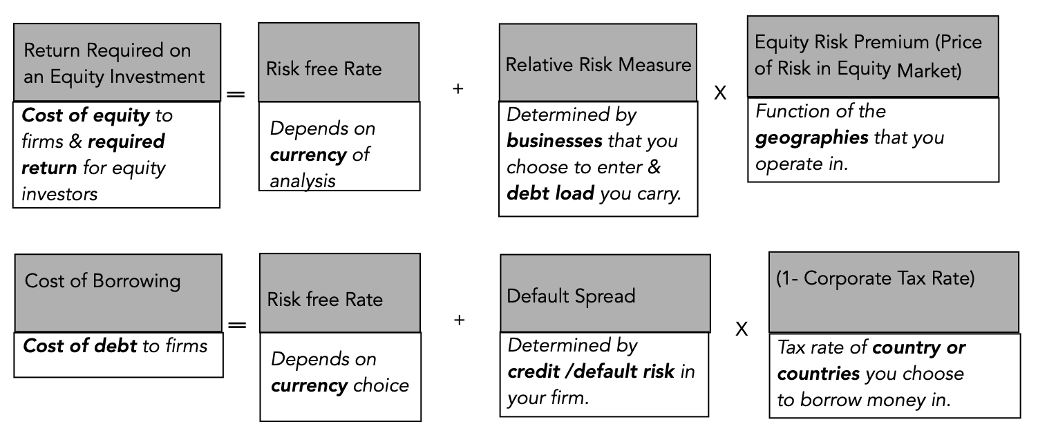
In short, changing the currency that you use to value a company should not fundamentally change your assessment of that company’s value, and the reason that it often does in practice is because analysts are often sloppy in their treatment of currency, mixing growth rates in one currency with discount rates in another, and real with nominal numbers. As a general principle, to prevent double or miscounting inflation effects and risk, each input into discount rates carries a specific component, with the riskfree rate being the conveyor of expected inflation, the relative risk measure (beta for equity, bond rating for debt) measuring the business and leverage risk of the company and the equity risk premium/default spread reflecting the price of risk in markets.
The combination of rising risk free rates (not just in US dollars, but also in other currencies) and surging risk premiums (default spreads and equity risk premiums) is pushing up corporate costs of capital. In the figure below, I graph the costs of capital for US and global firms, in US$ terms, on July 1, 2022:
In January 2022, I had posted a similar histogram of costs of capital for global and US companies, reflecting risk free rates and risk premiums then, and the change, over the six months, has been extraordinary, with the median cost of capital for a US firm increasing from 5.77% to 8.97%, and for a global firm, from 6.37% to 9.70%. As I look across the many posts I have had this year on how inflation is changing market pricing and psychology, I find myself drawing on one of my favorite Bob Dylan lyrics, "the times, they are a'changin'". The biggest risk that we face, as we navigate our way through uncharted territory, is inertia, where we continue to do the things that have worked for the last decade, when we need to adapt and change.
As inflation has taken center stage, markets have gone into retreat globally, and across asset classes. In 2022, as bond rates have risen, stock prices have fallen, and crypto has imploded, even true believers are questioning what the bottom for markets might be, and when we will get there. While it is easy to call the market movement in 2022 a correction and to argue that it is overdue, it is facile, and it fails to address the question of why it is happening now, and whether the correction is overdone or has more to go. In this post, I will argue that almost everything that we are observing in markets, across asset classes, can be explained by a pull back on risk capital, and that understanding the magnitude of the pull back, and putting in historical perspective, is key to gauging what is coming next.
Risk Capital: What is it?
To put risk capital in perspective, it is best to start with a definition of risk that is comprehensive and all-inclusive, and that is to think of risk as a combination of danger (downside) and opportunity (upside) and to consider how investments vary in terms of exposure to both. In every asset class, there is a range of investment choices, with some being safer (or even guaranteed) and others being riskier.
Risk capital is the portion of capital that is invested in the riskiest segments of each market and safety capital is that portion that finds its way to the safest segments in each market.
While risk and safety capital approach the market from opposite ends in the risk spectrum, one (safety capital) being driven by fear and the other (risk capital), by greed, they need to not only co-exist, but be in balance, for the market to be healthy. When to two are not in balance, these imbalances can have profound and often unhealthy effects not just of markets, but also on the overall economy. At the extremes, when risk capital is absent and everyone seeks safety, the economy and markets will atrophy, as businesses and investors will stay away from risky ventures, and when risk capital is too easy and accessible, risky asset prices will soar, and the economy will see too much growth in its riskiest segments, often at the expense of more stable (and still necessary) businesses.
Risk Capital's Ebbs and Flows
It is a common misconception that the risk-takers supply risk capital (risk takers) and that the investors who invest for safety draw from different investor pools, and that these pools remain unchanged over time. While investor risk aversion clearly does play a role in whether investors are drawn to invest in risk or safety capital, it obscures two realities:
Variation within an investor's portfolio: Many investors, including even the most risk averse, may and often do set aside a portion of their portfolios for riskier investments, drawn by the higher expected returns on those investments. For some investors, this set aside will be the portion that they can afford to lose, without affecting their life styles in any material way. For others, it can be the portion of their capital with the longest time horizon (pension fund savings or 401Ks, if you are a young investor, for example), where they believe that any losses on risk capital can be made up over time. For still others, it is that segment of their portfolios that they treat las long shot gambles, hoping for a disproportionately large payoff, if they are lucky. The amount that is put into the risk capital portion will vary with investor risk aversion, with more risk averse investors putting less or even nothing into the riskiest assets, and less risk averse investors putting in more.
Variation across time: The amount that investors are willing to put into risk capital, or conversely redirect to safety capital, will change over time, with several factors playing a role in determining whether risk capital will be plentiful or scarce. The first is market momentum, since more money will be put into the riskiest asset classes, when markets are rising, because investors who benefit from these rising markets will have more capital that they are willing to risk. The second is the the health and stability of the economy, since investors with secure jobs and rising paychecks are more willing to take risks.
There are two macro factors that will come into play, and both are in play in markets today. The first is the return that can be earned on guaranteed investments, i.e., US treasury bills and bonds, for instance, if you are a investor in US dollar, since it is a measure of what someone who takes no or very low risk can expect to earn. When treasury rates are low or close to zero, refusing to take risk will result in returns that are very low or close to zero as well, thus inducing investors to expose themselves to more risk than they would have taken in higher interest rate regimes. The second is inflation, which reduces the nominal return you make on all your investments, and the effects of rising inflation on risk capital are complex. As expected inflation rises, you are likely to see higher interest rates, and as we noted above, that may induce investors to cut back on risk taking and focus on earning enough to cover the ravages of inflation. As uncertainty about inflation rises, you will see reallocation of investment across asset classes, with real assets gaining when unexpected inflation is positive (actual inflation is higher than expected), and financial assets benefiting when unexpected inflation is negative (actual inflation is less than expected).
And Consequences
If you are wondering why you should care about risk capital's ebbs and flows, it is because you will feel its effects in almost everything you do in investing and business.
Risk Premiums: The risk premiums that you observe in every risky asset market are a function of how much risk capital there is in play, with risk premiums going up when risk capital becomes scarcer and down, when risk capital is more plentiful. In the bond and loan market, access to risk capital will determine default spreads on bonds, with lower rated bonds feeling the pain more intensely when risk capital is withdrawn or moves to the side lines. Not only will default spreads widen more for lower-rated bonds, but there will be less bond issuances by riskier companies. In the equity market, the equity risk premium is the price of risk, and its movements will track shifts in risk capital, increasing as risk capital becomes scarcer.
Price and Value Gaps: As those of you who read this blog know well, I draw a contrast between value and price, with the former driven by fundamentals (cash flows, growth and risk) and the latter by mood, momentum and liquidity. The value and price processes can yield different numbers for the same company, and the two numbers can diverge for long periods, with convergence not guaranteed but likely over long periods.
I argue that investors play the value game, buying investments when the price is less than the value and hoping for convergence, and that traders play the pricing game, buying and selling on market momentum, rather than fundamentals. At the risk of generalizing, safety capital, with its focus on earnings and cash flows now, is more likely to focus on fundamentals, and play the investor game, whereas risk capital, drawn by the need to make high returns quickly, is more likely to play the trading game. Thus, when risk capital is plentiful, you are more likely to see the pricing game overwhelm the value game, with prices often rising well above value, and more so for the riskiest segments of every asset class. A pull back in risk capital is often the catalyst for corrections, where price not only converges back on value, but often overshoots in the other direction (creating under valuations). It behooves both investors and traders to therefore track movements in risk capital, since it is will determine when long term bets on value will pay off for the former, and the timing of entry into and exit from markets for the latter.
Corporate Life Cycle: The ebbs and flows of risk capital have consequences for all businesses, but the effects will vary widely across companies, depending on where they are in the life cycle. Using another one of my favorite structures, the corporate life cycle, you can see the consequences of expanding and shrinking risk capital, through the lens of free cash flows (and how they vary across the life cycle).
Early in the corporate life cycle, young companies have negative free cash flows, driven by losses on operations and investments for future growth, making them dependent on risk capital for survival and growth. As companies mature, their cash flows first become self sustaining first, as operating cash flows cover investments, and then turn large and positive, making them not only less dependent on risk capital for survival but also more valued in an environment where safety capital is dominant. Put simply, as risk capital becomes scarcer, young companies, especially those that are money-losing and with negative cash flows, will see bigger pricing markdowns and more failures than more mature companies.
Risk Capital: Historical Perspective
How do you track the availability and access to risk capital over time? There are three proxies that I will use, and while each has its limitations, read together, they can provide a fuller measure of the ebbs and flows of risk capital. The first is funds invested by venture capitalists, with a breakdown further into types, from pre-seed and seed financing to very young companies to capital provided to more young companies with more established business models, as a prelude to exit (acquisition or IPO). The second is the trend line in initial public offerings (number and value raised), since companies are more likely to go public and be able to raise more capital in issue proceeds, when risk capital is plentiful. The third is original bond issuances by the riskiest companies (below investment grade and high yield), since these issuances are more likely to have a friendly reception when risk capital is easily available than when it is not.
Let’s start with venture capital, the typical source of capital for start ups and young companies for decades in the United States, and more recently, in the rest of the world. In the graph below, I trace out total venture capital raised, by year, between 1995 and 2021, in the US:
Source: NVCA Yearbooks
The dot-com boom in the 1990s created a surge in venture capital raised and invested, with venture capital raised peaking at more than $100 billion in 2000, before collapsing as the that bubble burst. The 2008 banking and market crisis caused a drop of almost 50% in 2009, and it took the market almost five years to return to pre-crisis levels. In the just-concluded decade, from 2011 to 2020, the amount raised and invested by venture capitalists has soared, and almost doubled again in 2021, from 2020 levels, with venture capital raised in 2021 reaching an all-time high of $131 billion, surpassing the 2000 dot-com boom levels, albeit in nominal terms. Along the way, exits from past venture capital investments, either in IPOs or in M&A, have become more lucrative for the most successful companies, with 43 exits that exceeded a billion (the unicorn status) in 2021.
If success in venture capital comes from exiting investments at a higher pricing, initial public offerings represent the most lucrative route, and tracking the number of initial public offerings over time provides a window on the ebbs and flows of risk capital, over long periods. Using data made public by Jay Ritter on IPOs, I track the number of IPO and dollar proceeds from offerings in the graph below from 1980 to 2021:
Source: Jay Ritter
As you can see, IPOs go through hot periods (when issuances surge) and cold ones (when there are relatively few listed), with much of the last decade representing hot periods and 2000/01 and 2008/09 representing periods when there were hardly any offerings. While the number of IPOs in 2021 is still below the peak dot-com years, the proceeds from IPOs has surged to an all-time high during the year.
In the final graph, I look at corporate bond offerings, broken down into investment grade and high yield, by year, from 1996 to 2021:
Source: SIFMA
Here again, you see a familiar pattern, with the percentage of high-yield bond issuances tracking the availability of risk capital. As with IPOs, you see big dips in 2000-01and 2008-09, reflecting market corrections and crises, and a period of easy access to risk capital in the last decade. Again, the percentage of corporate bond issuances hit an all-time high in 2021, representing more than a quarter of all bond issuances. In sum, all three proxies for risk capital show the same patterns over time, pulling back and surging during the same time periods, and with all three proxies, it is clear that 2021 was a boom year.
An Update
The last two and a half years may not represent much time on a historical scale, but the period has packed in enough surprises to make it feel like we have aged a decade. We started 2020 with a pandemic that altered our personal, work and financial lives, and in 2022, at least in North America and Europe, we have seen inflation reach levels that we have not seen for decades. Looking at the 30 months through the lens of risk capital can help us understand not only the journey that markets have gone through to get where they are today, but also perhaps decipher where they may go next. In the graph below, I look at venture capital, IPOs and high yield bond issuances over the last two and a half years:
The first thing to note is that there was a pullback on all three measures in the first quarter of 2020, as COVID put economies into deep freeze and rolled markets. The big story, related to COVID, is that risk capital not only did not stay on the side lines for long but came surging back to levels that exceeded pre-COVID numbers, with all three measures hitting all-time highs in 2021. In a post in late 2020, I argued that it was the resilience of risk capital that explained why markets recovered so quickly that year, even as the global economy struggled, that year, and pointed to three explanatory factors. The first was the perception that the COVID shut-down was temporary, and that economies would come back quickly, once the immediate threat from the virus passed. The second was the decline in interest rates across the globe, with rates in developed market currencies (US $, Euro, Japanese Yen etc.) moving towards zero, increasing the costs of staying on the sidelines. The third was a change in investor composition, with a shift from institutional to individual investor market leadership, and increased globalization.
The first half of 2022 has been a trying period for markets, and as inflation has risen, it is having an effect on the availability of and access to risk capital. There has been a pullback in all three proxies for risk capital, albeit smaller in venture capital, than in IPOs and in high-yield bond issuances in the first few months of 2022. That pullback has had its consequences, with equity risk premiums rising around the world. In the graph below, I have updated the equity risk premium for the S&P 500 through the start of July 2022:
The chart reveals how unsettling this year has been for equity investors, in the United States. Not only has the implied ERP surged to 6.01% on June 23, 2022, from 4.24% on January 1, 2022, but stocks are now being priced to earn 9.03% annually, up from the 5.75% at the start of the year. (The jump in ERP may be over stated, since the forward earnings estimates for the index, from analysts, does not seem to be showing any upcoming pain from an expected recession. )
As inflation and recession fears have mounted, equity markets are down significantly around the world, but the drop in pricing has been greatest in the riskiest segments of the market. In the table below, I look at the price change in the first six months of 2022 for global stocks, broken down by quintiles, into net profit margin and revenue growth classes:
Source for raw data: S&P Cap IQ
Note that high growth, negative earnings companies have fared much worse, in general, during the 2022 downturn, than more mature, money-making companies. The fear factor that is tilting the balance back to safety capital from risk capital has also had clear consequences in the speculative collectibles space, with cryptos bearing the brunt of the punishment. Finally, there are markdowns coming to private company holdings, both in the hands of venture capitalists, and public market investors (including mutual funds that have been drawn into this space and public companies like Softbank).
The big question that we all face, as we look towards the second half of the year, is whether the pullback in risk capital is temporary, as it was in 2020, or whether it is more long term, as it was after the dot-com bust in 2000 and the market crisis in 2008. If it is the former, there is hope of not just a recovery, but a strong rebound in risky asset prices, and if it is the latter, stocks may stabilize, but the riskiest assets will see depressed prices for much longer. I don't have a crystal ball or any special macro forecasting abilities, but if I had to guess, it would be that it is the latter. Unlike a virus, where a vaccine may provide at least the semblance of a quick cure (real or imagined), inflation, once unleashed, has no quick fix. Moreover, now that inflation has reared its head, neither central banks nor governments can provide the boosts that they were able to in 2020 and may even have to take actions that make things worse, rather than better, for risk capital. Finally, at the risk of sounding callous, I do think that a return of fear and a longer term pullback in risk capital is healthy for markets and the economy, since risk capital providers, spoiled by a decade or more of easy returns, have become lazy and sloppy in their pricing and trading decisions, and have, in the process, skewed capital allocation in the economy. If a long-term slowdown is in the cards, it is almost certain that the investment strategies that delivered high returns in the last decade will no longer work in this new environment, and that old lessons, dismissed as outdated just a few years go, may need to be relearned.
In my last post, I discussed how inflation's return has changed the calculus for investors, looking at how inflation affects returns on different asset classes, and tracing out the consequences for equity values, in the aggregate. In general, higher and more volatile inflation has negative effects on all financial assets, from stocks to corporate bonds to treasury bonds, and neutral to positive effects on gold, collectibles and real assets. That said, the impact of inflation on individual company values can vary widely, with a few companies benefiting, some affected only lightly, and other companies being affected more adversely, by higher than expected inflation. In an environment where finding inflation hedges has become the first priority for most investors, the search is on for companies that are less exposed to high and rising inflation. The conventional wisdom, based largely on investor experiences from the 1970s, is that commodity companies and firms with pricing power are the best ones to hold, if you fear inflation, but is that true, and even if it is true, why is it so? To answer these questions, I will return to basics and try to trace the effects of inflation on the drivers of value, with the intent of finding the characteristics of stocks with better inflation-hedging properties.
Inflation and Value
When in doubt about how any action or information plays out in value, I find it useful to go back to value basics, and trace out the effects of that action/information on value drivers. Following that rule book, I looked at the effects of inflation on the levers that determines value, in the graph below:
Put simply, the effects of inflation on firm value boil down to the impact inflation has on expected cash flows/growth and risk. At the risk of restating what is already in the graph above, the factors that will play out in determining the end impact on inflation on value are in the table below:
If you were seeking out a company that would operate as an inflation hedge, you would want it to have pricing power on the products and services that it sells, with low input costs, and operating in a business where investments are short term and reversible. On the risk front, you would like the company to have a large and stable earnings stream and a light debt load.
Looking Back
There are lessons that can be learned by looking at the past, about how inflation affects different groupings of companies, though there is the danger of over extrapolation. In this section, I look first at how classes of stocks have done over the decades, and relating that performance to inflation (expected and unexpected). I then examine how equities have performed in the less than five months of 2022, where inflation has returned to the front pages.
Historical Data: 1930-2019
To see how this framework works in practice, let's start by looking at the performance of US stocks, across the decades, and look at the returns on stocks, broadly categorized based on market capitalization and price to book ratios. The former is short hand for the small cap premium and the latter is the proxy for the value factor in returns.
The distinction that I made between expected and unexpected inflation comes into play in this table. It is unexpected inflation that seems to have a large impact on the behavior of small cap stocks, outperforming in decades where inflation was higher than expected (1940-49, 196069, 1970-79) and underperforming in decades with lower than expected inflation (1990-99, 2010-19). The value effect, measured as the difference between low price to book and high price to book stocks was highest in the 1970s, when both actual and unexpected inflation were high, but remained resilient in the 1980s, when inflation stayed high, but came in under expectations.
The 2022 Experience
As the focus has shifted back to inflation in the last five months, it is worth looking at performance across US stocks, broken down by different categorizations, to see whether the patterns of the past are showing up in today's markets.. For starters, let's look at the how the damage done by inflation on stocks varies across sectors, looking at the 2022 broken down in three slices, the returns in the first quarter of 2022 (when Russia competed with inflation for market attention), the period from April 1 - May 19, 2022 (when inflation was the dominant story) and the entire year to date.
In 2022, the collective market capitalization of all US firms has dropped by 19.75%, with the bulk of the drop occurring after April 1, 2022. During the period (April 1- May 19, 2022), the three worst performing sectors (highlighted) were technology, consumer discretionary and communication services, and the best performing sectors were energy (no surprise, given the rise in oil prices) and utilities, old standbys for investors during tumultuous periods.
To check to see if the outperformance of small cap and low price to book ratios that we saw in the 1970s is being replicated in 2022, I broke companies down by decile (based on market cap and price to book at the start of 2022), and looked at changes in aggregate value in 2022:
As in the 1970s, the small cap premium seems to have returned with a vengeance, as small cap stocks have outperformed large caps in 2022, and the lowest price to book stocks have done less badly than high price to book stocks. To examine the interaction and stock price performance in 2022, I looked at the aggregate returns on firms classified into deciles based upon both equity risk (betas) and default risk (with bond ratings):
The link between equity risk and stock returns support the hypothesis that firms that are riskier are more affected by inflation, with one exception: the stocks with the lowest betas have also done badly in 2022. On bond ratings, there is no discernible link between ratings and returns, until you get to the lowest rated bonds (CCC & below). In a final assessment, I break down companies based upon operating cash flows (EBITDA as a percent of enterprise value) and dividend yield (dividends as a percent of market capitalization).
Companies that generate more cash flows from their operations and return more of that cash flow in dividends to stockholders have clearly held their value better than companies with low or negative cash flows that pay no dividends, in 2022. Looking at these results, value investors will undoubtedly find vindication for their beliefs that this is a correction long over due, i.e., a return to normalcy where safe stocks in boring sectors that pay high dividends deliver excess returns. I do think that given how consistently growth stocks have been beating value stocks for the last decade, a correction was in order, but I believe it is way too early to proclaim the return of old fashioned value investing.
Bottom Line
This has been a painful year for investors in US equities, but the pain has not been evenly spread across investors. Portfolios that are over weighted in risky, money losing companies have been hurt more than portfolios that are more weighted towards companies with less debt and more positive cash flows. Even within some of the worst performing sectors, such as technology, breaking companies down, based upon earnings and cash flows, there is a clear advantage to holding money making, older tech companies than money losing, young tech companies:
The question of whether these trends will continue to apply for the rest of the year cannot be answered without taking a stand on inflation, and the effects that fighting it will create for the economy.
If you believe that there is more surprises to come on the inflation front, and that a recession is not only imminent, but likely to be steep, the returns in the first five months of 2022 will be a precursor to more of the same, for the rest of the year.
If you believe that markets have mostly or fully adjusted to higher inflation, betting on a continuation of the small cap and value outperformance to continue is dangerous.
To the extent that there may be other countries where inflation is not the clear and present danger that it is in the United States, investing in equities in those countries will offer better risk and return tradeoffs.
As I noted in my last post, once the inflation genie is out of the bottle, it tends to drive every other topic out of market conversations, and become the driving force for everything from asset allocation to stock selection.
The nature of markets is that they are never quite settled, as investors recalibrate expectations constantly and reset prices. In most time periods, those recalibrations and resets tend to be small and in both directions, resulting in the ups and downs that pass for normal volatility. Clearly, we are not in one of those time periods, as markets approach bipolar territory, with big moves up and down. The good news is that the culprit behind the volatility is easy to identify, and it is inflation, but the bad news is that inflation remains the most unpredictable of all macroeconomic factors to factor into stock prices and value. In this post, I will look at where we stand on inflation expectations, and the different paths we can end up on, ranging from potentially catastrophic to mostly benign.
Inflation: The Full Story
I wrote my first post on this blog in 2008, and inflation merited barely a mention until 2020, though it is an integral component of investing and valuation. Since 2020, though, inflation has become a key story line in almost every post that I write about the overall market, and I have had multiple posts just on the topic. To see why inflation has become so newsworthy, take a look at the chart below, where I graph inflation from 1950 to 2022, in the United States:
While I report multiple measures of inflation, from the consumer price index (adjusted and unadjusted) to the producer price index, to the price deflator used in the GDP, they all tell the same story. We have had a long stretch of low and stable inflation, and that is especially true since the 2008 crisis. In fact, the average inflation rate in the 2011-20 decade was the lowest of the seven decades that I cover in this chart. Just as important, though, is the fact that variation in inflation, from year to year, was lower in 2011-2020 in every other decade, other than 1991-2000. It reinforces a point I made in my inflation post last year, where I argued that to understand inflation's impact on asset values, you have to break it down into its expected and unexpected components, with the former showing up in the expected returns you demand on investments, and the latter playing out as a risk factor.
Investors who are old enough to remember the 1970s point to it as a decade of high inflation, but that is only with the benefit of hindsight. At the start of that decade, investors had no reason to believe that they were heading into a decade of higher inflation, and initial signs of price increases were attributed to temporary factors (with OPEC being a convenient target). In fact, expected inflation lagged actual inflation through much of the decade, and the damage done to financial asset returns that decade came as much from actual inflation being higher than expected inflation, period after period, as from higher inflation.
It is precisely because we have been spoiled by a decade of low and stable inflation that the inflation numbers in 2021 and 2022 came as such a surprise to economists, investors and even the Fed. Early on, the inflation surge was explained away by the reopening of the economy, after the COVID shutdown, and then by stressed supply chains, and expectations about future inflation stayed low. However, as reported inflation has remained stubbornly high, and neither COVID nor supply chains provided sufficient rationale, market expectations of inflation have started to go up. I capture this shift using two measures of expected inflation, the first coming from the University of Michigan's surveys of consumer expectations of inflation for the future and the latter from the US Treasury market, as the difference between the ten-year treasury bond and the ten-year inflation-protected treasury bond (TIPs) rates:
Consumer expectations of inflation reached 5.40% in March 2022, hitting levels not seen since the early 1980s. While the market-implied expected inflation rate has also climbed to a ten-year high of 2.85%, it is clearly lower than the consumer survey expectation. There are three possible explanations for the divergence:
Short term versus Long term: The consumer survey extracts an expectation of inflation in the near term, whereas the treasury markets are providing a longer term perspective, since I am using ten-year rates to derive the market-implied inflation.
Consumers are over adjusting: The big inflation surges have happened in gasoline, food and housing, all items that consumers use on a continuous basis, and it is possible that they are over reacting and adjusting expected inflation up too much, as a consequence.
Markets are under adjusting: Alternatively, it is possible that it is consumers who are being realistic, and it is that the bond markets which are under adjusting to higher inflation, partly because many investors have operated only in a low and steady inflation environment, and partly because some of these investors have a belief that the Fed has super powers when it comes to setting interest rates and determining inflation.
I have always argued that the notion of the Fed as this all-powerful entity that sets rates, determines economic growth and keeps inflation in check is a myth, and a very dangerous one at that, since it gives license to policy makers and investors to behave rashly, expecting a safety net to protect them from their mistakes.
Economic Consequences
As inflation, actual and expected, has made a return, it is not surprising that the ripple effects are being felt across the economy, with the ripples sometimes resembling tidal waves. The most direct effects have been on interest rates, where we have seen rates rise quickly, and to levels not seen in years. In the chart below, I look at how the treasury curve has shifted in the recent periods:
To provide a sense of how much rates have changed just in 2022, compare the yield curve on January 1, 2022 to the one on May 5, 2022. On January 1, 2022, the yields on the very short end of the maturity spectrum (1-6 month treasuries) were close to zero, the ten-year treasury bond rate was 1.51% and the long end of the yield curve had an upward slope. On May 5, 2022, the treasury yields for the short end had risen, with the 1-month rate reach 0.50%, the ten-year treasury bond rate had breached 3% and the term structure had leveled out for the long end of the spectrum (with the 2-year yield moving towards the 10-year yield, which in turn was close to the 20-year and 30-year yields). Of course, the "Fed did it" crowd will argue that this is all Jerome Powell's doing, an indication of how little they understand about both what rates the Fed does control (the Fed Funds rate is at the very shortest end of the spectrum, and it is not a trading rate) and how willing they are to ignore the data. If you were to graph out when the Fed woke up from its inflation-denial and when treasury rates started rising, it seems clear that it was the treasury market that is causing the Fed to act, rather than the other way around.
As treasury rates have risen, markets also seem to have been more wary about risk, and how it is being priced. In the chart below, I start with the default spreads in the corporate bond market and you can see the increase in spreads that have occurred just over the course of 2022:
Default spreads have risen across every ratings class, but more so for lowly-rated bonds than for bonds with higher ratings. Here again, there are some who would attribute this to the Russia-Ukraine conflict, but that would miss the fact that bulk of the surge in spreads happened before February 23, 2022, when the conflict started. In the equity market, I capture the price of risk with a forward-looking estimate of expected returns on stocks, computed from the level of stock prices and expected future cash flows, and I graph both the expected return and the implied equity risk premium (from netting out the risk free rate) in the graph below:
In equity markets, the shift in expected returns has been significant, perhaps even dramatic, as the expected return on stocks, which started 2022 at 5.75%, has moved above 8% for the first time since May 2019, with some of that shift coming from a higher treasury bond rate (1.51% to 2.89%) and some of it coming from a higher equity risk premium (4.24% to 5.14%).
As the inflation bogeyman returns, the worries of what may need to happen to the economy to bring inflation back under control have also mounted. Almost every economic forecasting service has increased its assessed probability for a recession, with variations on depth and length. In a note published in mid-April, Larry Summers and Alex Domash go as far as to put the likelihood of a recession at 100%, based upon a joint indicator, i.e., that a combination of inflation > 5% and unemployment<4% has always led to a recession within 12 to 24 months, using quarterly data from the 1950s to today. While I remain a skeptic about historic rules of thumb (downward sloping yield curve, for example) to make predictive statements about future economic growth, I think that we can state categorically that there is a greater chance of an economic slowdown now than just a few weeks ago.
Investment Consequences
As the storm clouds of higher inflation and interest rates, in conjunction with slower or even negative economic growth, gather, it should come as no surprise that equity markets are struggling to find their footing. At the close of trading on May 5, 2022, the S&P 500 stood at 4147, down 13.3% from the start of the year value, accompanied by increased volatility. To the question of whether to sell, hold on or buy in the face of weakness, the answer will depend on your macro assessments of the following:
Steady State Interest Rate: As noted in the last section, the ten-year bond rate has doubled this year, an uncommonly large move for US treasuries, and there are three possibilities for the future. The first is that the bulk of the move in rates is behind us, and that treasury rates now reflect updated expectations of inflation. The second is that, like the 1970s, we will play catch up with inflation, and that rates will continue to move up, until expectations on inflation become more realistic. The third is that inflation is either transient, and will revert back to the lows we saw last decade, or that the economy will go into a recession and act as a natural break on inflation and interest rates. Note that in all three cases, it is not the Fed that is driving rates, but what is happening to inflation.
Equity Risk Premium Path: The equity risk premium of 5.24%, estimated at the start of May 2022, is at the high end of historical equity risk premiums, but we have seen higher premiums, either in crises (end of 2008, first quarter of 2020) or when inflation has been high (the late 1970s). I think that what happens to equity risk premiums for the rest of the year will largely depend on inflation numbers, with high and volatile inflation continuing to push up the premium, and steadying and dropping inflation having the opposite effect.
Earnings Estimates: The strength of the economy has been a big contributor to boosting actual and expected earnings on companies in the last two years, and these higher earnings have translated into more cash returned in dividends and buybacks. The earnings estimates for the S&P 500 companies from analysts, at the start of May 2022, reflect that strength and there seems to have been no adjustment downwards for a recession possibility. That may either reflect the fact that equity analysts are not among those who expect a recession (or expect only a very mild one, with little impact on earnings) or the possibility that there may be a lag in the process between the economy weakening and analysts adjusting expected earnings.
To see how these three forces play out, consider what I would term the status quo scenario, where you assume that today's treasury bond rate (3%) is the steady state, that earnings estimates will largely be delivered and that the equity risk premium will stabilize around current levels:
The intrinsic value that you get for the index (4181) is almost spot on to the actual value, and that should not come as a surprise, since it reflects the consensus view on rates, earnings and risk premiums. However, there are wide divergences from the consensus on all three inputs and in the table below, I estimate the index values under these divergent viewpoints:
As you can see, the range of values is immense and they include scenarios ranging from the upbeat to the catastrophic. At one end of the spectrum, in the most benign scenario, which I will title Much Ado about Nothing, inflation turns out to be transient, fears of economic collapse are overstated and the equity risk premium reverts back towards historic norms, and the market looks under valued, perhaps even significantly so. At the other end, in perhaps the most malignant scenario, titled The Seventies Show, inflation continues to rise, even as the economy goes into recession and risk premiums spike, leading to a further correction of close to 50% in the market. In the middle, the Volcker rerun, Jerome Powell discovers his inner central banking self, cracks down on inflation and wins, but does so by pushing the company into a deep recession, making himself extremely unpopular with politicians up for election and the unemployed. There is a fourth possibility, where you Live and let live (with inflation), where we (as investors and consumers) accept a higher inflation world, with its costs and consequences, as the price to pay to keep the economy going.
One of the costs that come with the last scenario is that inflation eats away at trust in not just currencies, but in all financial assets, and that investors will turn away from stocks and bonds. In the 1970s, the asset classes that benefited the most from this flight were gold and real estate, and the question is which asset classes will best play this role now, if inflation is here to stay. I do think that securitizing real estate has made it behave more like financial assets, and removed some of its power to hedge against inflation, but there may be segments (such as rental properties, where rent can be raised to match inflation) that retain their inflation fighting magic. Gold's history as a collectible gives it staying power, but the truth is that it is not big enough or productive enough as an investment class for us to all hold it. That, of course, brings us to cryptos, NFTs and other, more recent, entrants into the investment choice list. In theory, you could make the argument that these new investment choices will operate like gold, but you have two serious barriers to overcome. The first is that they have not been around for long, and that history is full of collectibles, from tulip bulbs to Beanie Babies to Pokemon cards, that people paid high prices for, but failed to hold their value. The second is that in the limited history that we have for cryptos and NFTs, they have behaved less like collectibles (holding or increasing in value, as stocks and bonds collapse) and more like very risky equities, going up when stocks go up, and dropping when stocks go down. In fact, higher and sustained inflation may be the acid test of whether there is any substance to the bitcoin as millennial gold story, and the results will make or break those holding cryptos for the financial apocalypse that they see coming.
In Conclusion
The inflation genie is out of the bottle, and if history is any guide, getting it back in is going to take time and create significant pain. It is the lesson that the US learned in the 1970s, and that other countries have learned or chosen to not learn from their own encounters with inflation. It is the reason that when inflation made itself visible in the early part of 2021, I argued that the Fed should take it seriously, and respond quickly, even if there existed the possibility that it was transient. Needless to say, the Fed and the administration chose a different path, one that can be described as whistling past the graveyard, not just ignoring the danger with happy talk, but also actively taking decisions that only exacerbated the danger. Needless to say, they now find themselves between a rock (more inflation) and a hard place (a recession), and while you may be tempted to say "I told you so", the truth is that we will all feel the pain.