Showing posts with label Small Cap Premium. Show all posts

Sunday, March 15, 2026

The Price of Risk: An Equity Risk Premium Monologue!

   I start my valuation classes with a question of whether valuation is an art or a science, and I argue that it is neither; it does not have the precision that characterizes a science and unlike an art, it does come with principles that constrain you on what you can and cannot do. I describe valuation as a craft, where you learn as you value companies, and in the process, there are times where you question how it is practiced, and try to find ways to do it better. I have learned my share of lessons in the four decades that I have practiced valuation, and I have often abandoned standard practices, in the hope of developing better ones. There is no input in valuation where I have found myself questioning existing practices more than in estimating the price of risk in equity markets, i.e., the equity risk premium, and I have wrestled with ways of coming up with alternatives. That endeavor was pushed into high gear by the 2008 market crisis, when I started to pay more attention to how markets price risk, what causes that price of risk to change over time and the limitations in the ways that we estimate that price of risk in financial analysis.

Status Quo and Standard Practice
    Leading into 2008, I had long been skeptical about how we approached the estimation of equity risk premiums,  essential ingredients in hurdle rates in corporate finance and discount rates in valuation. It was (and still remains) standard practice to look at historical data, almost entirely from the US, on what stocks had earned over treasuries, and use that historical equity risk premium as the best estimate of the equity risk premium for the future, That approach would have yielded an equity risk premiums of between 5.5% to 14.5%, at the start of 2026, depending on the time period used, the way we compute averages and what we use as the riskfree rate.


These historical equity risk premiums are not only backward-looking and very noisy (see the standard errors), but they allow bias to easily creep in, through the choice of equity risk premiums, with bullish (bearish) analysts picking lower (higher) numbers.  Disconcertingly, they also move in the wrong direction, falling during crises (as historical returns get updates) and rising during good times.

A Forward-Looking Alternative
    To counter the problems that I saw with historical risk premiums, I started estimating forward-looking equity risk premiums, by essentially backing out from stock prices and expected cash flows, the expected return (internal rate of returns) that markets were pricing into stocks. 


That approach yields forward-looking equity risk premiums, and while there is estimation error in the expected earnings growth and payout numbers, it yields vastly more precise estimates that are also model-agnostic. Using this approach, the equity risk premium at the start of 2026 was 4.23% (over the US treasury bond rate):
Note that this estimation is model-agnostic, and is simply a measure of what markets are pricing in, given expected cash flows at the moment.

ERP Estimation during Crises
    Unlike historical equity risk premiums, these implied premiums are sensitive to market gauges of fear and greed, and change, as those change. In fact, I computed the ERP, by day, during the 2008 market crisis, and you can see the shifts during that 14-week period below:


Note that the crisis started with the equity risk premiums at 4.2% on September 12, 2008m but almost doubled over the next two months, as stocks went into free fall. To me, these implied equity risk premiums made far more intuitive sense, rising as market fears about banks and the economy rose.
    I have continued with the practice of estimating equity risk premiums, by day, during market crises (real or perceived). Here, for instance, is my assessment of the UK market in 2016 in the weeks leading up to the Brexit vote, the market reaction to COVID and the global economic shutdown in 2020, and how the tariffs roiled markets last year. In fact, as we wrestle with an war and oil price induced market shock in March 2026, I started my daily estimates for the ERP on March 1 and will report on how that price has changed over the last two weeks, in the next section.

Equity Risk Premiums - Lessons Learned
        The process of estimating implied equity risk premiums on a continuing basis is driven less by intellectual curiosity and more by my need for these numbers, when I value companies. That process has taught me three lessons about equity risk premiums, and I have responded by altering my practices.
    
1. The equity risk premium is a dynamic and shifting number, and a good estimate of the premium should reflect this volatility. Using an equity risk premium that is different from the implied equity risk premium makes every valuation a joint judgment on what you think about the company and what you think about the market. Put simply, sticking with a 4% equity risk premium during a crisis, when the implied risk premium has surged to 6% will lead you to find most companies to be undervalued, almost entirely because you think that the market is undervalued (not the company). In my view, a company valuation should be market-neutral, and the only way you can get there is by using a current implied equity premium.
My response: Rather than compute the implied equity risk premium at the start of every year, and using that premium over the course of the year, I shifted to computing the equity risk premium for the S&P 500 at the start of every month, in September 2008.  I report those numbers on my entry page to my website (damodaran.com) and use them to value companies during the course of the month. You can find these monthly equity risk premium estimates by going to this link
2. The implied equity risk premium is a consolidated metric for market pricing, and every debate or discussion about whether the market is under or over priced can be reframed as a debate about whether the implied equity risk premium is too low (over pricing), just right (fairly priced) or too high (under pricing). Since the implied ERP incorporates the level of interest rates, expected growth and cash payout, it is a more complete assessment of the market than looking at dividend yields and earnings yields (or variants of PE ratios), two widely used proxies for market pricing. In this post, I took an extended look at how these different measures of equity risk premiums measure up, in terms of predicting future equity returns.
My response: I have been open about my discomfort with timing markets, but when I am asked what I think of the overall market (Is it too high? Is it a bubble?), I first measure the current equity risk premium and then assess it against history. I used this technique to assess US equities at the start of this year in a post, with the accompanying graph: 

My conclusion, at the start of 2026, was that while stocks were richly priced using almost every conventional metric (high PE ratios, low dividend yields), the implied equity risk premium was in line with what US stocks have generated over the last 65 years. That said, I did note that 2025 was a tumultuous year, with tariffs making the news and the post-war dollar-centric global economic system starting to fray, and argued that the market seems to be too sanguine about catastrophic risk. Almost on cue, two weeks ago, bombs started falling in the Middle East, and US equities and bonds have been struggling to price in the effects of higher oil prices. In keeping with my practice of estimating equity risk daily, during troubled times, I did compute the implied ERP for the S&P 500 every day, during the last two weeks (Feb 27- March 13):

Oil is up to over a hundred dollars a barrel and the S&P 500 is down, but so far, the market is not behaving as if it is in crisis mode. The equity risk premium, which started March at 4.37% has risen, but only to 4.51%, over the two weeks. In fact, it is the ten-year US treasury bond that has had the bigger surge, up from 3.97% at close of trading, on February 27, to 4.28% at close of trading, on March 13, indicating inflation fears are trumping other market concerns right now. All of this could change next week or the week after, and I will continue to track the equity risk premiums, by day, until the market settles in.
3. The equity risk premium is an essential ingredient into almost every part of financial analysis, incorporated into hurdle rates in corporate finance, discount rates in valuation and in expected returns on equity in financial planning. Given this centrality, I was surprised how little attention it has received from both academics and practitioners, when I looked for references. There is very little usable academic research on equity risk premiums specifically, though there is a great deal on asset pricing and risk. As for practitioners, they have, for the most part, relied on historical risk premiums, and often obtain these premiums from services that summarize the historical data. When I took my first finance class, the historical risk premiums came from data from Ibbotson Associates, that contained annual return data on stocks, bonds and bills. That data was acquired by Duff and Phelps, where it became part of a voluminous book on cost of capital, but much of what that book had to say about equity risk premiums reflected slicing and dicing the historical data, hoping to get further insights, and for the most part failing, because of the noisiness in the data. The US historical data is now in the hands of Kroll, but there is little of value that be extracted by doing deeper and deeper mining expeditions on historical return data. In fact, if you are a fan of historical equity risk premiums (I am not, as you can guess), my suggestion would be to use the Credit Suisse Yearbook, which looks at historical equity risk premiums in 20 markets over more than a hundred years, and does not suffer from the selection bias of focusing on just US data.
My response: I am a practitioner and I decided, for my own understanding, to pull together everything I knew about equity risk premiums into a paper that I wrote in early 2009, and shared online that year. Practitioners seemed to find it useful, and I have updated that paper every year since, at the start of the year. It has grown over time, as I have sought to pull together new findings on equity risk premiums and incorporate changes in markets, and my seventeenth annual update is now ready. I have to confess that at this point, much of the change is data-driven, with tables and graphs updated to include the most recent year's data, but I hope you still find it useful. The paper resides on the social science research network (SSRN), an Elsevier-run platform for working papers in the social sciences. Unlike most of the other papers on that platform, I have no interest is ever publishing this paper, but you are welcome to download not just the paper, but all of the data that goes with the paper. 

Equity Risk Premiums - The 2026 Edition
    If you do get a chance to download the paper, I should warn you ahead of time that it long (153 pages), unexciting and entirely directed at practitioners. It is modular, though, and it is broadly broken down into the following sections:
1. The Determinants of Equity Risk Premiums: Given that equity risk premiums represent the price of risk in the market, it should come as no surprise that almost everything that happens in the market, political or economic, affect its level. The picture below summarizes the determinants, and you can find more details in the paper:
As you can see, all of these variables can and will change over time, explaining why the ERP should be a volatile number.

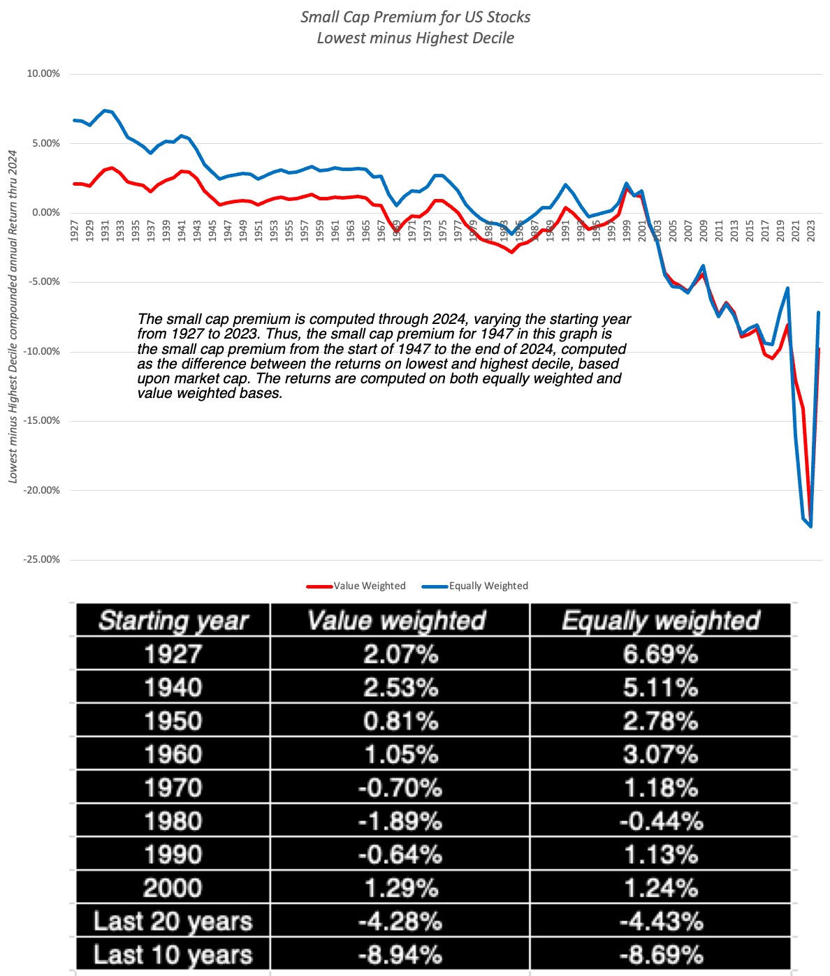
2. Historical Equity Risk Premiums (and spin offs): I spend a section of the paper discussing historical equity risk premiums, examining the statistical properties that make it a faulty approach, and why a belief in mean reversion has made it the status quo. While most of the historical equity risk premiums that you see reported in practice come from the US and are based upon the Ibbotson data going back to 1926, I also look at historical data that goes back further (to 1871) as well as historical premiums in the rest of the world. The historical data on returns in the US has also been mined by services to extract premiums that have been earned by subsets of stocks, and since these premiums often get used by practitioners, I look at the efficacy of these premiums. I specifically look at the small cap premium, a widely used add on in valuation, and not that not only has it been noisy over the entire time period (1926-2025), but that it has disappeared since 1981:

The fact that the small cap premium endures in practice is a testimonial to how once bad practices become embedded in valuation, they never leave.

3. Equity Risk Premiums, by country: While I do have a companion paper that explores country risk in detail, that I update in the middle of the year, I describe my process for estimating equity risk premiums, by country, starting with a mature market premium, and then adding on additional premiums, based on country default risk spreads (based on ratings and sovereign CDS spreads).


4. Implied Equity Risk Premiums and Alternatives: In this section, I start with a description of an intrinsic value model for the market, and use that model to illustrate what you would need to assume for the dividends yield or earnings yield to become reasonable proxies for the equity risk premiums; for the latter, for instance, you have to assume either that there is no earnings growth or that if there is growth, it is value neutral. I then use the full version of the model, allowing for higher growth and cash payout that includes buybacks, to derive my implied equity risk premium estimates. I also look at how my implied equity risk premium estimates relate to other risk proxies (default spreads on bonds, VIX etc.) and how they change over time, as the riskfree rate changes.

5. Efficacy of ERP Estimates: The test of whether an equity risk premium estimate is a good one is in the data, since equity risk premiums measure expectations of what investors hope to earn on equities in future periods. In the last section of the paper, I examine the predictive efficacy of alternative measures of equity risk premiums, by looking at their correlation with actual stock market returns in the next year, the next five years and the next ten years:
Since a good ERP estimate should have a large positive correlation with actual returns on stocks in future years, the current implied premium does best for the five-year and ten-year return, and the historical risk premium does worst, with actual returns increasing (decreasing) when it decreases (increases). In bad news for market timers, none of the equity risk premium approaches does well at forecasting next year's actual return, and even at the longer time periods, there is significant error in predictions.

Paper


Sunday, January 26, 2025

Data Update 3 for 2025: The times they are a'changin'!

In my first two data posts for 2025, I looked at the strong year that US equities had in 2024, but a very good year for the overall market does not always translate into equivalent returns across segments of the market. In this post, I will remain focused on US equities, but I will break them into groupings, looking for differences. I first classify US stocks by sector, to see return variations across different industry groupings. I follow up by looking at companies broken down by market capitalization,  with an eye on whether the much-vaunted small cap premium has made a comeback. In the process, I also look how much the market owes its winnings to its biggest companies, with the Mag Seven coming under the microscope. In the next section, I  look at stock returns for companies in different price to book deciles, in a simplistic assessment of the value premium. With both the size and value premiums, I will extend my assessment over time to see how (and why) these premiums have changed, with lessons for analysts and investors. In the final section, I look at companies categorized by price momentum coming into 2024, to track whether winning stocks in 2023 were more likely to be winners or losers in 2024.

US Stocks, by Sector (and Industry)

       It is true that you very seldom see a market advance that is balanced across sectors and industries. This market (US stocks in 2024) spread its winnings across sectors disproportionately, with four sectors - technology, communication services, consumer discretionary and financials - delivering returns in excess of 20% in 2024, and three sectors - health care, materials and real estate delivering returns close to zero:

Sector Returns - Historical (with $ changes in millions)

The performance of technology stocks collectively becomes even more impressive, when you look at the fact that they added almost $4.63 trillion in market cap just in 2024, and that over the last five (ten) years, the sector has added $11.3 trillion ($13.6 trillion) in market cap

   I  break the sectors down into 93 industries, to get a finer layer of detail, and there again there are vast differences between winning and losing industry groups, based upon stock price performance in 2024:

$ changes in millions

While most of the industries on the worst-performing list represent old economy companies (steel, chemicals, rubber & tires), green energy finds itself on the list as well, perhaps because the "virtue trade" (where impact and socially conscious investors bought these companies for their greenness, rather than business models) lost its heft. The top two performers, in 2024, on the best performing industry list, semiconductors and auto & truck, owe much of their overall performance to super-performers in each one (Nvidia with semiconductors and Tesla with auto & truck), but airline companies also had a good year, though it may be premature to conclude that they have finally found working business models that can deliver profitability on a continuous basis.

US Stocks, by Market Cap

    For much of the last century, the conventional wisdom has been that small companies, with size measured by market cap, deliver higher returns than larger companies, on a risk-adjusted basis, with the debate being about whether that was because the risk measures were flawed or because small cap stocks were superior investments. That "small cap premium" has found its way into valuation practitioners playbooks, manifesting as an augmentation (of between 3-5%) on the cost of equity of small companies.  To get a sense of how market capitalization was related to returns, I classified all publicly traded US companies, by market cap, and looked at their returns in 2024.


The returns across deciles are volatile, and while the lowest deciles in terms of market cap deliver higher percent returns, looking at the top and bottom halves of the market, in terms of market cap, you can see that there is not much setting apart the two groups. 
    To make an assessment of how the performance of small cap stocks in 2024 falls in the historical spectrum, I drew on Ken French's research return data, one of my favorite data sources, and looked at the small cap premium as the difference in compounded annual returns between the lowest and highest deciles of companies, in terms of market cap:

My small cap premium spreadsheet, based on Ken French data

In this graph, you can see the basis for the small cap premium, but only if go back all the way to 1927, and even with that extended time period, it is far stronger with equally weighted than with value weighted returns; the 1927-2024 small cap premium is 2.07% with value-weighted returns and 6.69% in  equally weighted terms. It should be noted that even its heyday, the small cap premium had some disconcerting features including the facts that almost of it was earned in one month (January) of each year, and that it was sensitive to starting and end points for annual data, with smaller premium in mid-year starting points. To see how dependent this premium is on the front end of the time period, I estimated the small cap premium with different starting years in the graph (and the table), and as you can see the small cap premium drops to zero with any time period that starts in 1970 and beyond. In fact, the small cap premium has become a large cap premium for much of this century, with small cap returns lagging large cap returns by about 4-4.5% in the last 20 years.

    The market skew towards large cap companies can be seen even more dramatically, if you break stocks down by percentile, based upon market cap, and look at how much of the increase in market cap in US equities is accounted for by different percentile groupings:

US Stocks: Market Cap Change Breakdown

Looking across 6000 publicly traded stocks in 2024, the top percentile (about 60 stocks) accounted for 74% of the increase in market cap, and the top ten percent of all stocks delivered 94% of the change in total market capitalization.

    Zeroing in even further and looking at the biggest companies in the top percentile, the Mag Seven, the concentration of winners at the very top is clear:

$ changes in millions

In 2024, seven companies (Apple, Amazon, Meta, Alphabet, Microsoft, Nvidia and Tesla) increased in market cap by $5.6 trillion, almost of the entire market's gain for the year. While it is not uncommon for stock market returns to be delivered by a few winners at the top,  with the Mag Seven, the domination extends over a decade, and in the last ten years (2014-2024), these seven companies have added $15.8 trillion in market cap, about 40% of the increase in market capitalization across all US stocks over the decade.
    For years now, some investors have bet on a reversal in this trend line, with small cap stocks coming back in favor, and these investors have lagged the market badly. To get a better handle on why large cap stocks have acquired a dominant role, in markets, I look at three explanations that I have seen offered for the phenomenon:

  1. Momentum story: Momentum has always been a strong force in markets, in both directions, with price increases in stocks (decreases) followed by more price increases (decreases). In effect, winning stocks continue to win, drawing in new funds and investors, but when these same stocks start losing, the same process plays out in reverse. A reasonable argument can be made that increasing access to information and easing trading, for both individual and institutional investing, with a boost from social media, has increased momentum, and thus the stock prices of large cap stocks. The dark side of this story, though, is that if the momentum ever shifted, these large cap stocks could lose trillions in value.
  2. Passive investing: Over the last two decades, passive investing (in the form of index funds and ETFs) has taken market share from active investors, accounting for close to  50% of all invested funds in 2024. That shift has been driven by active investing underperformance and a surge in passive investing vehicles that are accessible to all investors. Since many passive investing vehicles hold all of the stocks in the index in proportion to their market cap, there presence and growth creates fund flows into large cap stocks and keeps their prices elevated. Here again, the dark side is that if fund flows reverse and became negative, i.e., investors start pulling money out of markets, large cap stocks will be disproportionately hurt.
  3. Industry economics: In writing about the disruption unleashed by tech start-ups, especially in the last two decades, I have noted the these disruptors have changed industry economics in many established businesses, replacing splintered, dispersed competition with consolidation. Thus, Meta and Alphabet now have dominant market shares of the advertising business, just as Uber, Lyft and Grab have consolidated the car service business. As industries consolidate, we are likely to see them dominated by a few, big winners, which will play out in the stock market as well. It is possible that antitrust laws and regulatory authorities will try to put constraints on these biggest winners, but as I noted in my post on the topic, it will not be easy.
In my view, the small cap premium is not coming back, and given that it has been invisible for five decades now, the only explanation for why appraisers and analysts hold on to it is inertia. That said, the large cap premium that we have seen in the last two decades, was businesses have transitioned from splintered to consolidated structure, will also fade. Where does that leave us? Picking a company to invest in, based upon its market capitalization, will be, at best, a neutral strategy, and that should surprise no one.

The Value Premium?

    Just as the small cap premium acquired standing as conventional wisdom in the twentieth century, the data and research also indicated that stocks that trade at low price to book ratios earned higher returns that stocks that trade at high price to book ratios, in what was labeled as the value premium. As with the size premium, low price to book (value) stocks have struggled to deliver in the twenty first century, and as with the small size premium, investors have waited for it to return. To see how stocks in different price to book classes performed in 2024, I looked at returns in 2024, for all US stocks, broken down into price to book deciles:

Deciles created based on price to book ratios at start of 2024

In 2024, at least, it was the companies in the top decile (highest price to book ratios) that delivered the best returns in 2024, and stocks in the lowest decile lagged the market. 
    Here again, Ken French's data is indispensable in gaining historical perspective, as I looked the difference in annual returns between the top decile and bottom decile of stocks, classified by price to book, going back to 1927:

My value premium spreadsheet, based on Ken French data

In this graph, I am computing the premium earned by low price to book stocks, in the US, with different starting points. Thus, if you go back to 1927 and look at returns on the lowest and highest deciles, the lowest decile earned an annual premium of 2.43%. That premium remains positive until you get to about 1990, when it switches signs; the lowest price to book stocks have earned 0.87% less annually between 1990 and 2024, than the highest price to book stocks. As was the case with the small cap premium, the premium earned by low price to book stocks over high price to book stocks has faded over time, spending more time in negative territory in the last 20 years, than positive. 
    Value investors, or at least the ones that use the conventional proxies for cheapness (low price to book or low PE ratios), have felt the effects, significantly under performing the market for much of the last two decades. While some of them still hold on to the hope that this is just a phase that will reverse, there are three fundamentals at play that may indicate that the low price to book premium will not be back, at least on a sustained basis:
  1. Price to book ≠ Value: It is true that using low price to book as an indicator of value is simplistic, and that there are multiple other factors (good management, earnings quality, moats) to consider before making a value judgment. It is also true that as the market's center of gravity has shifted towards companies with intangible assets, the troubles that accountants have had in putting a number on intangible asset investments has made book value less and less meaningful at companies, making it a poorer and poorer indicator of what a company's assets are worth.
  2. Momentum: In markets, the returns to value investing has generally moved inversely with the strength of momentum. Thus, the same forces that have strengthened the power of momentum, that we noted in the context of the fading of the small cap premium, have diluted the power  of value investing.
  3. Structural Shifts: At the heart of the premium earned by low price to book ratios is mean reversion, with much of the high returns earned by these stocks coming from moving towards the average (price to book) over time. While that worked in the twentieth century, when the US was the most mean-reverting and predictable market/economy of all time, it has lost its power as disruption and globalization have weakened mean reversion.
So, what does this mean for the future? I see no payoff in investing in low price to book stocks and waiting for the value premium to return. As with market cap, I believe that the value effect will become volatile, with low price to book stocks winning in some years and high price to book stocks in others, and investing in one or another of these groups, just on the basis of their price to book ratios, will no longer deliver excess returns.

    Since the fading of the small cap and value premiums can be traced at least partially to the strengthening of momentum, as a market force, I looked at the interplay between momentum and stock returns, by breaking companies into deciles, based upon stock price performance in the previous year (2023), and looking at returns in 2024:

Deciles formed on percentage returns in 2023

As you can see, barring the bottom decile, which includes the biggest losers of 2023, where there was a strong bounce back (albeit less in dollar terms, than in percent), there was a strong momentum effect in 2024, with the biggest winners from last year (2023) continuing to win in 2024. In short, momentum continued its dominance in 2024, good news for traders who make money in its tailwinds, with the caveat that momentum is a fickle force, and that 2025 may be the year where it reverses.

Implications

    The US equity market in 2024 followed a pathway that has become familiar to investor in the last decade, with large companies, many with a tech focus, carried the market, and traditional strategies that delivered higher returns, such as investing in small cap or low price to book stocks, faltered. This is not a passing phase, and reflects the market coming to terms with a changed economic order and investor behavior. There are lessons from the year for almost everyone in the process, from investors to traders to corporate executive and regulators:

  1. For investors: I have said some harsh things about active investing, as practiced today, since much of it is based upon history and mean reversion. A mutual fund manager who screens stocks for low PE ratios and high growth, while demanding a hefty management fee, deserves to be replaced by an ETF or index fund, and that displacement will continue, pruning the active management population. For active investors who hold on to the hope that quant strategies or AI will let them rediscover their mojo, I am afraid that disappointment is awaiting them.
  2. For traders: Traders live and die on momentum, and as market momentum continues to get stronger, making money will look easy, until momentum shifts. Coming off a year like 2024, where chasing momentum would have delivered market-beating returns, the market may be setting up traders for a takedown. It may be time for traders to revisit and refine their skills at detecting market momentum shifts.
  3. For companies: Companies that measure their success through stock market returns may find that the market price has become a noisier judge of their actions. Thus, a company that takes a value destructive path that feeds into momentum may find the market rewarding it with a higher price, but it is playing a dangerous game that could turn against it. 
  4. For regulators: With momentum comes volatility and corrections, as momentum shifts, and those corrections will cause many to lose money, and for some, perhaps even their life savings. Regulators will feel the pressure to step in and protect these investors from their own mistakes, but in my view, it will be futile. In the markets that we inhabit, literally any investment can be an instrument for speculation. After all, Gamestop and AMC were fairly stolid stocks until they attracted the meme crowd, and Microstrategy, once a technology firm, has become almost entirely a Bitcoin play. 

I recently watched Timothy Chalamet play Bob Dylan in the movie, A Complete Unknown,  and I was reminded of one of my favorite Dylan tunes, "The times they are a-changin".  I started my investing in the 1980s, in a very different market and time, and while I have not changed my investing principles, I have had to modify and adapt them to reflect a changed market environment. You may not agree with my view that both the small cap and value premiums are in our past, but it behooves you to question their existence. 

YouTube Video

Datasets

  1. My small cap premium calculator (based on Ken French data)
  2. My value premium calculator (based on Ken French data)

Friday, May 20, 2022

A Follow up on Inflation: The Disparate Effects on Company Values!

In my last post, I discussed how inflation's return has changed the calculus for investors, looking at how inflation affects returns on different asset classes, and tracing out the consequences for equity values, in the aggregate. In general, higher and more volatile inflation has negative effects on all financial assets, from stocks to corporate bonds to treasury bonds, and neutral to positive effects on gold, collectibles and real assets. That said, the impact of inflation on individual company values can vary widely, with a few companies benefiting, some affected only lightly, and other companies being affected more adversely, by higher than expected inflation. In an environment where finding inflation hedges has become the first priority for most investors, the search is on for companies that are less exposed to high and rising inflation. The conventional wisdom, based largely on investor experiences from the 1970s, is that commodity companies and firms with pricing power are the best ones to hold, if you fear inflation, but is that true, and even if it is true, why is it so?  To answer these questions, I will return to basics and try to trace  the effects of inflation on the drivers of value, with the intent of finding the characteristics of stocks with better inflation-hedging properties.

Inflation and Value

When in doubt about how any action or information plays out in value, I find it useful to go back to value basics, and trace out the effects of that action/information on value drivers. Following that rule book, I looked at the effects of inflation on the levers that determines value, in the graph below:


Put simply, the effects of inflation on firm value boil down to the impact inflation has on expected cash flows/growth and risk. At the risk of restating what is already  in the graph above,  the factors that will play out in determining the end impact on inflation on value are in the table below:


If you were seeking out a company that would operate as an inflation hedge, you would want it to have pricing power on the products and services that it sells, with low input costs, and operating in a business where investments are short term and reversible. On the risk front, you would like the company to have a large and stable earnings stream and a light debt load

Looking Back
There are lessons that can be learned by looking at the past, about how inflation affects different groupings of companies, though there is the danger of over extrapolation. In this section, I look first at how classes of stocks have done over the decades, and relating that performance to inflation (expected and unexpected). I then examine how equities have performed in the less than five months of 2022, where inflation has returned to the front pages.

Historical Data: 1930-2019
To see how this framework works in practice, let's start by looking at the performance of US stocks, across the decades, and look at the returns on stocks, broadly categorized based on market capitalization and price to book ratios. The former is short hand for the small cap premium and the latter is the proxy for the value factor in returns.
The distinction that I made between expected and unexpected inflation comes into play in this table. It is unexpected inflation that seems to have a large impact on the behavior of small cap stocks, outperforming in  decades where inflation was higher than expected (1940-49, 196069, 1970-79)  and underperforming in decades with lower than expected inflation (1990-99, 2010-19). The value effect, measured as the difference between low price to book and high price to book stocks was highest in the 1970s, when both actual and unexpected inflation were high, but remained resilient in the 1980s, when inflation stayed high, but came in under expectations. 

The 2022 Experience
    As the focus has shifted back to inflation in the last five months, it is worth looking at performance across US stocks, broken down by different categorizations, to see whether the patterns of the past are showing up in today's markets.. For starters, let's look at the how the damage done by inflation on stocks varies across sectors, looking at the 2022 broken down in three slices, the returns in the first quarter of 2022 (when Russia competed with inflation for market attention), the period from April 1 - May 19, 2022 (when inflation was the dominant story) and the entire year to date.


In 2022, the collective market capitalization of all US firms has dropped by 19.75%,  with the bulk of the drop occurring after April 1, 2022. During the period (April 1- May 19, 2022), the three worst performing sectors (highlighted) were technology, consumer discretionary and communication services, and the best performing sectors were energy (no surprise, given the rise in oil prices) and utilities, old standbys for investors during tumultuous periods.  

To check to see if the outperformance of small cap and low price to book ratios that we saw in the 1970s is being replicated in 2022, I broke companies down by decile (based on market cap and price to book at the start of 2022), and looked at changes in aggregate value in 2022:

As in the 1970s, the small cap premium seems to have returned with a vengeance, as small cap stocks have outperformed large caps in 2022, and the lowest price to book stocks have done less badly than high price to book stocks. To examine the interaction and stock price performance in 2022, I looked at the aggregate returns on firms classified into deciles based upon both equity risk (betas) and default risk (with bond ratings):
The link between equity risk and stock returns support the hypothesis that firms that are riskier are more affected by inflation, with one exception: the stocks with the lowest betas have also done badly in 2022. On bond ratings, there is no discernible link between ratings and returns, until you get to the lowest rated bonds (CCC & below). In a final assessment, I break down companies based upon operating cash flows (EBITDA as a percent of enterprise value) and dividend yield (dividends as a percent of market capitalization).
Companies that generate more cash flows from their operations and return more of that cash flow in dividends to stockholders have clearly held their value better than companies with low or negative cash flows that pay no dividends, in 2022.  Looking at these results, value investors will undoubtedly find vindication for their beliefs that this is a correction long over due, i.e., a return to normalcy where safe stocks in boring sectors that pay high dividends deliver excess returns. I do think that given how consistently growth stocks have been beating value stocks for the last decade, a correction was in order, but I believe it is way too early to proclaim the return of old fashioned value investing. 

Bottom Line
This has been a painful year for investors in US equities, but the pain has not been evenly spread across investors. Portfolios that are over weighted in risky, money losing companies have been hurt more than portfolios that are more weighted towards companies with less debt and more positive cash flows. Even within some of the worst performing sectors, such as technology, breaking companies down, based upon earnings and cash flows, there is a clear advantage to holding money making, older tech companies than money losing, young tech companies:
The question of whether these trends will continue to apply for the rest of the year cannot be answered without taking a stand on inflation, and the effects that fighting it will create for the economy. 
  • If you believe that there is more surprises to come on the inflation front, and that a recession is not only imminent, but likely to be steep, the returns in the first five months of 2022 will be a precursor to more of the same, for the rest of the year. 
  • If you believe that markets have mostly or fully adjusted to higher inflation, betting on a continuation of the small cap and value outperformance to continue is dangerous. 
  • To the extent that there may be other countries where inflation is not the clear and present danger that it is in the United States, investing in equities in those countries will offer better risk and return tradeoffs.
As I noted in my last post, once the inflation genie is out of the bottle, it tends to drive every other topic out of market conversations, and become the driving force for everything from asset allocation to stock selection. 

YouTube Video


Inflation Posts (in 2022)

Wednesday, May 13, 2020

A Viral Market Update VIII: A Crisis Test - Value vs Growth, Active vs Passive, Small Cap vs Large!

In the weeks since my first update on the crisis on February 26, 2020, the markets have been on a roller coaster ride, as equity markets around the world collectively lost $30 trillion in market cap between February 14, 2020 and March 20, 2020, and then clawed back more than half of the loss in the following month. Having lived through market crises in the past, I know that this one is not quite done, but I believe we now have lived through enough of it to be able to start separating winners from losers, and use this winnowing process to address three big questions that have dominated investing for the last decade:
  • Has this crisis allowed active investors to shine, and use that performance to stop or even reverse the loss of market share to passive vehicles (ETFs and index funds) that has occurred over the last decade? 
  • Will this market correction lead to growth/momentum investing losing its mojo and allow value investors to reclaim what they believe is their rightful place on top of the investing food chain?  
  • Will the small cap premium, missing for so many decades, be rediscovered after this market shock?
I know each of these is a hot button issue, and I welcome disagreement, but I will try to set my biases aside and let the data speak for itself.

Market Action
As with my prior updates, I will begin by surveying the market action, first over the two weeks (4/17-5/1), following my last update,  and then looking at the returns since February 14, the date that I started my crisis clock. First up, I look at returns on stock indices around the world, breaking them up into two periods, from February 14 to March 20, roughly the low point for markets during this crisis and from March 20 to May 1, as they mounted a comeback.
Download data
The divide in the two periods is clear. Consider the S&P 500, down 28.28% between 2/14 and 3/20, but up 22.82% from March 20 and May 1, resulting in an overall return of -11.92% over the period. While the magnitudes vary across the indices, the pattern repeats, with the Shanghai 50 close to breaking even over the entire period, and the Bovespa (Brazil) and the ASX 200 (Australia) delivering the worst cumulative returns between 2/14 and 5/1. As stock markets have swooned and partially recovered, the yields on US treasuries dropped sharply early in the crisis and have stayed low since.
Download data
The 3-month treasury bill rate, which was 1.58% on February 14,  has dropped close to zero on May 1, and the treasury bond rate has declined from 1.59% to 0.64% over the same period. The much talked about inverted yield curve late last year, that led to so many prognostications of gloom and doom, has become upward sloping, and staying consistent with my argument that too much was being made of the former as a predictor of recession, I will not read too much into its slope now. Moving to the corporate bond market, I focused on 10-year corporates in different ratings classes:

Early in this crisis, the corporate bond markets did not reflect the worry and fear that equity investors were exhibiting, but they caught on with a vengeance a couple of weeks in, and the damage was clearly visible by April 3, 2020, with default spreads almost tripling across the board for all ratings classes. Since April 3, the spreads have declined, but remain well above pre-crisis levels. There should be no surprise that the price of risk in the bond market has risen, and as the crisis has taken hold, I have been updating equity risk premiums daily for the S&P 500 since February 14, 2020:
Download data
The equity risk premium surged early in the crisis, hitting a high of 7.75% on March 23, but that number has been dropping back over the last weeks, as the market recovers. By May 1, 2020, the premium was back down to 6.03%, with pre-crisis earnings and cash flows left intact, and building in a 30% drop in earnings and a 50% decline in buybacks yields an equity risk premium of 5.39%. For good reasons or bad, the price of risk in the equity market seems to be moving back to pre-crisis levels. I don’t track commodity prices on a regular basis, but I chose to track oil and copper prices since February 14:
At the risk of repeating what I have said in prior weeks, the drop in copper prices is consistent with an expectation of a global economic showdown but the drop in oil prices reflects something more. In fact, a comparison of Brent and West Texas crude oil prices highlights one of the more jaw-dropping occurrences during this crisis, when the price of the latter dropped below zero on April 19.  The oil business deserves a deeper look and I plan to turn to that in the next few weeks. Finally, I look at gold and bitcoin prices during the crisis, with the intent of examining their performance as crisis assets:
Download data
Gold has held its own, but I think that the fact that it is up only 7.4% must be disappointing to true believers, and Bitcoin has behave more like equities than a crisis asset, and very risky equities at that, dropping more than 50% during the weeks when stocks were down, and rising in the next few weeks, as stocks rose, to end the period with a loss of 16.37% between February 14 and May 1.

Equities: A Breakdown
Starting with the market capitalizations of individual companies, I measured the change in market capitalization on a week to week basis, allowing me to slice and dice the data to chronicle where the damage has been greatest and where it has been the least. Breaking down companies by region, here is what the numbers updated through May 1 look like:
Add caption
Latin America has been the worst performing region in the world, with Africa, Australia and Russia right behind and China and the Middle East have been the best performing regions between February 14 and May 1. I continue the breakdown on a sector-basis in the table below:
Add caption
Health care, consumer staples and technology have been the best performing sectors and financials are now the biggest losers. Extending the analysis to industries and looking at the updated list of worst and best performing industries:
Add caption
Repeating a refrain from my updates in earlier weeks, this has been, as crises go, about as orderly a retreat as any that I have seen. The selling has been more focused on sectors that have heavy capital investment and oil-focused, burdened with debt, and has been much more muted in sectors that have low capital intensity and less debt.

Value versus Growth Investing
In the tussle between value and growth investing, value investors have held the upper hand for a long time. In addition to laying claim to being the custodians of value, they also seemed to have all the numbers on their side of the argument, as they pointed to decades of outperformance by value stocks, at least in the United States. The last decades, though, have delivered numbers that are more favorable to growth investors, and this crisis is perhaps as good a time as any to reexamine the debate.

The Difference
For decades, we have accepted a lazy categorization of stocks on the value versus growth dimension. Stocks that trade at low PE or low price to book ratios are considered value stocks, and stocks that trade at high multiples of earnings and book value are growth stocks. In fact, the value factor in investing is built around price to book ratios. If you are a value investor, your reaction to this categorization is that this is no way to describe value and that true value investing incorporates many other dimensions including management quality, sustainable moats and low leverage. Conceding all those points, I would argue that the key difference between value and growth investing can be captured by looking at a financial balance sheet:

Thus, the real difference between value and growth investors lies not in whether they care about value (sensible investors in both groups do), but where they believe the investing payoff is greater. Value investors believe that it is assets in place that markets get wrong, and that their best opportunities for finding "under valued" stocks is in mature companies with mispriced assets in place. Growth investors, on the other hand, assert that they are more likely to find mispricing in high growth companies, where the market is either missing or misestimating key elements of growth.

The Lead In
Until the last decade, it was conventional wisdom that value investing beat growth investing, especially over longer time horizon, and the backing for this statement took the form of either anecdotal evidence (with the list of illustrious value investors much longer than the list of legendary growth investors) or historical data showing that low price to book stocks have delivered higher returns than high price to book stocks:
Source: Raw Data from Ken French
Looking across the entire period (1927-2019), low price to book stocks have clearly won this battle, delivering 5.22% more than high price to book stocks, and this excess return is almost impervious to risk and transaction cost adjustments. Value investors entered the last decade, convinced of the superiority of their philosophy, and in the table below, I look at the difference in returns between low and high PE and PBV stocks, each decade going back to the 1920s.
It is quite clear that 2010-2019 looks very different from prior decades, as high PE and high PBV stocks outperformed low PE and low PBV stocks by substantial margins. The under performance of value has played out not only in the mutual fund business, with value funds lagging growth funds, but  has also brought many legendary value investors down to earth. Pushed to explain why, the defense that value investors offered was that the 2008 crisis, Fed interventions and the rise of the FAANG stocks created a perfect storm that rewarded momentum and growth investing, at the expense of value. Implicit in this argument is the belief that this phase would pass and that value investing would regain its rightful place.

The COVID Crisis 
In the early days of the crisis, there were many value investors who viewed at least some of the market correction as punishment for investor overreach on growth and momentum stocks in the past decade.  As the weeks have progressed, that argument has been quelled by the cumulating evidence that the market punishment perversely has been far worse for value stocks, i.e., stocks with low PE ratios and high dividend yields than for momentum or growth stocks. To illustrate this, I first look at how the market effects have varied across stocks in different PE ratio classes:

Note that it is the lowest PE stocks that have lost the most market capitalization (almost 25%) between February 14 and May 1, whereas the highest PE stocks have lost only 8.62%, and to add insult to injury, even money losing companies have done better than the lowest PE stocks. I follow up by looking at stocks broken down by price to book ratios:

The results mirror what we saw with PE stocks, with low price to book stocks losing far more value than the highest price to book stocks.  I then break down stocks based upon dividend yields:
Low dividend yield stocks and even non-dividend paying stocks have fared far better than high dividend yield stocks. Finally I look at companies, based upon net debt ratios:

Put simply, here is what I see in the data. If I had followed old-time value investing rules and had bought stocks with low PE ratios and high dividends in pre-COVID times, I would have lost far more than if I bought high PE stocks or stocks that trade at high multiples of book value, paying little or no dividends. The only fundamental that has worked in favor of value investors is avoiding companies with high leverage.

A Personal Viewpoint
I believe that value investing has lost its way, a point of view I espoused to portfolio managers in Omaha a few years ago, in a talk, and in a paper on value investing, titled Value Investing: Investing for Grown Ups? In the talk and in the paper, I argued that much of value investing had become rigid (with meaningless rules and static metrics), ritualistic (worshiping at the altar of Buffett and Munger, and paying lip service to Ben Graham) and righteous (with finger wagging and worse reserved for anyone who invested in growth or tech companies). I also presented evidence that it was bringing less to the table than active growth investing, by noting that the average active value investor underperformed a value index fund by more than the average growth investor lagged growth index funds. I also think that fundamental shifts in the economy, and in corporate behavior, have rendered book value, still a key tool in the value investor's tool kit, almost worthless in sectors other than financial services, and accounting inconsistencies have made cross company comparisons much more difficult to make. On a hopeful note, I think that value investing can recover, but only if it is open to more flexible thinking about value, less hero worship and less of a sense of entitlement (to rewards). If you are a value investor, you will be better served accepting the reality that you can do everything right on the valuation front, and still make less money than your neighbor who picks stocks based upon astrological signs, and that luck trumps skill and hard work, even over long time periods.

Active versus Passive Investing
Some of the readers of this blog are in the active investing business and I apologize in advance for raising questions about your choice of profession. After all, any discussion of active versus passive investing that comes down on the side of the latter implicitly is a judgment of whether you are adding value by trying to pick stocks or time markets. Consequently, these discussions quickly turn rancid and personal, and I hope this one does not.

The Difference
In passive investing, as an investor, you allocate your wealth across asset classes (equities, bonds, real assets) based upon your risk aversion, liquidity needs and time horizon, and within each class, rather than pick individual stocks, bonds or real assets, you invest in index funds or exchange traded funds (ETFs)  to cover the spectrum of choices. In active investing, you try to time markets (by allocating more money to asset classes that you believe are under valued and less to those that you think are over valued) or pick individual assets that you believe offer the potential for higher returns. Active investing covers a whole range of different philosophies from day trading to buying entire companies and holding them for the long term.

Put simply, active investing covers a range of philosophies with different time horizons, different and often contradictory views about how markets make mistakes and correct them,

The Lead In
Until the 1970s, active investing dominated passive investing for two simple reasons. The first was the presumption that institutional investors were smarter, and had access to more information than the rest of us, and should thus do better with our money. The second was that there were no passive investing vehicles available for average investors. Both delusions came crashing down in the late sixties and early seventies.
  • First, the pioneering studies of mutual fund performance, including this famous one that introduced Jensen's alpha, came to the surprising conclusion that rather than outperform markets, mutual funds under performed by non-trivial amounts. In the years since, there have been literally hundreds of studies that have asked the same question about mutual funds, hedge funds and private equity, using far richer data sets and more sophisticated risk adjustment models to arrive at the same result. You can see Morningstar's 10-year excess return distribution for all active large-blend mutual funds, from 2010-2019, below (with similar graphs for other classes of active mutual funds):
    If the counter is that it is hedge and private equity funds where the smart money resides today, the evidence with those funds, once you adjust for reporting and survivor bias, mirrors the mutual fund results. Put bluntly, "smart" money is not that smart, and the advantages that it possesses (bright people, more data, powerful models) don't translate into returns for its investors. Ironically, over the same period, there were hundreds of other studies that claimed to find market inefficiencies, at least on paper, suggesting that there is no internal inconsistency in believing that markets are inefficient and also believing that bearing these markets is really, really difficult to do.
  • Second, Jack Bogle upended investment management in 1976 with the Vanguard 500 Index fund, the most disruptive change in the history of the investment business. Over the next three decades, the index fund concept expanded to cover geographies and asset classes, allowing investors unhappy with their investment advisors and mutual funds to switch to low-cost alternatives that delivered higher returns. The entry of ETFs tilted the game even further in favor of passive investing, while also offering active investors new ways of playing sectors and markets.
The shift of funds from active to passive has been occurring for a long time, but the shift was small early in the process. In 1995, less than 5% of money was passively invested (almost entirely in index funds) and that percentage rose to about 10% in 2002 and 20% in 2010. In the last decade, that shift has accelerated, as you can see in the graph below:
Source: Morningstar
The increase in passive investing's market share has come primarily from almost $4 trillion in funds flowing into passive vehicles, but active investing has also seen outflows in the last five years. While some have attributed this to failures of active investors in the last decade, I believe that active investing has been a loser's game, as Charley Ellis aptly described it, for decades, and that the shift can be more easily explained by investors having more choices, as trading moves online and becomes close to costless, and readier access to information on how their portfolios are performing. 

The Crisis Performance
Active investors have argued that their failures were due to an undisciplined bull market, where their stock pricing expertise was being discounted, and that their time would come when the next crisis hit. There were also dark warnings about how passive investing would lead to liquidity meltdowns and make the next crisis worse. If active investors wanted to have a chance to shine, they have got in their wish in the last few weeks, where their market timing and stock picking skills were in the spotlight. With their expertise, they should have managed to not only to avoid the worst of the damage in the first few weeks, but should have then gained on the upside, by redeploying assets to the sectors/stocks recovering the quickest. While there is anecdotal evidence that some investors were able to do this, with Bill Ackman's prescient hedge against the COVID collapse getting much attention, I am sure that there were plenty of other smart investors who not only did not see it coming, but made things worse by doubling down on losing bets or cashing out too early.

As we look at the bigger picture, the results are, at best, mixed, and hopes that this crisis would vindicate active investors have not come to fruition, at least yet. I looked at Morningstar's assessment of returns on equity mutual funds in the first quarter of 2020, measured against returns on passive indices for each fund class:
Source: Morningstar
Note that the first quarter included the worst weeks of the crisis (February 14- March 20), and there is little evidence that mutual funds were able to get ahead of their passive counterparts, with only two groups showing outperformance (small and mid-cap value), but active funds collectively under performed by 1.37% during this period. Focusing on market timing skills, tactical asset allocation funds (whose selling pitch is that they can help investors avoid market crisis and bear markets) were down 13.87% during the quarter, at first sight beating the overall US equity market, which was down 20.57%. That comparison is skewed in favor of these funds, though, since tactical asset allocation funds typically tend to invest about 60% in equities, and when adjusted for that equity allocation, they too underperformed the market. Looking at hedge funds in the first quarter of 2020, the weighted hedge fund index was down 8.5% and saw $33 billion in fund outflows, though there were some bright spots, with macro hedge funds performing much better. Overall, though, there was little to celebrate on the active investing front during this crisis. On the market liquidity front, while much has been made of the swings up and down in the market during this crisis, the market has held up remarkably well. A comparison to the chaos in the last quarter of 2008 suggests that the market has dealt with and continues to deal with this crisis with far more equanimity than it did in 2008. In fact, I think that the financial markets have done far better than politicians, pandemic specialists and market gurus during the last weeks, in the face of uncertainty.

A Personal Viewpoint
I have been skeptical about both the reasons given for active investing's slide over the last decade and the dire consequences of passive investing, and this crisis has only reinforced that skepticism. For active investing to deal with its very real problems, it has to get past denial (that there is a problem), delusion (that active investing is actually working, based upon anecdotal evidence) and blame (that it is all someone else's fault). Coming out of this crisis, I think that more money will leave active investing and flow into passive investing, that active investing will continue to shrink as a business, but that there will be a subset of active investing that survives and prospers. I don't believe that  artificial intelligence and big data will rescue active investing, since any investment strategies built purely around numbers and mechanics will be quickly replicated and imitated. Instead, the future will belong to multidisciplinary money managers, who have well thought-out and deeply held investment philosophies, but are willing to learn and quickly adapt investment strategies to reflect market realities. 

Small versus Large Cap 
The small cap premium was among the earliest anomalies uncovered by researchers in the 1970s and it came from the recognition that small market capitalization stocks earned higher returns than the rest of the market, after adjusting for risk. That premium has become part of financial practice, driving some investors to allocate disproportionate portions of their portfolios to small cap funds and appraisers to add small cap premiums to discount rates, when valuing small companies.

The Difference
There are two things worth noting at the outset about the small cap premiums. The first is that market capitalization is the proxy for size in the small cap studio, not revenues or earnings. Thus, you can have a young company with little or no revenues and large losses with a large market capitalization and a mature company with large revenues and a small market capitalization. The second is that to define a small capitalization stock, you have to think in relative terms, by comparing market capitalizations across companies. In fact, much of the relevant research on small cap stocks has been based on breaking companies down by market capitalization into deciles and looking at returns  on each decile. One reason that the small cap premium resonates so strongly with investors is because it seems to make intuitive sense, since it seems reasonable that small companies, with less sustainable business models, less access to capital and greater key person risk, should be riskier than larger companies. 

The Lead In
As with value investing, the strongest arguments for the small cap premium come from looking at historical returns on US stocks, broken down by decile, into market cap classes.
Going back to 1927, the smallest cap stocks have delivered about 3.47% more annually than than the rest of the market, on a value-weighted basis. That outperformance though obscures a troubling trend in the data, which is that the small cap premium has disappeared since 1980; small cap stocks have earned about 0.10% less than the average stock between 1980 and 2019. The table below breaks down the small cap premium, by decade:

The data in this table is testimony to two phenomena. The first is the belief in mean reversion that lies at the heart of so many investment strategies, with the mean being computed over long time periods, and primarily with US stocks. The second is that once bad valuation practices, once embedded in the status quo, are very difficult to remove. In my view, the use of small cap premiums in valuation practice have no basis in the data, but that does not mean that people will stop using them.

The Crisis Performance
As with active and value investing, there are some who believe that the fading of the small cap premium is temporary and that it will return, when markets change. To the extent that this crisis may constitute a market shift, I examined the performance of stocks, broken down by market capitalization into deciles between February 14, 2020 and May 1, 2020.

I know that it is still early in this crisis, but looking at the numbers so far, there is little good news for small cap investors, with stocks in the lowest two declines suffering more than the rest of the market. In fact, if there is a message in these returns, it is that the post-COVID economy will be tilted even more in favor of large companies, at the expense of small ones, as other businesses follow the tech model of concentrated market power. 

A Personal Viewpoint
It is still possible that the shifts in investor behavior and corporate performance could benefit small companies in the future, but I am hard pressed trying to think of reasons why. It is my belief that forces that allowed small cap stocks to earn a premium over large cap stocks have largely faded. I am not arguing that investing in small cap stocks is a bad strategy, but investing in small companies, just because they are small, and expecting to get rewarded for doing so, is asking to be rewarded for doing very little. Markets are unlikely to oblige. It is possible that you can build more discriminating strategies around small cap stocks that can make money, but that will require again bringing something else to the equation that is not being tracked or priced in by the market already.

YouTube Video


Data
  1. Market data (May 1, 2020)
  2. Regional breakdown - Market Changes and Pricing (May 1, 2020)
  3. Sector breakdown - Market Changes and Pricing (May 1, 2020)
  4. Industry breakdown - Market Changes and Pricing (May 1, 2020)
  5. Equity Risk Premium, by day (Updated through May 1, 2020)
  6. Small Cap versus Large Cap Stocks (1927-2019)
  7. Small Cap - Market Changes and Pricing (May 1, 2020)
  8. Value versus Growth ((1927-2019)
  9. PE breakdown - Market Changes and Pricing (May 1, 2020)
  10. PBV breakdown - Market Changes and Pricing (May 1, 2020)
  11. Dividend Yield  breakdown - Market Changes and Pricing (May 1, 2020)