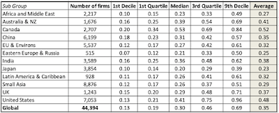
In my last four posts, I focused on the macro variables that we draw on, in both corporate finance and valuation, to estimate required returns or hurdle rates. In data post 3, I looked at how the prices of risk in both the bond market (default spreads) and the equity market (equity risk premiums) dropped in 2019, in the US. In data post 4, I extended the discussion to cover country and currency risk. In this one, I will bring in the micro variables that cause differences in risk across firms, and how to convert them into risk measure.
Relative Risk Measures
To get from the macro risk measures to company-level hurdle rates, you need to make judgments on relative risk. Put simply, if you buy into the proposition, like I do, that some companies/investments are riskier than others, you need a measure of relative risk that captures this variation. It is in this context that I think of betas, a loaded concept that carries with it the baggage of modern portfolio theory and efficient markets. If you add to this the standard approach to estimating betas, built on looking at past prices and running regressions against market indices, you have the makings of a perfect storm, designed to drive value investors to apoplexy. I have no desire to re-litigate these arguments, partly because those for and opposed to betas are set in their ways, but let me suggest some compromise propositions.
Relative Risk Proposition 1: You do not need to believe in betas to do financial analysis and valuation.
While there are many who seem to tie discounted cash flow valuations to the use of beta or betas, there is nothing inherently in a DCF that requires that you make this leap:
While the discount rate in a DCF is a risk-adjusted number, the approach is agnostic about how you measure risk and adjust discount rates for that risk.
Relative Risk Proposition 2: If you don't like to or want to measure relative risk with betas, you can come up with alternate measures that better reflect your view of how risk should be measured.
While I do use beta as my proxy for risk, I do so with open eyes, recognizing its many limitations as a risk measure, and I have been always willing to consider competing risk measures. In fact, I have presented alternate measures of risk, drawing on the two building blocks of betas that draw the most pushback. The first is the assumption that marginal investors are diversified, and that the only risk that needs to be measured is the risk that cannot be diversified away. The second is its use of prices (stock and market) to estimate risk, seemingly contradicting intrinsic value's basic precept that market prices are not trustworthy. Since a picture is worth a thousand words, here a few alternative risk measures to consider, if you don't trust betas;
Put simply, if your primary problem with betas is the assumption that marginal investors are diversified, there are total risk measures that are built around measuring the total risk in a company or investment, by looking at either the standard deviation or adding premiums (small cap, company-specific risk) to the traditional risk and return model. If your concern is that past prices are being used to estimate betas, you can switch to using accounting earnings and computing risk measures either from the perspective of diversified investors (accounting beta) or undiversified ones (earnings variability).
Relative Risk Proposition 3: The margin of safety is not a competitor to any of the risk measures above, since it is a post-value adjustment for risk.
Rather than repeat what I said in a much longer post that I had on the topic, let me summarize the points that I made there. When value investors talk about protecting themselves from risk by using a margin of safety, they are talking about building a buffer between value and price, but to use the margin of safety, you need to value a stock first. To get that value, you need a risk measure, and that brings us back full circle to how you adjust for risk, when valuing companies.
Relative Risk in 2020
With that long lead-in, let's take a look at how companies measured up on relative risk measures, at the start of 2020. In keeping with my argument in the last section that you can use alternative risk measures, I will report on three alternative risk measures:
Betas: I start with betas, estimated with conventional regressions of returns on the stock against a market index, for each of the companies in my sample. To get a measure of how these betas vary across companies, I have a distribution of betas, broken down globally and for regions of the world:
It is worth noting that, at least for public companies, half of all companies have betas between 0.85 and 1.45, globally. If you are wondering why the betas are not higher for companies in riskier parts of the word, it is worth emphasizing that betas are scaled around one, no matter of the world you are in, and are not designed to convey country risk. (The equity risk premiums that I wrote about in my last post carry that weight.)
Relative Standard Deviation: For those who do not buy into the notion that the marginal investors are diversified and that the only risk that matters is market risk, I report on the standard deviation in stock prices (using the last two years of data):
Note that you can convert these numbers into relative measures, resembling betas, by dividing by the average standard deviation of all stocks. Thus, if you have a US stock with an annualized standard deviation of 35.00% in stock returns, you would divide that number by the average for US equities of 42.36% to arrive a relative standard deviation of 0.826 (=35.00%/42.36%).
High-Low Risk: For those who prefer a non-parametric and more intuitive measure of risk, I compute a risk measure by looking at the difference between high and low prices in the most recent year, and dividing by the sum of the two numbers. Thus, for a stock that has a high price of 20 and a low price of 12, during the course of a year, this measure would yield 0.25 ((20-12)/ (20+12)). Note that the bigger the range in prices, the more risky a stock looks on this measure, and this too is broken down globally and by region:
As with the other risk measures, this too can be converted into a relative risk measure, by dividing by the average.
Earnings Variability: Finally, for those who trust accountants more than markets (even though I am not one of them), I have computed a risk measure that is built around earnings variability, computed by looking at the standard deviation in net income over the last 10 years for each firm, and converted into a standardized measure, by dividing by the average net income over the ten years (a coefficient of variation in net income), The global and regional breakdown is below:
The earnings variability number has a bigger selection bias than the other measures, because it requires a longer history (10 years of data) and positive earnings, cutting the sample size down significantly. Here again, dividing a company's coefficient of variation in net income by the average value across all companies will give you a relative risk measure.
I follow up by looking at median values for each of the risk measures by industry grouping. Since I have 94 industry groupings, I will not report them all here, but you can download the data on all of the industry groupings, by clicking here.
Hurdle Rates in 2020
The relative risk measures are a means to an end, since the only reason for computing them is to use them to get to required returns. In this section, I begin by looking at the cost of equity, then bring in the cost of debt and close of by looking at the cost of capital.
a. Cost of Equity
There are three ingredients that go into the cost of equity and the last few posts have laid the foundations for the three inputs:
The risk free rate is a function of the currency you choose to compute your hurdle rates in, and will be higher for high-inflation currencies than low-inflations ones. Since I will be comparing and aggregating costs of equity across more than 40,000 firms spread across the world, I will compute their costs of equity in US dollars, using the US T.Bond rate as of January 1, 2020, as the risk free rate. You can convert these into any other currency, using the differential inflation approach that I described in my earlier post from a couple of weeks ago.
The equity risk premium for a company is a function of where it does business, and in my last data update post, I described my approach to estimating equity risk premiums for individual countries, and the process of weighting these (using either revenues or production) to get equity risk premiums for companies.
For the relative risk measure, I will use betas but as I argued in the last section, I am agnostic about what you prefer to use instead. Thus, if you prefer earnings variabliity as a measure, you can use relative earnings variability as your risk measure.
With these inputs, I estimate the costs of equity for all of the companies in my database, and report the distribution in the table below:
Comparing this distribution to the one for betas, earlier in this post, you will notice a wider spread in the numbers across regions, as we bring in equity risk premium differences into the calculation.
b. Cost of Debt
The cost of debt is a simpler exercise, since it is a measure of the rate at which companies can borrow money today, not a reflection of the rates at which they have borrowed in the past. It is a function of the risk free rate and the default spread:
As with the cost of equity, the risk free rate is a function of the currency in which you estimate the cost of debt in, and I will estimate the costs of debt for all companies in US dollars, again to make comparisons across companies. For the default spread, I have little choice but to use bludgeon measures, since I cannot assess credit risk for 40,000 plus companies. For companies that have an S&P bond rating (about 15% of the sample), I use the rating to estimate a default spread. For the rest, I estimate synthetic bond ratings based on financial ratios (interest coverage and debt ratios). The US $ pre-tax cost of debt distribution is below:
Since these costs are all in US dollars, the differences across regions reflect difference in country default risk and reflect wide divergences. It is worth noting that the tax law tilt towards debt, represented in the fact that interest expenses are tax deductible and cash flows to equity (dividends and buybacks) have to come from after-tax cash flows, is not just a phenomenon for the US, but true over much of the world, with the Middle East representing the holdout. This tax benefit shows up in the cost of capital, through the conversion of the pre-tax cost of debt into an after-tax cost, using the marginal tax rate to make the adjustment:
After-tax cost of debt = Pre-tax cost of debt (1 - Marginal Tax Rate)
In my sample, I use the marginal tax rate of the country in which a company is incorporated. You can find these marginal tax rates, which KPMG should be credited for collecting, also on my website for download.
c. Debt Ratios and Costs of Capital
The final piece of the puzzle in computing the cost of capital is the mix of debt and equity that companies use in funding their operations. In keeping with the cost of capital being a measure of what companies have to pay for their debt and equity today, I use the market values of equity and debt, with leases converted into debt and included in the latter, to compute the cost of capital. While I will talk in more detail about debt loads and choices in a future post, you can sense of the debt load at companies, as a percent of capital (in market value terms) in the table below below:
With these debt ratios, and using the costs of equity and debt also shown above, I compute costs of capital, in US dollar terms, for all publicly traded companies and the resulting distribution is below:
This is a table that I will use, and have already put to use, in valuing companies since it provides a quick and effective way to estimate discount rates for companies, without losing yourself in the details. Thus, when valuing a young, money-losing public company in the US (like Casper, the only mattress-maker that went public last week), I will use a cost of capital of 9.15%, representing the 90th percentile of US firms, whereas to value a slow-growing European company in a stable business, like Heineken, my cost of capital will be 6.02%, the 25th percentile of European companies. For all companies, the median cost of capital of 7.58% is a good proxy for the number that all companies will converge towards, as they approach maturity. If all of these numbers look low to you, that is because they reflect a risk free rate, in US dollars, that is low, and if it does rise, it will carry these numbers upwards. As with the risk measures, I have estimated costs of equity, debt and capital, by industry group and you can download them for all companies globally, as well as regionally (US, Emerging Markets, Europe, Japan and Australia/Canada) and for India and China, separately.
I think that all investors would buy into the precept that investing in equities comes with risk, but that is where the consensus seems to end. Everything else about risk is contested, starting with whether it is a good or a bad, whether it should be sought out or avoided, and how it should be measured. It is therefore with trepidation that I approach this post, knowing fully well that I will be saying things about risk that you strongly disagree with, but it is worth the debate.
Risk: Basic Propositions
I. Risk falls on a continuum: Risk is not an on-off switch, where some assets are risky and others are not. Instead, it is better to think of it on a continuum, with investments with very little or close to no risk at one extreme (riskless) to extraordinarily risky investments at the other.
In fact, while most risk and return models start off with the presumption that there exists a riskless asset, one in which you can invest for a guaranteed return and no loss of principal, I think that a reasonable argument can be made that there are no such investments. In abstract settings, we often evade the question by using government bond rates (like the US treasury) as risk free rates, but that assumes:
That governments don't default, an assumption that conflicts with the empirical evidence that they do, on both local currency and foreign currency borrowings
That if the government delivers it's promised coupon we are made whole again, also not true since inflation can be a wild card, rendering the real return on a government bond negative, in some periods. A nominal risk free rate is not a real risk free rate, which is one reason that I track the inflation indexed treasury bond (TIPs) in conjunction with the conventional US treasury bond; the yield on the former is closer to a real risk free rate, if you assume the US treasury has no default risk.
If there is one lesson that emerged from the 2008 crisis, it is that there are some periods in market history where there are truly no absolutely safe havens left and investors have to settle for the least stomach churning alternative that they can find, during these crises.
II. For a company, risk has many sources: Following up on the proposition that investing in the equity of a business can expose you to risk, it is worth noting that this risk can come from multiple sources. While a risk profile for a company can have a laundry list of potential risks, I break these risks into broad categories:
Note that some of these risks are more difficult to estimate and deal with than others, but that does not mean that you can avoid them or not deal with them. In fact, as I have argued repeatedly, your best investment opportunities may be where it is darkest.
III. For investors, risk standing alone can be different from risk added to a portfolio: This is perhaps the most controversial divide in finance, but I will dive right in. The risk of an investment can be different, if it is assessed as a stand-alone investment, as opposed to being part of a portfolio of investments and the reason is simple. Some of the risks that we listed in the table above, to the extent that they are specific to the firm, and can cut in either direction (be positive or negative surprises) will average out across a portfolio. It is simply the law of large numbers at work. In the graph below, I present a simplistic version of diversification at play, by looking at how the standard deviation of returns in a portfolio changes, as the number of investments in it goes up, in a world where the typical investment has a standard deviation of 40%, and for varying correlations across investments.
If the assets are uncorrelated, the standard deviation of the portfolio drops to just above 5%, but note that the benefits persist as long as the assets in your portfolio are not perfectly positively correlated, which is good news since stocks are usually positively correlated with each other. Furthermore, the greatest savings occur with the first few stocks that are added on, with about 80% of the benefits accruing by the time you get to a dozen stocks, if they are not all in the same sector or share the same characteristics (in which case the correlation across those stocks will be higher, and the benefit lower).
I know that I am now opening up an age old debate in investing as to whether it is better to have a concentrated portfolio or a diversified one. Rather than argue that one side is right and the other wrong, I will posit that it depends upon how certain you feel about your investment thesis, i.e., that your estimate of value is right and that the market price will correct to that value, with more certainty associated with less diversification. Speaking for myself, I am always uncertain about whether the value that I have estimated is right and even more so about whether the market will come around to my point of view, which also means that it is best for me to spread my bets. You can be a value investor and be diversified at the same time.
IV. Your risk measurement will depend on how and why you invest and your time horizon: Broadly speaking, there are three groups of metrics that you can use to measure the risk in an investment.
Price Measures: If an asset/investment is traded, the first set of metrics drawn on the price path and what you can extract from that path as a measure of risk. There are many in investing who bemoan the Markowitz revolution and the rise of modern finance, but one of the byproducts of modern portfolio theory is that price-based measures of risk dominate the risk measurement landscape.
Earnings/Cashflow Measures: There are many investors who believe that it is uncertainty about earnings and cash flows that are a true measure of risk. While their argument is that value is driven by earnings and cash flows, not stock price movements, their case is weakened by the fact that (a) earnings are measured by accountants, who tend to smooth out variations in earnings over time and (b) even when earnings are measured right, they are measured, at the most, four times a year, for companies that have quarterly reporting, and less often, for firms that report only annually or semi-annually.
Risk Proxies: Some investors measure the risk of an asset, by looking at the grouping it belongs to, arguing that some groupings are more risky than others. For instance, in the four decades since technology stocks became part of the market landscape, "tech" has become a stand in for both high growth and high risk. Similarly, there is the perception that small companies are riskier than larger companies, and that the market capitalization, or level of revenues, should be a good proxy for the risk of a company.
While I will report on each of these three groups of risk measures in this post, you can decide which measure best fits you, as an investor, given your investment philosophy.
Price Risk Measures
The most widely accessible measures of risk come from the market, for publicly traded assets, where trading generate prices that change with each trade. That price data is then used to extract risk measures, ranging from intuitive ones (high to low ranges) to statistical measures (such as standard deviation and covariance).
Price Range
When looking at a stock's current price, it is natural to also look at where it stands relative to that stock's own history, which is one reason most stock tables report high and low prices over a period (the most recent 12 months, for instance). While technical analysts use these high/low prices to determine whether a stock is breaking out or breaking down, these prices can also be used as a rough proxy for risk. Put simply, riskier stocks will trade with a wider range of prices than safer stocks.
HiLo Risk Measure
To compute a risk measure from high and low prices that is comparable across stocks, the range has to be scaled to the price level. Otherwise, highly priced stocks will look more risky, because the range between the high and the low price will be greater for a $100 stock than for a $5 stock. One simple scalar is the sum of the high and the low prices, giving the following measure of risk:
To illustrate, consider two stocks, A with a high of $50 and a low of $25 and B with a high of $12 and a low of $8. The risk measures computed will be:
HiLo Risk of stock A = (50-25)/ (50+25) = 0.333
HiLo Risk of stock B = (12-8)/ (12 +8) = 0.20
Based upon this measure, stock A is riskier than stock B.
Distribution
I compute the HiLo risk measure for all stocks in my data set, to get a sense of what would be high or low, and the results are captured in the distribution below (Q1: First Quartile, Q3: Third Quartile):
Embedded in the distribution is the variation of this measure across regions, with some, at first sight, counterintuitive results. The US, Canada and Australia seem to be riskier than most emerging market regions, but that says more about the risk measure than it does about companies in these countries, as we will argue in the next section. If you want to see these risk measures on a country basis, try this link. Pluses and Minuses
The high/low risk measure is simple to compute and requires minimal data, since all you need is the high price and the low price for the year. It is even intuitive, especially if you track market prices continuously. It does come with two problems. The first is the flip side of its minimal data usage, insofar as it throws away all data other than the high and the low price. The second is a more general problem with any price based risk measure, which is that for the price to move, there has to be trading, and markets that are liquid will therefore see more price movements, especially over shorter time period, than markets that are not. It is therefore not surprising that US stocks look riskier than African stocks, simply because liquidity is greater in the US. So, why bother? If you are comparing stocks within the same liquidity bucket, say the S&P 500, the high-low risk measure may correlate well with the true risk of the company. However, if your comparisons require you to look across stocks with different liquidity, and especially so if some are traded in small, emerging markets, you should use this or any other price-based measure with caution.
Standard Deviation/Variance
If you have data on stock prices over a period, it would be statistical malpractice not to compute a standard deviation in these prices over time. Those standard deviations are a measure, albeit incomplete and imperfect, of how much price volatility you would have faced as an investor, with the intuitive follow up that safer stocks should be less volatile.
Returns on Stocks
As with the HiLo risk measure, computing a standard deviation in stock prices, without adjusting for price levels, would yield the unsurprising conclusion that higher prices stocks have higher standard deviations. With this measure, the scaling adjustment becomes a simpler one, since using percentage price changes, instead of prices themselves, should level the playing field. In fact, if you wanted a fully integrated measure of returns, you should also include dividends in the periods where you receive them. However, since dividends get paid, at most, once every quarter, analysts who use daily or weekly returns often ignore them.
Distribution
To compute and compare standard deviations in stock returns across companies, I have to make some estimation judgments first, starting with the time period that I plan to look over to compute the standard deviation and the return intervals (daily, weekly, monthly) over that period. I use 2-year weekly standard deviations for all firms in my sample, using the time period available for companies that have listed less than 2 years, and the distribution of annualized standard deviations is in the graph below.
As with the HiLo risk measure, and for the same reasons, the US, Canada and Australia look riskier than most emerging markets. Again, I report on the regional differences in the table embedded in the graph, with country-level statistics available at this link.
Pluses and Minuses
It is Statistics 101! After all, when presented with raw data, one of the first measures that we compute to detect how much spread there is in the data is the standard deviation. Furthermore, the standard deviation can be computed for returns in any asset class, thus allowing us to compare it across stocks, high yield bonds, corporate bonds, real estate or crypto currencies. To the extent that we can also compute historical returns on these same assets, it allows us to relate those returns to the standard deviations and compute the payoff to taking risk in the form of Sharpe ratios or information ratios.
Sharpe Ratio = (Return on Risky Asset - Risk free Rate)/ Standard Deviation of Risky Asset
That said, the flaws in using just standard deviation as a measure of risk in investing have been pointed out by legions of practitioners and researchers.
Not Normal: The only statistical distribution which is completely characterized by the expected return and standard deviation is a normal distribution, and very little in the investment world is normally distributed. To the extent that investment return distributions are skewed (often with long positive tails and sometimes with long negative tails) and have fat tails, there is information in the other moments in the distribution that is relevant to investors.
Upside versus Downside Variance: One of the intuitive stumbling blocks that investors have with standard deviation is that it will higher if you have outsized returns, whether they are higher or lower than the average. Since we tend to think of downside movements as risk, not upside, the fact that stocks that have moved up strongly and dropped precipitously can both have high standard deviations makes some investors queasy about using them as measures of risk.
Liquidity effects: As with the high low risk measure, liquidity plays a role in how volatile a stock is, with more liquid stocks being characterized with higher standard deviations in stock prices than less liquid ones.
Total Risk, rather than risk added to a portfolio: The standard deviation in stock prices measures the total risk in a stock, rather than how much risk it adds to a portfolio, which may make it a poor measure of risk for diversified investors. Put differently, adding a very risky stock, with a high standard deviation, to a portfolio may not add much risk to the portfolio if it does not move with the rest of the investments in the portfolio.
In summary, the combination of richer pricing data and access to statistical tools has made it easier than ever to compute standard deviation in prices, but using it as your sole measure of risk can lead you to make bad investment decisions.
Covariance/Beta
In the graph on the effect of diversification on portfolio risk, I noted that the key variable that determines how much benefit there is to adding a stock to portfolio is its correlation with the rest of the portfolio, with higher and more positive correlations associated with less diversification benefit. Building on that theme, you can measure the risk added by an investment to a diversified portfolio by looking at how it moves in relation to the rest of the portfolio with its covariance, a measure that incorporates both the volatility in the investment and its correlation with the portfolio.
This equation for added risk holds only if the investment added is a small proportion of the diversified portfolio, but if that is the case, you can have a risky investment (with a high standard deviation) that adds very little risk to a portfolio, if the correlation is low enough. Standardized Measure (Beta)
The covariance measure of risk added to a portfolio, left as is, yields values that are not standardized. Thus, if you were told that the covariance of a stock with a well diversified portfolio is 25%, you may have no sense of whether that is high, low or average. It is to obtain a scaled measure of covariance that we divide the covariance of every investment by the variance of the portfolio that we are measuring it against:
If you are willing to add on whole layers of assumptions about no transactions costs, well functioning markets and complete information, the diversified portfolio that we will all hold will include every traded asset, in proportion to its market value, the capital asset pricing model will unfold and the betas for investments will be computed against this market portfolio. Note though, that even if you are unwilling to go the distance and accept the assumptions of the CAPM, the covariance and correlation remain measures of the risk added by an investment to a portfolio.
Distribution
If you already are well versed in financial theory, and find the lead in to beta in this section simplistic and unnecessary, I apologize, but I think that any discussion of the CAPM and betas very quickly veers off topic into heated debates about efficient markets and the limitations of modern finance. I think it is good to revisit the basics of the model, and even if you disagree with the model's precepts (and I do not think that there is anyone who fully buys into all of its assumptions), decide what parts of the model you want to keep and which ones you want to abandon. Since the key number that drives the covariance and beta of an investment is its correlation with, I report on the global distribution of this statistics:
Unlike the high low risk measure and the standard deviation, where my estimation choices were limited to time period and return interval, the correlation coefficient is also a function of the index or market that is used to compute it. That said, the distribution yields some interesting numbers that you can use, even as a non-believer in the CAPM. The median correlation for a US stock with the market is about 20%, and if you check the graph for savings, that would imply that having a portfolio of ten, twenty or thirty stocks yield substantial benefits. As you move to emerging markets, where the correlations are even lower, especially if you are a global investor, the benefits become even larger. Again, if you want to see this statistic on a country-by-country basis, try this link.
Pluses and Minuses
If you have bought into the benefits of diversification and have your wealth spread out across multiple investments, there is a strong argument to be made that you should be looking at covariance-based measures of risk, when investing. If you use a beta or betas to measure risk in an investment, you get an added bonus, since the number is self standing and gives you all the information you need to make judgments about relative risk. A beta higher (lower) than one is a stock that is riskier (safer) than average, but only if you define risk as risk added to a portfolio.
I use covariance based measures of risk in valuation but I recognize that these measures come with limitations. In addition to all of the caveats that we noted about liquidity's effect on price based measures, the most critical ingredient into covariance is the correlation coefficient and that statistic is both unstable and varies over time. Thus, the covariance (and beta) of the stock of a company that is going through a merger or is in distress will often decrease, since the stock price will move for reasons unrelated to the market. As a result, the covariance measures (and this includes the beta) have substantial estimation error in them, which is one reason that I have long argued against using the beta that you get for one company with one pass of history (a regression beta) in financial analysis. What can you do instead? Since covariance and beta are measures of risk added to a portfolio, they should be more reflective of the businesses (or industries) a company operates in than of company-specific characteristics. Using an industry average beta for steel companies, when valuing US Steel or Nucor, or an industry average beta for software companies, when valuing Adobe, is more prudent than using the regression betas for any of these companies. I will build on this theme in my next post.
Earnings Risk Measures
For many value investors, the biggest problem with using standard deviations or betas is that they come from stock prices. So what? In the value world, it is not markets that should drive our perception of risk, but the fundamentals of the company. Thus, using a price based risk measure when doing intrinsic value is viewed as inconsistent. In this section, I will look at proxies for risk that are built upon a company's performance over time.
Money Losing or Money Making
If we define success in a business in terms of making money, the simplest measure of whether a company is risky is whether it generates profits or not. Simplistic though it might be, a money losing company, all held held constant, is riskier than a money making company. That said, investors take multiple cracks at measuring profitability, with some defining it as net profits (after taxes and interest expenses), some more expansively as operating income (to look at pre-debt earnings) and some even more broadly as EBITDA. In the table below, I break down the percentages of companies globally that report positive and negative values, using each measure:
Not surprisingly, in every part of the world, the percentage of firms that have positive EBITDA exceeds the percentage with positive operating income or positive net income. Looking across regions, Japan has the highest percentage of money making firms, with 88.80% making positive net income, and Canada and Australia, with their preponderance of natural resource companies, have the highest percentage of money losers.
Earnings Variance
It is true that whether a company makes money is a very rough measure of risk and a more complete measure of earnings risk would look at earnings variability over time. This is more difficult than it sounds, for three reasons. First, unlike pricing data, earnings data is available only once every quarter in much of the world, and even more infrequently (semi annual or annual) in the rest. Second, unlike price data, which can never be negative, earnings can, and computing variance in earnings, when earnings are negative, are messy. Third, even if you can compute the variance or standard deviation in earnings, it is difficult to compare that number across companies, since companies with higher dollar earnings will have more variance in those earnings in dollar terms. It is for this reason that I compute a coefficient of variation in earnings for each firm, where I divide the standard deviation in earnings by the average earnings over the period of analysis:
Coefficient of variation in earnings = Standard Deviation in Earnings/ Average Earnings over estimation period
When the average earnings are negative, I use the absolute value in the denominator. I computed this measure of earnings variability in both operating and net income for companies that have data going back at least five years, and the distribution is captured below:
There are some surprises here. While Australia and Canada again score near the top of the risk table, with the highest variation in earnings, Latin American companies have the lowest volatility in operating and net income, if you compare medians. You can take this to mean that Latin American companies are not risky or that there are perils to trusting accountants to measure performance. Finally, the country level risk statistics are available at this link.
Pluses and Minuses
While I sympathize with the argument that value investors pose, i.e., that using price based risk measures in intrinsic valuation is inconsistent, I am very quickly brought back to earth by the recognition that computing risk from accounting earnings or financial statements comes with its own limitations, which in my view, quickly overwhelm its benefits. The accounting tendency to smooth things out shows up in earnings streams and if you add to that how the numerous discretionary accounting plays (from how to account for acquisitions to how to measure inventory) play out in stated earnings, I am not sure that I learn much about risk from looking at a time series of accounting earnings. You may find that there are other items in accounting statements that are less susceptible to accounting choices, such as revenues or cash flows, but, for the moment, I remain unconvinced that any of these beat price-based measures of risk.
Risk Proxies
The vast majority of investors never attach risk measures to stocks, choosing instead to proxies or stand-ins for risk. Thus, tech stocks are viewed as riskier than non-tech stocks, small cap stocks are perceived as more risky than large cap stocks and, in some value investing circles, stocks that trade at low PE ratios or have high dividend yields are viewed as safer than stocks with high PE ratios or do not pay dividends. In this section, I look at how the measures of risk that I have computed from price and accounting data correlate with these proxies. Market Capitalization
It seems like common sense to argue that smaller companies must be riskier than larger companies. After all, they often operate in niche markets, have less access to capital and are often dependent on a few customers for success. That said, though, even these common sense arguments start to break down if you think about investing in portfolios of small cap stocks, as opposed to large ones, since many of these risks are firm specific and could be diversified away across stocks. To examine, whether risk varies across market capitalization classes, I looked at the risk measures that we have computed already in this post:
The market capitalization correlates remarkably well with measures of both price and earnings risk, with smaller companies exposed to far more risk than larger firms. The note of caution, though, comes in the correlation numbers, where the smallest companies have the lowest correlation with the market, suggesting that much of the added risk in these companies can be diversified away. Put simply, if you want to own only three or four stocks in your portfolio, it is perfectly appropriate to think of small companies as riskier than large ones, but if you choose to be diversified, company size may no longer be a good proxy for the risk added to your portfolio.
PE Ratios and Dividend Yields
For some value investors, it is an article of faith that the stocks that trade at low multiples of earnings and pay large dividends are safer than stocks that trade at higher multiples and or pay low dividends. That is perhaps the reason why the Graham screens for cheap stocks include ones for low PE and high dividend yields. In the table below, we look at how stocks in different PE ratio classes vary on price and earnings risk measures:
With both groups, we notice an interesting pattern. While there is no clear link between how low or high a stock's PE ratio is and its risk measures, money losing companies (where PE ratios are not computed or are not meaningful) are riskier than the rest of the market. Similarly, with dividend yields the link between dividend yields and risk measures is weak, but non-dividend paying companies are riskier than the rest of the market.
Industry Grouping
For decades, investors have used the industry groupings that companies belong to as the basis for risk judgments. Not only does this take the form of conventional investment advice, where risk averse investors are asked to invest in utility stocks, but it is also used to make broad brush statements about tech stocks being risky. Again, there is probably a good reason why these views came into being, at the time that they did, but economies and markets change, and it behooves us to look at the data to see if these rules of thumb still hold. Just as with the market capitalization classes, I have computed the risk statistics for the 94 industries that I categorize all companies into, and you can get the entire list by clicking here. The ten most risky and least risky industries, using price based risk measures are listed below:
The least risky firms, looking globally, on a price risk basis, are financial service firms (with banks an and insurance companies making the list) and the most risky firms include natural resource, technology and entertainment companies. Looking at earnings based risk measures, we get the following listing:
There is significant overlap between the two measures, with the same industries, for the most part, showing up on both lists. The caveat I would add is that some of these sectors have thousands of companies in them, and that there are wide differences in risk across these companies.
Picking your Poison
This has become a far longer post than I intended and I want to wrap it up with three suggestions, when it comes to risk.
Risk avoidance is not a strategy: During periods of high volatility and market tumult, investors often obsess about risk. While that is natural, it is worth remembering that avoiding risk is not a risk strategy, but a desperation ploy. In investing, the objective is to earn the highest returns you can, with risk operating as a constraint. Unfortunately, in corporate finance, this lesson has been forgotten by risk managers, where the focus has been on products (hedging, derivatives) that companies can use to minimize risk exposure rather than on determining what risks to avoid, what risks to pass through to investors and what risks too seek out to maximize value. (See my book on risk management for an eraboration)
Disagree with models but don't abandon first principles: Finance, in both theory and practice, is full of models for and measures of risk. Since these models/measures are built on assumptions, some of which you may disagree with vehemently, you may find yourself unwilling to use them in your investing. That is not only understandable, but healthy, but please do not throw the baby out with the bathwater and abandon first principles. Thus, refusing to use betas to estimate discount rates is okay but leaping to the conclusion that risk should not be considered in investing is absurd.
Pick the risk measure that is right for you: We are lucky enough to be able to estimate or access different risk measures, price or earnings based, for companies that we might be interested in investing in. Rather than lecturing you on what I think is the best measure of risk, I would recommend that you look inwards, because you have to find a risk measure that works for you, not for me. Thus, if you are a value investor who buys companies for the long term, because you like their businesses, and you trust accountants, an earnings-based risk measure may appeal to you. In contrast, if you are more of a trader, buying stocks on the expectation that you can sell to someone else at a higher price, a price-based risk measure will fit you better. With both price and earnings measures, the question of whether you want to use individual company risk or risk added to a portfolio will depend upon whether you have a concentrated or diversified portfolio. Finally, the different risk measures that I have listed in this section often move together, as can be seen in this correlation matrix.
Thus, while you may use market capitalization as your risk measure and I might use beta, our risk rankings may not be very different.
In closing, whatever risk measure you pick to assess investments, I hope that you earn returns that justify the risk taking!
"It was the best of times, it was the worst of times, it was the age of wisdom, it was the age of foolishness, it was the epoch of belief, it was the epoch of incredulity, it was the season of Light, it was the season of Darkness, it was the spring of hope, it was the winter of despair, we had everything before us, we had nothing before us, we were all going direct to Heaven, we were all going direct the other way.” That Charles Dickens opening to The Tale of Two Cities is an apt description of financial markets today. While disagreement among market participants has always been a feature of markets, seldom has there been such a divide between those who believe that we are on the verge of a massive correction and those who equally vehemently feel that this is the cusp of a new bull market, and between those who see unprecedented economic and policy uncertainty and market indicators that suggest the exact opposite. Is one side right and the other wrong? Is it possible that both sides are right? Or that both sides are wrong?
The Divergence
The investor divide is visible, and sometimes dramatically so, in almost every aspect of markets, from risk indicators to fund flows to consumer behavior.
1. Risk on? Risk off?
Do we live in risky or safe times? It depends on who you ask and what indicator to look at. Over the last two decades, the VIX (Volatility Index) has become a proxy for how much risk investors see in equity markets and the graph below captures the movement of the index (and a similarly constructed index for European stocks) over much of that period:
VIX: S&P 500, Euro VIX: Euro Stoxx 50
Last year, the volatility measures in both the US and Europe not only took Brexit and the Trump election in stride but they have, in the months since the US presidential elections, continued their downward move, ending May 2017 at close to historic lows.
Lest you believe that this drop in volatility is restricted to stocks, you see similar patterns in other measures of risk including treasury yield volatility (shown in the graph) and in corporate bond volatility. This volatility swoon is also not restricted to the US, since measures of global volatility have also leveled off or decreased over the last few months. In fact, the volatility in currency movements has also dropped close to all-time lows.
In sum, the market seems to be signaling a period of unusual stability. That is at odds with what we are reading about economic policies, where there is talk of major changes to the US tax code and trade policies, signaling a period of high volatility for global economies. The economic policy uncertainty index, is an index constructed by looking at news stories, CBO lists of temporary tax code provisions and disagreement among economic forecasters, has been sending a very different signal to the market than the market volatility indices:
In the months since the election, the indices have spiked multiple times, breaking through records set during the 2008 crisis. In short, we are either on the cusp of unprecedented stability (at least as measured with the market volatility indices) or explosive change (according to the economic policy indices).
2. Funds in? Funds out?
The ultimate measure of how comfortable investors feel about risk is whether they are putting money into stocks or taking them out and fund flows have historically been a good measure of that comfort. Put simply, if investors are wary and risk averse about an asset class or market, you should expect to see money flow out of that market and if they are sanguine, you should see money flow in. In the graph below, we look at fund flows into equity, bond and commodity funds, by month, from the start of 2016 to the April 2017:
Source: Investment Company Institute
More money has flowed into both equity and bond funds, on a monthly basis, since November 2016 than in the first ten months of 2016. While the fund flow picture is consistent with the drop in volatility that you see across the market-based risk measures, there are discordant notes here as well. First, and perhaps least surprisingly, the perennial market bears have become even more bearish, with concerns about macroeconomic risk augmenting their long-standing concerns about stocks trading at high PE ratios. Second, there are big name investors who are cautioning that a market correction is around the corner, with Jeff Gundlach being the latest to argue that it is time to sell the S&P 500 and buy emerging market stocks. Finally, there is some evidence that money is leaving US stocks, with the Wall Street Journal reporting that money going into US stocks is at a 9-year low, while inflows into European stocks hit a five-year high.
3. Corporate and Business Behavior
Ultimately, risk does not come from market perceptions or newsletters but is reflected in consumer spending and business investment. On these dimensions as well, there is enough ammunition for both sides to see what they want to see. With consumer confidence, the trend lines are clear cut, with consumers becoming increasingly confident about both their current and future prospects:
That confidence, though, is not carrying through into consumer spending, where the numbers indicate more uncertainty about the future:
While consumer spending has increased since November, the rate of change has not accelerated from growth in prior years. You can see similar divergences between confidence and spending numbers at the business level, with business confidence up strongly since November 2016 but business investment not showing any significant acceleration. In short, both consumers and businesses seem to be feeling better about future prospects but they don't seem willing to back up that confidence with spending.
The Diagnostics
So, how do we go about explaining these stark differences between different indicators? Has risk gone up or has it gone down in the last few months? Is money coming into stocks or is it leaving stocks? Why, if consumers and businesses are feeling better about the future, are they not spending and investing more? There are four possible explanations and they are not mutually exclusive. In fact, I believe that all four contribute to the dichotomy.
Markets have become inured to crises: The last decade has been one filled with crises, in different regions and with different origins, with each one described as the one that is going to tip markets into collapse. Each time, after the debris has cleared, markets have emerged resilient and sometimes stronger than they went in. It is possible that investors have learned to take these market shocks in stride. Like the boy who cried wolf, it is possible that market pundits are viewed by investors as prone to hysteria, and are being ignored.
Disagreement about economic policy changes/effects: It is also possible that economic pundits and investors are parting ways on both the likelihood of economic policy shocks and/or the consequences. On economic policy changes, the skepticism on the part of investors can be explained by the fact that governments across the globe seem to be more interested in talking about making big changes than they are in making those changes. On the effects of changes, the logic that policy uncertainty leads to economic uncertainty which, in turn, causes market uncertainty is being put to the test as governments and central banks are discovering that policy changes, on everything from interest rates to tax rates, are having a much smaller impact on both economic growth and investor behavior than they used to, perhaps because of globalization.
Macro to Micro Risk: One of the residual effects of the 2008 crisis was an increase in correlation across stocks, with the proportion of risk attributable to market risk in individual stocks rising, relative to firm-specific risk, with that effect persisting into 2016. Since November 2016, the correlation across stocks has dropped, as investors try to assess how new policies on taxes and infrastructure will help or hurt individual stocks.and this may explain the drop in the VIX, even as individual stocks are perhaps getting riskier.
Politics first, analysis later: It is no secret that we live in partisan times, where almost every news story is viewed through political lens. Why should financial markets be immune from political partisanship? I have seen no research to back this up, but my very limited sampling of investor views (on politics and markets) indicates a convergence of the two in recent months. Put simply, Trump supporters are more likely to be bullish on stocks and confident about the future of the economy, and Trump opponents are more likely to be bearish about both stocks and the economy. Both sides see what they want to see in news stories and data releases and ignore that which does not advance their theses.
So, who is right here? I think that both sides have reasonable cases to make and both have their blind spots. On crisis weariness, it is true that market watchers have been guilty of hyping every crisis over the last decade, but it is also true that not all crises are benign and that one of them may very well be the next "big one". On economic policy changes and effects, I am inclined to side with those who feel that the powers of governments and central banks to guide economies is overstated but I also know that both entities can cause serious damage, if they pursue ill-thought through policies. On the political front, I won't tip my hand on my political affiliations but I believe that viewing economics and markets through political lens can be deadly for my portfolio.
My Sanity Check: Equity Risk Premiums
As you can see, it is easy to talk yourself on to the cliff or off the cliff but after all the talking is done, it remains just that, talk. So, I will fall back on a calculation that lets the numbers do the talking (rather than my biases) and that is my computation of the implied equity risk premium for US stocks. On June 1, 2017, as I have at the start of every month since September 2008 and every year going back to 1990, I backed out the rate of return that investors can expect to make on the S&P 500, given where it was trading at on that day (2411.8) and expected cash flows from dividends and buybacks on the index in the future (estimated from the cash flows in the most recent twelve months and consensus estimates of earnings growth over the next five years in earnings). Given the index level and cash flows on June 1, 2017, the expected annual return on stocks (the IRR of the cash flows) is 7.50%. Netting out the 10-year treasury bond rate (2.21%) on June 1 yields an implied equity risk premium of 5.29%.
To the extent that the equity risk premium is higher than median values over values over the 1960-2017 time period, you should feel comforted, but the market's weakest links are visible in this graphs as well. Much of the expansion in equity risk premiums in the last decade has been sustained by two forces.
Low interest rates: If the US treasury bond rate was at its 2007 level of 4.5%, the implied equity risk premium on June 1, 2017, would have been 3%, dangerously close to all time lows.
High cash return: US companies have been returning immense amounts of cash in the form of buybacks over the last decade and it is the surge in the collective cash flow that pushes premiums up. As earnings at S&P 500 companies flattened and dropped in 2015 and 2016, you can argue that the current rate of cash return is not just unsustainable but also incompatible with the infrastructure-investment driven growth stories told by some market bulls.
The first half of 2017 delivered some good news and some bad news on this front. The good news is that notwithstanding rumors of Fed tightening, treasury bond rates dropped from 2.45% on January 1, 2017 to 2.21% on June 1, 2017, and S&P 500 companies reported much stronger earnings for the first quarter, up almost 17% from the first quarter of 2016. The bad news is that it seems a near certainty that Fed will hike the Fed Funds rate soon (though its impact on longer term rates is debatable) and that there is preliminary evidence that companies have slowed the pace of stock buybacks. The bottom line, and this may disappoint those of you who were expecting a decisive market timing forecast, is that stocks are richly priced, relative to history, but not relative to alternative investments today. Paraphrasing Dickens, we could be on the verge of a sharp surge in stock prices or a sharp correction, entering an extended bull market or on the brink of a bear market, at the cusp of an economic boom or on the precipice of a bust. I will leave it to others who are much better than me at market timing to make these calls and continue to muddle along with my stock picking.