In my first four posts, I looked at markets - equity, debt and collectibles - in the aggregate performed in 2025. In this post, I turn my attention to divergences in risk across companies, looking at alternative measures of risk, some based on prices and others at earnings, and how these differences play out in hurdle rates, a necessary ingredient for businesses trying to determine whether and how much to invest in individual projects and for investors making that same judgment, when looking at companies.
Risk: Definition and Measures
For a concept tas central to investing and corporate finance as risk is, it is astonishing how much divergence there is across even finance experts and academics on what it is, and consequently on how to measure it. I have heard some describe risk as uncertainty, essentially substituting one fuzzy word for another, others as the threat of grevious loss and still and still others as the possibility of negative outcomes. If you have taken a finance class, and I confess to having a part in this, you may define risk as volatility or standard deviation, or even bring Greek alphabets into play. My favorite definition of risk and one that I start my corporate finance class with is that Chinese symbol for crisis or big risk (and I am sure that I have mangled the symbols, since I have been corrected a dozen times in the past):
As someone who can neither read nor speak Chinese, I am reliant on friends who know the language, and I have been told that the first of the two symbols is the one for danger and the second is a symbol for opportunity. In effect, by bunding together danger and opportunity, the risk measure captures how risk both attracts (to get to opportunity) and repels (with the threat of danger). That duality explains why an investment or business strategy generally cannot be built around the objective of just minimizing risk, since that effectively will remove access to opportunities or recklessly chasing after opportunities, ignoring dangers
With that definition of risk in place, I will start the discussion of risk measures by examining the choices that we face in making the measurement:
Upside versus Downside: If you start with a generic definition of risk as receiving an outcome that is different from what your expectation, it is worth recognizing that some of these outcomes will be positive (better than expected) and some will be negative (worse than expected), and that it is the latter than investors and businesses dislike. Thus, there are some who argue that risk measures should focus on just downside outcomes, not all unexpected outcome.
Price-based versus accounting-based: Risk measures that are based upon data can be built on market prices, for publicly traded firms, or on accounting data, especially earnings. Price-based measures have the advantage of constant updating, giving you more data, but are sometimes contaminated by the noise and volatility that come from trading. Accounting measures yield more stability, but since they are updated infrequently, and accounting smooths changes over time, they can offer stale or distorted values.
Total versus Non-diversifiable: The risk in an investment, whether a project or a business, can come from many different sources, but some of the risks are more investment-specific whereas others are market-wide:
To the question of why we should care, the presence of many investments in a portfolio implies that risks that are investment-specific will average out, decreasing or even disappearing as portfolios get larger, whereas market risks remain intact. This insight, which earned Harry Markowitz a Nobel prize, gave birth to modern portfolio theory and is at the heart of most risk and return models in finance.
I have my preferences on how best to measure risk, I would like to keep an open mind and start by laying out the choices we face on risk-measures:
As you can see, the risk measure you choose will be a function of whether you (as an investor or business) believe that the marginal investors, i.e., the investors who own the most shares in your business and trade those share, are diversified or not, and what you believe about financial markets and accounting data.
Risk across Companies in 2025
My sample includes 48,156 publicly traded firms and given that these companies trade across different geographies and are in different businesses, it should come as no surprise that there are wide variations in risk across these companies. In this section, I will start with accounting-based measures, with the caveat that accounting standards vary across the world, though IFRS and GAAP have created significant convergence.
Accounting Measures
While there are a variety of accounting metrics that you can use to measure risk, the most logical one to focus on is earnings, but you have many choices. You could use net income or earnings per share, which will reflect not only the riskiness of the business operate in, but also the amount of debt you have chosen to take on, or you can used operating income, more reflective of just market risk. Within each of these metrics, you can measure risk as volatility (in earnings) or in more simplistic terms, on whether you have positive or negative income. For those investors and businesses to whom, it is debt that is the risk trigger, you can look at measures of that debt burden:
Let’s start with volatility in earnings, where we have two estimation choices that we must make, before we get started. The first is history, and I compute the standard deviations in operating and net income using ten years of earnings data, for each firm, a compromise between a number too high (where I lose too many firms in my sample) and too low (where I lack enough data). The second is that earnings standard deviations in earnings will reflect the level of earnings, with higher earnings companies having higher standard deviations. To control for this, I divide the standard deviation of earnings by the average earnings over the ten years, yielding coefficients of variation in earnings. The following table summarizes the distributional values for this metric, across sectors:
It should come as no surprise that utilities have the least volatile operating earnings and have the lowest coefficient of variation on that metric, and that energy and technology haver the most volatile operating income. On a net income basis, financials and utilities have the lowest volatility in earnings, , and energy and communication services have the highest net income volatility.
If you use the frequency of loss-making, as a risk proxy, the table below captures differences on that metric across sectors on this dimension:
Utilities are again the least risky sector, with a lower percentage of money losers than any other sector, and health care and technology firms have a higher percent of money losers than other sectors.
While there are some who use debt loads as proxies for company risk, and we will come back and look at differences across sectors and industries in a later post, it is a narrow measure, since a young, risky, high growth company with no debt would be classified as low-risk, if it is not debt-laden.
Price-based Measures
All of the stocks in our sample are publicly traded, and consequently, you can use market prices to measure risk. That said, liquidity is a wild card, high in some markets and low in others, and that can cause distortions in the comparison.
1. High and Low Prices: One of the simplest measures of price volatility is the range of prices, with wider divergences between high and low prices at more risky companies and smaller ones at safer companies:
I computed this statistic for each company in my sample, and then the averages across companies in each industry, and it should be lower (higher) for safer (riskier) stocks. Using my global data, this is what this statistic looks like, across sectors:
Utilities again come in as safest, using this risk metric, tied with real estate, and health care has the widest price ranges of the companies in my sample.
2. Standard deviation in price changes: This is a standard statistical construct, and measures volatility in a stock, though it does not distinguish between upside and downside volatility. Based upon the company-specific standard deviations, again averaged out across sectors, here is what the numbers looked like in 2025:
Financials and utilities are the two safest sectors, and technology and health care are the riskiest, if you measure risk with standard deviation.
3. Betas: If you buy into the notion that the investors setting prices are diversified, and thus care only about risk that cannot be diversified away, you will focus only on the portion of the standard deviation in a stock that comes from the market, and betas, notwithstanding the misinterpretations and misreading, are trying to measure that non-diversifiable portion of standard deviation and scale around one. Again, looking across industries, I look at the distribution of betas, by sector:
If you are interested in a less broad categorization, you can check out betas by industry at the end of this post.
As you review the sector rankings using the varied risk measures, you can see why the heated debates about which risk measure to use is often overdone, since they, for the most part, rank the sectors similarly, with the sectors having less earnings volatility and fewer money-losers also having less volatility in stock price, smaller price ranges and lower betas.
Hurdle Rates Even as we wrestle with choosing between price and accounting-based measures, it is worth remembering that the end game here is not the risk measure itself, and that risk measures are a means to an end, which is estimating hurdle rates. Hurdle rates come into play for both businesses and investors, setting thresholds that they can use to determine whether to invest or not:
There are some investors and businesses who believe that hurdle rates come from their guts, numbers that reflect personal risk aversion and past experiences, but hurdle rates are opportunity costs, reflecting returns that investors (businesses) can earn in the market on investments of equivalent risk.
In the context of a business, which raises money from debt and equity, you can look at hurdle rates through the eyes of the capital providers – a cost of equity, capturing what equity investor believers expect to make on other equity investments of equivalent risk, and a cost of debt, looking at what lenders can earn on lending to others with similar default risk:
That is what all risk and return models try to do, albeit with different degrees of fidelity to the principle. In fact, my use of an implied equity risk premium in the estimation of the cost of equity is designed to advance this cause, since it is model-agnostic and reflects what investors are pricing stocks to earn, on an annual basis. Thus, when you use the beta in the capital asset pricing model to derive the cost of equity, you should be computing the return you can earn elsewhere in the market on other investments with the same beta, making the cost of equity the hurdle rate for equity investments in a project or company. The cost of capital, which incorporate the cost of borrowing into its construct, is also a hurdle rate, albeit to both debt and equity providers:
As to the question of which of these hurdle rates you should use as a business, the answer lies in consistence. If you are looking at equity returns (return on equity or an internal rate of return based on equity cash flows alone), you should be measuring up against just the cost of equity. Alternatively, with returns on invested capital or an internal rate of return based upon cashflows to the business (pre-debt), it is the cost of capital that comes into play.
I compute the costs of equity and capital for all 48,156 firms in my sample, and in doing so, and in the interests of consistency and ease, I make some simplifying assumptions:
Once I have the costs of equity and capital for each firm, I compute industry averages, both for global firms, and by region (US, Japan, Europe, Emerging Markets, with India and China as sub-categories). You can find the links to the data at the end of this post, but there is another perspective that you can bring to the cost of capital discussion, based upon where a company falls in the company life cycle:
Intuitively, you would expect more uncertainty about business prospects with younger firms, than older ones, especially on the estimation front. That said, it is an open question of whether this uncertainty will translate into higher costs of equity and capital, since it depends on who the marginal investors in these firms are, and whether the risk is diversifiable (and not affect cost of equity) or non-diversifiable. To answer these questions, I classify firms into ten deciles, based on their corporate age, and compute costs of capital:
As you can see, there is no discernible pattern on costs of equity, as you go across the age classes. However, as firms age, they do borrow more, partly because their capacity to generate earnings increase, and that does have some impact on the cost of capital, especially with the oldest firms in the market. In corporate finance and valuation, an undervalued skill is having perspective, a sense of what comprises typical, and what is a high or a low value. It is for that reason that I also compute a histogram of costs of capital of all publicly traded firms at the start of 2026:
This table is one on my most-used, for many reasons. First, when doing my own valuations, especially for young firms or for firms where the cost of capital is in flux, it gives me the input to us. Thus, if I am valuing a small, AI firm that has just gone public and has global operations, in US dollars, I will start the valuation with a cost of capital of 11.66% and move that cost of capital over time towards 8.65%, as its gets larger and more established. Second, I do see (and must review or grade) other people’s valuations more than I do my own, and this table operates as a plausibility check; a valuation of a publicly traded US company that has a dollar cost of capital of 14% goes on my suspect list, since that is well above the 90th percentile for US firms. Third, the table operates as a reminder that any analysts where the bulk of the time is spent estimating and finessing the cost of capital is time ill-spent, since the 80% of all US (global) companies have costs of capital between 5.26% (6.28%) and 9.88% (11.66%).
For those working in different currencies, the inflation differential approach that I described and used in the last post can be used to convert the entire table. Thus, if you use the expected inflation rates of 2.24% and 4.00% for the United States and India, from the IMF forecasts, you can 1.76% to each of the numbers to each dollar cost of capital that you see in the table or as an industry average.
Conclusion
To run a business or invest in one, you need hurdle rates, and that is what costs of equi6y and debt measure. While models and equations may be how you get these numbers, it is always worth going back to first principles, whenever you face questions on what to do. Thus, recognizing that the cost of capital is an opportunity cost, i.e., the rate of return you can earn elsewhere in the market, on investments of equivalent risk, should be a prompt to use betas that reflect the risk in investments, rather than the entities making the investment, and updated costs of borrowing for the cost of debt. As we enter 2026, we are now in our fourth year with US dollar riskfree rates around 4%, and companies and investors seem to have become acclimatized to the resulting costs of capital, and the shock of seeing dollar riskfree rates surge in 2022, pushing up costs of capital across the board seem to have faded.
In the first five posts, I have looked at the macro numbers that drive global markets, from interest rates to risk premiums, but it is not my preferred habitat. I spend most of my time in the far less rarefied air of corporate finance and valuation, where businesses try to decide what projects to invest in, and investors attempt to estimate business value. A key tool in both endeavors is a hurdle rate – a rate of return that you determine as your required return for business and investment decisions. In this post, I will drill down to what it is that determines the hurdle rate for a business, bringing in what business it is in, how much debt it is burdened with and what geographies it operates in.
The Hurdle Rate - Intuition and Uses
You don't need to complete a corporate finance or valuation class to encounter hurdle rates in practice, usually taking the form of costs of equity and capital, but taking a finance class both deepens the acquaintance and ruins it. It deepens the acquaintance because you encounter hurdle rates in almost every aspect of finance, and it ruins it, by making these hurdle rates all about equations and models. A few years ago, I wrote a paper for practitioners on the cost of capital, where I described the cost of capital as the Swiss Army knife of finance, because of its many uses.
In my corporate finance class, where I look at the first principles of finance that govern how you run a business, the cost of capital shows up in every aspect of corporate financial analysis:
In business investing (capital budgeting and acquisition) decisions, it becomes a hurdle rate for investing, where you use it to decide whether and what to invest in, based on what you can earn on an investment, relative to the hurdle rate. In this role, the cost of capital is an opportunity cost, measuring returns you can earn on investments on equivalent risk.
In business financing decisions, the cost of capital becomes an optimizing tool, where businesses look for a mix of debt and equity that reduces the cost of capital, and where matching up the debt (in terms of currency and maturity) to the assets reduces default risk and the cost of capital. In this context, the cost of capital become a measure of the cost of funding a business:
In dividend decisions, i.e., the decisions of how much cash to return to owners and in what form (dividends or buybacks), the cost of capital is a divining rod. If the investments that a business is looking at earn less than the cost of capital, it is a trigger for returning more cash, and whether it should be in the form of dividends or buybacks is largely a function of what shareholders in that company prefer:
The end game in corporate finance is maximizing value, and in my valuation class, where I look at businesses from the outside (as a potential investor), the cost of capital reappears again as the risk-adjusted discount rate that you use estimate the intrinsic value of a business.
Much of the confusion in applying cost of capital comes from not recognizing that it morphs, depending on where it is being used. An investor looking at a company, looking at valuing the company, may attach one cost of capital to value the company, but within a company, but within a company, it may start as a funding cost, as the company seeks capital to fund its business, but when looking at investment, it becomes an opportunity cost, reflecting the risk of the investment being considered.
The Hurdle Rate - Ingredients
If the cost of capital is a driver of so much of what we do in corporate finance and valuation, it stands to reason that we should be clear about the ingredients that go into it. Using one of my favored structures for understanding financial decision making, a financial balance sheet, a cost of capital is composed of the cost of equity and the cost of debt, and I try to capture the essence of what we are trying to estimate with each one in the picture below:
To go from abstractions about equity risk and default risk to actual costs, you have to break down the costs of equity and debt into parts, and I try to do so, in the picture below, with the factors that you underlie each piece:
As you can see, most of the items in these calculations should be familiar, if you have read my first five data posts, since they are macro variables, having nothing to do with individual companies.
The first is, of course, the riskfree rate, a number that varies across time (as you saw in post on US treasury rates in data update 4) and across currencies (in my post on currencies in data update 5).
The second set of inputs are prices of risk, in both the equity and debt markets, with the former measured by equity risk premiums, and the latter by default spreads. In data update 2, I looked at equity risk premiums in the United States, and expanded that discussion to equity risk premiums in the rest of the world in data update 5). In data update 4, I looked at movements in corporate default spreads during 2024.
There are three company-specific numbers that enter the calculation, all of which contribute to costs of capital varying across companies;
Relative Equity Risk, i.e., a measure of how risky a company's equity is, relative to the average company's equity. While much of the discussion of this measure gets mired in the capital asset pricing model, and the supposed adequacies and inadequacies of beta, I think that too much is made of it, and that the model is adaptable enough to allow for other measures of relative risk.
I am not a purist on this measure, and while I use betas in my computations, I am open to using alternate measures of relative equity risk.
Corporate Default Risk, i.e, a measure of how much default risk there is in a company, with higher default risk translating into higher default spreads. For a fairly large subset of firms, a bond rating may stand in as this measure, but even in its absence, you have no choice but to estimate default risk. Adding to the estimation challenge is the fact that as a company borrows more money, it will play out in the default risk (increasing it), with consequences for both the cost of equity and debt (increasing both of those as well).
Operating geographies: The equity risk premium for a company does not come from where it is incorporated but from where it does business, both in terms of the production of its products and services and where it generates revenue. That said, the status quo in valuation in much of the world seems to be to base the equity risk premium entirely on the country of incorporation, and I vehemently disagree with that practice:
Again, I am flexible in how operating risk exposure is measured, basing it entirely on revenues for consumer product and business service companies, entirely on production for natural resource companies and a mix of revenues and production for manufacturing companies.
As you can see, the elements that go into a cost of capital are dynamic and subjective, in the sense that there can be differences in how one goes about estimating them, but they cannot be figments of your imagination.
The Hurdle Rate - Estimation in 2025
With that long lead in, I will lay out the estimation choices I used to estimate the costs of equity, debt and capital for the close to 48,000 firms in my sample. In making these choices, I operated under the obvious constraint of the raw data that I had on individual companies and the ease with which I could convert that data into cost of capital inputs.
Riskfree rate: To allow for comparisons and consolidation across companies that operate in different currencies, I chose to estimate the costs of capital for all companies in US dollars, with the US ten-year treasury rate on January 1, 2025, as the riskfree rate.
Equity Risk Premium: Much as I would have liked to compute the equity risk premium for every company, based upon its geographic operating exposure, the raw data did not lend itself easily to the computation. Consequently, I have used the equity risk premium of the country in which a company is headquartered to compute the equity risk premium for it.
Relative Equity Risk: I stay with beta, notwithstanding the criticism of its effectiveness for two reasons. First, I use industry average betas, adjusted for leverage, rather than the company regression beta, because because the averages (I title them bottom up betas) are significantly better at explaining differences in returns across stocks. Second, and given my choice of industry average betas, none of the other relative risk measures come close, in terms of predictive ability. For individual companies, I do use the beta of their primary business as the beta of the company, because the raw data that I have does not allow for a breakdown into businesses.
Corporate default risk: For the subset of the sample of companies with bond ratings, I use the S&P bond rating for the company to estimate the cost of debt. For the remaining companies, I use interest coverage ratios as a first measure to estimate synthetic ratings, and standard deviation in stock prices as back-up measure.
Debt mix: I used the market capitalization to measure the market value of equity, and stayed with total debt (including lease debt) to estimate debt to capital and debt to equity ratios
The picture below summarizes my choices:
There are clearly approximations that I used in computing these global costs of capital that I would not use if I were computing a cost of capital for valuing an individual company, but this approach yields values that can yield valuable insights, especially when aggregated and averaged across groups.
a. Sectors and Industries
The risks of operating a business will vary widely across different sectors, and I will start by looking at the resulting differences in cost of capital, across sectors, for global companies:
There are few surprises here, with technology companies facing the highest costs of capital and financials the lowest, with the former pushed up by high operating risk and a resulting reliance on equity for capital, and the latter holding on because of regulatory protection.
Broken down into industries, and ranking industries from highest to lowest costs of capital, here is the list that emerges:
The numbers in these tables may be what you would expect to see, but there are a couple of powerful lessons in there that businesses ignore at their own peril. The first is that even a casual perusal of differences in costs of capital across industries indicates that they are highest in businesses with high growth potential and lowest in mature or declining businesses, bringing home again the linkage between danger and opportunity. The second is that multi-business companies should understand that the cost of capital will vary across businesses, and using one corporate cost of capital for all of them is a recipe for cross subsidization and value destruction.
b. Small versus Larger firms
In my third data update for this year, I took a brief look at the small cap premium, i.e, the premium that small cap stocks have historically earned over large cap stocks of equivalent risk, and commented on its disappearance over the last four decades. I heard from a few small cap investors, who argued that small cap stocks are riskier than large cap stocks, and should earn higher returns to compensate for that risk. Perhaps, but that has no bearing on whether there is a small cap premium, since the premium is a return earned over and above what you would expect to earn given risk, but I remained curious as to whether the conventional wisdom that small cap companies face higher hurdle rates is true. To answer this question, I examine the relationship between risk and market cap, breaking companies down into market cap deciles at the start of 2025, and estimating the cost of capital for companies within each decile:
The results are mixed. Looking at the median costs of capital, there is no detectable pattern in the cost of capital, and the companies in the bottom decile have a lower median cost of capital (8.88%) than the median company in the sample (9.06%). That said, the safest companies in largest market cap decile have lower costs of capital than the safest companies in the smaller market capitalizations. As a generalization, if small companies are at a disadvantage when they compete against larger companies, that disadvantage is more likely to manifest in difficulties growing and a higher operating cost structure, not in a higher hurdle rate.
c. Global Distribution
In the final part of this analysis, I looked at the costs of capital of all publicly traded firms and played some Moneyball, looking at the distribution of costs of capital across all firms. In the graph below,I present the histogram of cost of capital, in US dollar terms, of all global companies at the start of 2025, with a breakdown of costs of capital, by region, below:
I find this table to be one of the most useful pieces of data that I possess and I use it in almost every aspect of corporate finance and valuation:
Cost of capital calculation: The full cost of capital calculation is not complex, but it does require inputs about operating risk, leverage and default risk that can be hard to estimate or assess for young companies or companies with little history (operating and market). For those companies, I often use the distribution to estimate the cost of capital to use in valuing the company. Thus, when I valued Uber in June 2014, I used the cost of capital (12%) at the 90th percentile of US companies, in 2014, as Uber's cost of capital. Not only did that remove a time consuming task from my to-do list, but it also allowed me to focus on the much more important questions of revenue growth and margins for a young company. Drawing on my fifth data update, where I talk about differences across currencies, this table can be easily modified into the currency of your choice, by adding differential inflation. Thus, if you are valuing an Indian IPO, in rupees, and you believe it is risky, at the start of 2025, adding an extra 2% (for the inflation differential between rupees and dollars in 2025) to the ninth decile of Indian costs of capital (12.08% in US dollars) will give you a 14.08% Indian rupee cost of capital.
Fantasy hurdle rates: In my experience, many investors and companies make up hurdle rates, the former to value companies and the latter to use in investment analysis. These hurdle rates are either hopeful thinking on the part of investors who want to make that return or reflect inertia, where they were set in stone decades ago and have never been revisited. In the context of checking to see whether a valuation passes the 3P test (Is it possible? Is it plausible? Is it probable?), I do check the cost of capital used in the valuation. A valuation in January 2025, in US dollars, that uses a 15% cost of capital for a publicly traded company that is mature is fantasy (since it is in well in excess of the 90th percentile), and the rest of the valuation becomes moot.
Time-varying hurdle rates: When valuing companies, I believe in maintaining consistency, and one of the places I would expect it to show up is in hurdle rates that change over time, as the company's story changes. Thus, if you are valuing a money-losing and high growth company, you would expect its cost of capital to be high, at the start of the valuation, but as you build in expectations of lower growth and profitability in future years, I would expect the hurdle rate to decrease (from close to the ninth decile in the table above towards the median).
It is worth emphasizing that since my riskfree rate is always the current rate, and my equity risk premiums are implied, i.e., they are backed out from how stocks are priced, my estimates of costs of capital represent market prices for risk, not theoretical models. Thus, if looking at the table, you decide that a number (median for your region, 90th percentile in US) look too low or too high, your issues are with the market, not with me (or my assumptions).
Takeaways
I am sorry that this post has gone on as long as it has, but to end, there are four takeaways from looking at the data:
Corporate hurdle rate: The notion that there is a corporate hurdle rate that can be used to assess investments across the company is a myth, and one with dangerous consequences. It plays out in all divisions in a multi-business company using the same (corporate) cost of capital and in acquisitions, where the acquiring firm's cost of capital is used to value the target firm. The consequences are predictable and damaging, since with this practice, safe businesses will subsidize risky businesses, and over time, making the company riskier and worse off over time.
Reality check on hurdle rates: All too often, I have heard CFOs of companies, when confronted with a cost of capital calculated using market risk parameters and the company's risk profile, say that it looks too low, especially in the decade of low interest rates, or sometimes, too high, especially if they operate in an risky, high-interest rate environment. As I noted in the last section, making up hurdle rates (higher or lower than the market-conscious number) is almost never a good idea, since it violates the principle that you have live and operate in the world/market you are in, not the one you wished you were in.
Hurdle rates are dynamic: In both corporate and investment settings, there is this almost desperate desire for stability in hurdle rates. I understand the pull of stability, since it is easier to run a business when hurdle rates are not volatile, but again, the market acts as a reality check. In a world of volatile interest rates and risk premia, using a cost of capital that is a constant is a sign of denial.
Hurdle rates are not where business/valuation battles are won or lost: It is true that costs of capital are the D in a DCF, but they are not and should never be what makes or breaks a valuation. In my four decades of valuation, I have been badly mistaken many times, and the culprit almost always has been an error on forecasting growth, profitability or reinvestment (all of which lead into the cash flows), not the discount rate. In the same vein, I cannot think of a single great company that got to greatness because of its skill in finessing its cost of capital, and I know of plenty that are worth trillions of dollars, in spite of never having actively thought about how to optimize their costs of capital. It follows that if you are spending the bulk of your time in a capital budgeting or a valuation, estimating discount rates and debating risk premiums or betas, you have lost the script. If you are valuing a mature US company at the start of 2025, and you are in a hurry (and who isn't?), you would be well served using a cost of capital of 8.35% (the median for US companies at the start of 2025) and spending your time assessing its growth and profit prospects, and coming back to tweak the cost of capital at the end, if you have the time.
If 2022 was an unsettling year for equities, as I noted in my second data post, it was an even more tumultuous year for the bond market. The US treasury market, considered by some still as a safe haven, was anything but safe or a haven, especially at the long maturities, as long term rates soared, with inflation (not the Fed) being the key driver. As a result, treasury bond investors faced one of their worst years in history, losing close to a fifth of their principal, as bonds were repriced. The rise in rates transmitted to corporate bond market rates, with a concurrent rise in default spreads exacerbating the damage to investors. Just as rising equity risk premiums push up the cost of equity, rising default spreads push up the cost of debt of companies, with the added complication of higher default risk for those companies that had pushed to the limits of their borrowing capacity in a low interest-rate environment.
US Treasuries: Risk and Time Horizon
In classrooms and in wealth managers’ offices, it has been standard practice to push US treasuries and highly rated corporate bonds as safe, and even with price changes factored in, as a portfolio stabilizer, with a mix of stocks and bonds forming a “balanced” portfolio. That is good advice in most years, but 2022 was not one of those years.
US Treasury Rates and Returns in 2022
To say that 2022 was an eventful year for US treasuries is an understatement, as treasury rates, which started the year close to historic lows, soared during the course of the year.
US Treasury rates rose across all maturities, but more so at the short end of the term structure (3 months, 1 year and 2 year) than at the long end (10 year or 30 year). The magnitude of the rises were also of historic proportions, with long term rates more than doubling, and short term rates climbing above the 4% mark. As a result of these rate changes, the term structure which started the year as upward sloping, ended the year downward sloping, giving rise to the usual talk of an imminent recession. As I have argued in prior posts, I believe too much is made of this indicator, but that is a subject for a different time.
Returns in 2022
In my first classes in finance, as a student, I was taught that the US treasury rate was a risk free rate, with the logic being that since the US treasury could always print money, it would not default. Whether that is true is a debate with having, but even if you believe that there is no default risk in a US treasury, there is price risk, insofar as the price of a bond can and will move as interest changes change. In normal years, those price changes are small, and the return on a T.Bond, with coupons counted in will tend to be positive, but in years when rates move a lot, the price change effect can be considerable, with prices dropping (rising) as rates increase (decrease). Note also that the percentage price change for a given change in interest rates will be greater, for lower starting rates; an increase in the T.Bond rate from 2% to 3% will create a more negative percentage price change than an increase the T.Bond rate from 5% to 6%.
With this context, it is easy to see why US treasury bonds were hit by the perfect storm in 2022, starting the year at a historically low level (1.51%) and going up by a historically high amount (up from 1.51% to 3.88%, an increase of 2.37%). The resulting price change and total return are shown below:
For simplicity, I have assumed annual rather than semi-annual coupons and for consistency, I have kept the maturity of the bond constant at ten years rather than drop it to nine years, after a year.
The total return on a ten-year T.Bond in 2022 was -17.83%, putting it almost on par with the negative returns on stocks in 2022 (-18.01%). Since inflation was 6.42% in 2022, the real return on a US 10-year treasury bond was -22.79%.
Historical Context
In my earlier post, I noted that US equity market performance in 2022 made it the seventh worst year in stock market history, if you go back to 1928. The T.bond market performance put equities to shame, as it delivered the worst annual returns, in both nominal and real terms, in the 1928-2022 time period:
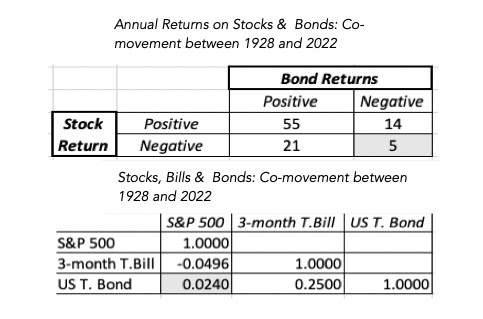
There were other measures on which the market set historical records, especially if you consider the co-performance of equity and bond markets. By themselves, stocks have had 26 negative return years in the last 95 years and, by themselves, bonds have had 19 negative returns over that period. That said, it is seldom that they have both delivered negative returns in the same year, as can be seen in the table below:
Over the 95-year period, there have been only five years where stocks and bonds have delivered negative returns in the same year, and of those five years, there has bee only one year where there were negative returns exceeding -10% in both markets, and that was 2022.
Investing is full of rules of thumb, and one of those rules that wealth managers have faithfully transmitted to their clients is the notion of a 60:40 mix in asset allocation, with 60% in stocks and 40% in bonds, backed up by the logic that this mix would deliver a more stable measure of returns over time. I will not take issue with that advice, though I find it far too rigid to work for all investor groupings, but in 2022, a 60:40 portfolio would have done little to insulate investors against risk, since stocks and bonds both delivered roughly the same returns (about -18%).
The Drivers of Interest Rates
It the question is why interest rates rose a lot in 2022, and if your answer to that question is the Fed, you have, in my view, lost the script. I know that in the last decade, it has become fashionable to attribute powers to the Fed that it does not have and view it as the ultimate arbiter of rates. That view has never made sense, because central banking power over rates is at the margin, and the key fundamental drivers of rates are expected inflation and real growth.
To immunize yourself against the Fed story, start with his graph, where I look at T.Bond rates over time, and compare them to what I term an intrinsic risk free rate, a simplistic measure obtained by adding the actual inflation rate each year to real GDP growth that year, in the US:
The mythology that it was that the Fed that kept rates low in the last decade (2011-2020) with quantitative easing and other rate gymnastics is quickly dispelled by this graph. It was the combination of low inflation and anemic growth that was at the heart of low rates, though the Fed did influence rates at the margin, perhaps pushing them down below their intrinsic levels with its machinations. As inflation has surged in the last two years, treasury bond rates have climbed, albeit at a much slower pace than inflation. That can be explained by the simple truth that it is expected inflation that is incorporated into interest rates, not actual inflation, and that expected inflation has been slow to change in the face of the inflation surprises of the last two years. In the graph below, I present one measure of expected inflation, obtained by taking the difference between the ten-year T.Bond rate and ten-year TIPs (inflation-protected treasury rate):
This "market-imputed" inflation rate has leveled out between 2-2.5% in 2022, higher than the 1- 1.5% imputed inflation of the prior decade.
If you still insist claiming that the Fed sets interest rates, it is time to face up to reality. There is no "interest rate room" in the Fed, where the Fed chair or FOMC committee, move the levers to set treasury or mortgage rates. The only rate that the Fed does set is the Fed Funds rate, and it is true that you have seen that rate jump from close to zero to just above 4% in 2022. Before you feel the urge to say "I told you so", take a look at US treasury rates (3-month and 10-year) on this graph, in relation to the Fed Funds rate, and make your own judgment on whether the rates climb after the Fed hikes the Fed Funds rate (which would you be your working hypothesis if the Fed sets rates) or if the Fed hikes rates in response to market rates going up:
You may come to a different conclusion that I do, but to me, it seems clear that the Fed (and other central banks) are following the market, not leading it, and that inflation is driving both. Just as a thought experiment, consider a world where there was no central bank or Fed, and ask yourself what would have happened to treasury bond rates in 2022, with the inflation news that was hitting markets. I will wager that you would have seen rates go up, with or without the Fed.
I do think that the Fed and other Central Banks, in the aftermath of the 2008 crisis, overcorrected and misread their mission as keeping economies afloat and financial markets booming, and in the process, they gave risk capital a false sense that it could take huge risks, without demanding sufficient premiums, and come in for soft landings. Much as we bemoan our portfolio performance during 2022, the market developments of the year are, on balance, healthy insofar as they bring risk capital back to earth. That said, I think that the fixation with the Fed is both unhealthy and counter productive. It has not only made investors passive bystanders in the great interest rate resetting, but has also given poorly performing active investors, individual and institutional, an easy excuse for their underperformance.
Corporate Bonds: Risk Plus!
As treasury bonds went on their roller coaster ride in 2022, corporate bonds could not escape the excitement, first because the rising rates on treasuries transmitted into rising corporate bond rates, and second, because default spreads, i.e., the added premium added to treasury rates when lending to riskier entities also exploded during the year.
Default Risk and Spreads
There is default risk, when companies borrow either from banks or by issuing bonds, and lenders try, sometimes well and sometimes badly, to incorporate that default risk when setting interest rates on bonds. Thus, at least in the corporate bond market, the default spread(s) become the market price of risk or risk premium for debt markets. To set the stage for what 2022 delivered in this market, it is worth noting that default spreads have been low for much of the last decade, and after a brief bout of fear in the first half of 2020, when COVID hit, approached historical lows in 2021. In short, lenders (banks and bond investors) seemed to have decided that the risk of corporate defaults had dropped and priced bonds accordingly. In 2022, that perception changed and corporate default spreads moved up during of the year:
Note again that the increase in spreads diverged across the ratings classes, in 2022, nudging up only a little across the highest ratings classes (AAA, AA), but jumping dramatically in the lower ratings (BB and below). While we have seen other years, such as 2008, where default spreads have spiked, the effect on corporate bond rates in 2022 was exaggerated by the increase in treasury rates that we pointed to in the last section. Thus, a company with an investment-grade rating (say BBB), that issued ten-year bonds would have seen the interest rate on these bonds spike from 2.71% at the start of 2022 to 5.60% at the start of 2023.
As with treasury rates, the best way to see how increasing rates affect investors is to estimate the return that investors in corporate bonds would have made, as corporate bonds rates doubled or more, during the year:
For simplicity, I have assumed annual rather than semi-annual coupons and for consistency, I have kept the maturity of the bond constant at ten years rather than drop it to nine years, after a year.
The return on a ten-year, Baa corporate bond in 2022, with the price change included would have been -23.99% in nominal terms and -31.12% in real terms, making it the worst year in at least my version of recorded history (1928- 2022) for the corporate bond market. The carnage clearly gets worse as you move to high yield bonds, where rising rates pushed down the prices of some of these bonds by 50% or more. Note that all of these calculations keep the bond rating for the company intact, as you move through 2022, but higher inflation and concerns about the economy caused some companies to be downgraded, exacerbating the damage.
Consequences for Companies
In my second post, from a little more a week ago, on my data updates for 2023, I noted that rising riskfree rates and equity risk premiums have pushed up the costs of equity for companies significantly in 2022. As the discussion in the last section should make clear, those rising rates were not restricted to equity, but also to debt, as companies ended 2023 with significantly higher costs of debt than at the start of the year. Bringing in the changes in both components, debt and equity, into the assessment, we computed the costs of capital for US and global companies in US dollar terms, in the graph below:
Just as a comparison, take a look at the equivalent table from the start of 2022:
The cost of capital for a median US (global) company rose from 5.77% (6.33%) at the start of 2022 to 9.63% (10.60%) at the start of 2023. To understand the implications of a rising cost of capital, it is worth remembering that the cost of capital is the Swiss Army knife of corporate finance, affecting almost every decision within a business, and in the graph below, I look at the implications:
Higher costs of capital, in addition to making it more difficult for companies to find new investments (projects, acquisitions), also have unpredictable effects on the mix of debt and equity used in funding (with the effect depending on whether the equity risk premiums rise more or less than default spreads) and increase the propensity of companies to return cash.
Interest Rates in 2023: Playing Prognosticator
Now that 2022 is behind us, the question that you undoubtedly have is where rates are going in 2023, and as with equity returns, I will argue that it rests almost entirely on how inflation evolves over the course of the year. If inflation stays stubbornly high, rates will stay high as well, and inflation drops precipitously, expect rates to follow them down. On the corporate bond front, the real economy will come into play. If the economy weakens, and that weakness plays out as lower earnings, there will be defaults, as companies that borrowed to the hilt, when rates were low, will now find themselves facing higher interest payments on that debt, that they may not be able to make. That will keep default spreads high, and keep corporate bond rates at their elevated levels. If the economy manages to dodge a recession, there is a strong chance that default spreads will start to drift down, especially in the low-inflation scenario,
Borrowing on the inflation/economy matrix that I used in my post on equities, here is how I see the combination of inflation and the real economy playing out in interest rates.
The Fed will spend the entire year chasing market interest rates, and market experts will spend their time watching the Federal Open Market Committee, and telling the rest of us that it is the Fed that is in charge of where rates go next. As in my assessment of equities, I believe that the Fed will add more smoke than fire to this mix, and my advice to you would be to sleep through every FOMC meeting this year and focus instead on the numbers on inflation and the real economy.