Happy New Year, and I hope that 2022 brings you good tidings! To start the year, I returned to a ritual that I have practiced for thirty years, and that is to take a look at not just market changes over the last year, but also to get measures of the financial standing and practices of companies around the world. Those measures took a beating in 2020, as COVID decimated the earnings of companies in many sectors and regions of the world, and while 2021 was a return to some degree of normalcy, there is still damage that has to be worked through. This post will be one of a series, where I will put different aspects of financial data under the microscope, to get a sense of how companies are adapting (or not) to a changing world.
The Moneyball Question
When I first started posting data on my website for public consumption, it was designed to encourage corporate financial analysts and investors alike to use more data in their decision making. In making that pitch, I drew on one of my favorite movies, Moneyball, which told the story of Billy Beane (played by Brad Pitt), the general manager of the Oakland As, revolutionized baseball by using data as an antidote to the gut feeling and intuition of old-time baseball scouts.
In the years since Beane tried it with baseball, Moneyball has decisively won the battle for sporting executives' minds, as sport after sport has adopted its adage of trusting the data, with basketball, football, soccer and even cricket adopting sabermetrics, as this sporting spin off on data science is called. Not surprisingly, Moneyball has found its way into business and investing as well. In the last decade, as tech companies have expanded their reach into our personal lives, collecting information on choices and decisions that used to private, big data has become not just a buzzword, but also a justification for investing billions in companies/projects that have no discernible pathway to profitability, but offer access to data. Along the way, we have all also bought into the notion of crowd wisdom, where aggregating the choices of tens of thousands of choice-makers, no matter how naive, yields a consensus that beats expert opinion. After all, we get our restaurant choices from Yelp reviews, our movie recommendations from Rotten Tomatoes, and we have even built crypto currencies around the notion of crowd-checking transactions.
Don't get me wrong! I was a believer in big data and crowd wisdom, well before those terms were even invented. After all, I have lived much of my professional life in financial markets, where we have always had access to lots of data and market prices are set by crowds of investors. That said, it is my experience with markets that has also made me skeptical about the over selling of both notions, since we have an entire branch of finance (behavioral finance/economics) that has developed to explain how more data does not always lead to better decisions and why crowds can often be collectively wrong. As you use my data, I would suggest four caveats to keep in mind, if you find yourself trusting the data too much:
More data is not always better than less data: In a post from a few months ago, I argued that we as investors and analysts) were drowning in data, and that data overload is now a more more imminent danger than not have enough data. I argued that disclosure requirements needed to be refined and that a key skill that analysts will need for the future is the capacity to differentiate between data and information, and materiality from distraction.
Data does not always provide direction: As you work with data, you discover that its messages are almost always muddled, and that estimates always come with ranges and standard errors. In short, the key discipline that you need to tame and use data is statistics, and it is one reason that I created my own quirky version of a statistics class on my website.
Mean Reversion works, until it does not: Much of investing over the last century in the US has been built on betting on mean reversion, i.e. that things revert back to historical norms, sooner rather than later. After all, the key driver of investment success from investing in low PE ratio stocks comes from their reverting back towards the average PE, and the biggest driver of the Shiller PE as a market timing device is the idea that there is a normal range for PE ratios. While mean reversion is a strong force in stable markets, as the US was for much of the last century, it breaks down when there are structural changes in markets and economies, as I argued in this post.
The consensus can be wrong: A few months ago, I made the mistake of watching Moneyheist, a show on Netflix, based upon its high audience ratings on Rotten Tomatoes, and as I wasted hours on this abysmal show, I got a reminder that crowds can be wrong, and sometimes woefully so. As you look at the industry averages I report on corporate finance statistics, from debt ratios to dividend yields, remember that just because every company in a sector borrows a lot, it does not mean that high debt ratios make sense, and if you are using my industry averages on pricing multiples, the fact that investors are paying high multiples of revenues for cloud companies does not imply that the high pricing is justified.
In short, and at the risk of stating the obvious, having access to data is a benefit but it is not a panacea to every problem. Sometimes, less is more!
The Company Sample for 2022
When I first started my data collection and analysis in 1990, data was difficult to come by, and when available, it was expensive. Without hundreds of thousands of dollars to spend on databases, I started my journey spending about a thousand dollars a year, already hitting budget constraints, subscribing to a Value Line database that was mailed to me on a CD every year. That database covered just 1700 US companies, and reported on a limited list of variables on each, which I sliced and diced to report on about a dozen variables, broken down by industry. Times have changed, and I now have access to extraordinarily detailed data on almost all publicly traded global companies. I am grateful to all the services that provide me with raw data, but I am cognizant that they are businesses that make money from selling data, and I try not to undercut them, or act as a competitor. That is why almost every variable that you will see me reporting on my website represents a computation or estimate of mine, albeit with raw data from a provider, rather than a regurgitation of data from a service. It is also why I report only aggregated data on industries, rather than company-level data.
Regional Breakdown
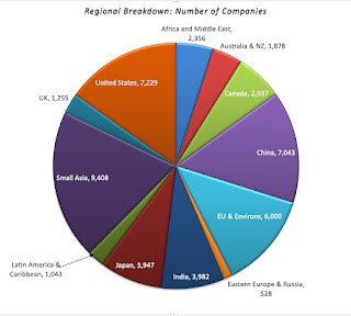
My data sample for 2022 includes every publicly traded firm that is traded anywhere in the world, with a market capitalization that exceeds zero. That broad sweep yields a total of 47,606 firms, spread across 135 countries and every continent in the world:
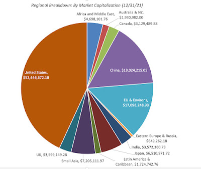
The largest slice is Small Asia, where small has to be read in relative terms, since it includes all of Asia, except for India, China and Japan, with 9,408 firms. It is followed by the United States, with 7,229 firms, and then China (including Hong Kong listings), with 7.043 firms. Since many of these firms have small market capitalizations, with some trading at market caps of well below $10 million, the chart below looks at the breakdown of the sample in market capitalization:
The market capitalization breakdown changes the calculus, with the US dominating with $52 trillion in collective market cap, more than 40% of the overall global value, followed by China with $19 trillion in aggregate market capitalization.
Sector/Industry Breakdown
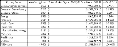
The most useful way to categorize these 47,606 companies is by industry groupings, but that process does raise thorny questions about what industry groupings to use, and where to put firms that are not easily classifiable. To illustrate, what business would you put Apple, a company that was categorized (rightly) as a computer hardware company 40 years ago, but that now gets more than 60% of its revenues and profits from the iPhone, a telecommunication device that is also a hub for entertainment and services? I started my classification with a very broad grouping, based upon S&P's sector classes:
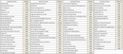
This should not come as a surprise, especially given their success in markets over the last decade, but technology is the largest sector, accounting for 19.22% of global market capitalization, though industrials account for the largest number of publicly traded firms. One sector to note is energy, which at 4.86% of global market capitalization at the start of 2022, has seen its share of the market drop by roughly half over the last decade. Addressing the legitimate critique that sector classifications are too broad, I created 94 industry groupings for the companies, drawing on the original classifications that I used for my Value Line data thirty years ago (to allow for historical comparisons) and S&P's industry list. The table below lists my industry groups, with the number of companies in each one:
I am sure that some of you will find even these industry groupings to be over-broad, but I had to make a compromise between having too many groupings, with not enough firms in each one, and too few. It also required that I make judgment calls on where to put individual firms, and some of those calls are debatable, but I feel comfortable that my final groups are representative.
The Data Variables
When I first started reporting data, I had only a dozen variables in my datasets. Over time, that list has grown, and now includes more than a hundred variables. A few of these variables are macro variables, but only those that I find useful in corporate finance and valuation, and not easily accessible in public data bases. Most of the variables that I report are micro variables, relating to company choices on investing, financing and dividend policies, or to data that may be needed to value these companies.
Macro Data
If your end game is obtaining macroeconomic data, there are plenty of free databases that provide this information today. My favorite is the one maintained by the Federal Reserve in St. Louis, FRED, which contains historical data on almost every macroeconomic variable, at least for the US. Rather than replicate that data, my macroeconomic datasets relate to four key variables that I use in corporate finance and valuation.
Risk Premiums: You cannot make informed financial decisions, without having measures of the price of risk in markets, and I report my estimates for these values for both debt and equity markets. For debt markets, it takes the form of default spreads, and I report the latest estimates of these corporate bond spreads at this link. In the equity market, the price of risk (equity risk premium) is more difficult to observe, and I start by reporting on the conventional estimate of this measure by looking at historical returns (going back to 1928) on stocks, bonds, bills and real estate at this link. I offer an alternative forward-looking and more dynamic measure of this premium in an implied premium, with the start of 2022 estimate here and the historical values (going back to 1960) of this implied premium here.
Risk free Rates: While the US treasury bond rate is widely reported, I contrast its actual value with what I call an intrinsic measure of the rate, computed by adding the inflation rate to real growth each year at this link.
Currency and Country Risk: Since valuation often requires comfort with moving across currencies, I provide estimates of risk free rates in different currencies at this link. I extend my equity risk premium approach to cover other countries, using sovereign default spreads as my starting point, at this link.
Tax Rates: Since the old saying about death and taxes is true, I report on marginal tax rates in different countries at this link, and while I would love to claim that I did the hard work, the credit belongs to KPMG for keeping this data updated over time.
I do update my equity risk premiums for the US at the start of every month on my website, and the country equity risk premiums once every six months.
Micro Data
I am not interested in reported financial ratios, just for the sake of reporting them, and my focus is therefore on those statistics that I use in corporate finance and valuation. You may find my choices to be off putting, but you could combine my reported data to create your own. For example, I believe that return on assets, an accounting ratio obtained by dividing net income by total assets, is an inconsistent abomination, leading to absurd conclusions, and I refuse to report it, but I do report returns on invested capital and equity.
Rather than just list out the variables that I provide data on, I have classified them into groups in the table below:
With each of these variables, I report industry averages for all companies globally, as well as regional averages for five groups: (a) US, (b) EU, UK and Switzerland, (c) Emerging Markets, (d) Japan and (e) Australia, NZ and Canada. Since the emerging market grouping is so large (representing more than half my sample) and diverse (across every continent), I break out India and China as separate sub-groups. You can find the data to download on my website, at this link.
Data Timing and Timeliness
Almost all of the data that you will see in my updates reflects data that I have collected in the last week (January 1, 2022- January 8, 2022. That said, there will be difference in timeliness on different data variables, largely based upon whether the data comes from the market or from financial statements.
For data that comes from the market, such as market capitalization and costs of capital, the current data is as of January 1, 2022.
For data that comes from financial statements, the numbers that I use come from the most recent filings, which for most companies will be data through September 30, 2021.
Thus, my trailing PE ratio for January 1, 2022, is computed by dividing the market capitalization on January 1, 2022, by the earnings in the twelve months ending in September 2021. While that may seem inconsistent, it is consistent with the reality that you, as an investor or analyst, use the most current data that you can get for each variable. As we go through the year, both the market and the accounting numbers will change, and a full-fledged data service would recompute and update the numbers. I am not, and have no desire to be, a data service, and will not be updating until the start of 2023. Thus, there are two potential dangers in using my data later in the year, with the first emerging if the market sees a steep shift, up or down, which will alter all of the pricing multiples, and the second occurring in sectors that are either transforming quickly (disrupted sectors) or are commodity-based (where changes in commodity prices can alter financials quickly).
Estimation Choices
When I embarked on the task of estimating industry averages, I must confess that I did not think much of the mechanics of how to compute those averages, assuming that all I would have to do is take the mean of a series of numbers. I realized very quickly that computing industry averages for pricing and accounting ratios was not that simple. To illustrate why, I present you with a slice of my table of PE ratios, by industry grouping, for US firms, the start of 2022:
Take the broadcasting group, just as an illustration, where there were 29 firms in my US sample. The three columns with PE ratios (current, trailing and forward) represent simple averages, but these case be skewed for two reasons. The first is the presence of outliers, since PE ratios can be absurdly high numbers (as is the case with auto & truck companies), and can pull the averages up. The second is the bias created by removing firms with negative earnings, and thus no meaningful PE ratio, from the sample. The last two columns represent my attempts to get around these problems. In the second to last column, I compute an aggregated PE ratio, by taking the total market capitalization of all firms in the group and dividing by the total earnings of all firms in the group, including money losers. In effect, this computes a number that is close to a weighted average that includes all firms in the group, but if a lot of firms are money-losers, this estimate of the PE ratio will be high. To see that effect, I compute an aggregated PE ratio, using only money-making firms, in the last column. You may look at the range of values for PE ratios, from 7.05 to 24.99 for broadcasting firms, and decide that I am trying to confuse the issue, but I am not. It is the basis for why I take all arguments that are based upon average PE ratios with a grain of salt, since the average that an analyst uses will reflect the biases they bring to their sales pitches.
The other issue that I had to confront, especially because my large sample includes many small companies, listed and traded in markets with information disclosure holes, is whether to restrict my sample to markets like the US and Europe, where information is more dependable and complete, or to stay with my larger sample. The problem with doing the former is that you create bias in your statistics by removing smaller and risker firms from your sample, and I chose to have my cake and eat it too, by keeping all publicly traded firms in my global sample, but also reporting the averages for US and European firms separately.
Using the Data
I report the data on my website, because I want it to be used. So, if you decide that some of the data is useful to you, in your investing or analysis, you are welcome to use it, and you don't have to ask for permission. If you find errors in the data, please let me know, and I will fix it. If you are looking for a variable that I do not compute, or need an average for a region that I don't report separately on (say Brazil or Indonesia), please understand that I cannot meet customized data requests. I am a solo operator, with other fish to fry, and there is no team at my disposal. As I mention in my website, this data is meant for real time analysis for those in corporate finance and valuation. It is not designed to be a research database, though I do have archived data on most of the variables going back in time, and you may be able to create a database of your own. If you do use the data, I would ask only three things of you:
Understand the data: I have tried my best to describe how I compute my numbers in the spreadsheets that contain the data, in worksheets titled "Variables and FAQ". On some of the variables, especially on equity risk premiums, you may want to read the papers that I have, where I explain my reasoning, or watch my classes on them. Whatever you do, and this is general advice, never use data from an external source (including mine), if you do not understand how the data is computed.
Take ownership: If you decide to use any of my data, especially in corporate financial analysis and valuation, please recognize that it is still your analysis or valuation.
Don't bring me into your disagreements, especially in legal settings: If you are in disagreement with a colleague, a client or an adversary, I am okay with you using data from my website to buttress your arguments, but please do not bring me in personally into your disputes. This applies in spades, if you are in a legal setting, since I believe that courts are where valuation first principles go to die.
Conclusion
I would love to tell you that I am driven by altruistic motives in sharing my data, and push for sainthood, but I am not. I would have produced all of the data that you see anyway, because I will need it for my work, both in teaching and in practice, all year. Having produced the data, it seems churlish to not share it, especially since it costs me absolutely nothing to do so. If there is a hidden agenda here, it is that I think that in spite of advances over the last few decades, the investing world still has imbalances, especially on data access, and I would like it make a little flatter. Thus, if you find the data useful, I am glad, and rather than thank me, please pass on the sharing.
Investors are constantly in search of a single metric that will tell them whether a market is under or over valued, and consequently whether they should buying or selling holdings in that market. With equities, the metric that has been in use the longest is the PE ratio, modified in recent years to the CAPE, where earnings are normalized (by averaging over time) and sometimes adjusted for inflation. That metric, though, has been signaling that stocks are over valued for most of the last decade, a ten-year period when stocks delivered blockbuster returns. The failures of the signal have been variously attributed to low interest rates, accounting mis-measurement of earnings (especially at tech companies), and by some, to animal spirits. In this post, I offer an alternative, albeit a more complicated, metric that I believe offers not only a more comprehensive measure of pricing, but also operates as a barometer of the ups and downs in the market.
The Price of Risk
The price of risk is what investors demand as a premium, an extra return over and above what they can make on a guaranteed investment (risk free), to invest in a risky asset. Note that this price is set by demand and supply and will reflect everything that investors collectively believe, hope for, and fear.
Does the price of risk have to be positive? The answer depends on whether human beings are risk averse or not. If they are, the price of risk will be reflected in a positive premium, and the level of the premium will increase, as investors become more risk averse. If, on the other hand, investors are risk neutral, the price of risk will be zero, and investors will buy risky business, stocks and other investments, and settle for the risk free rate as the expected return.
Note that nothing that I have said so far is premised on modern portfolio theory, or any academic view of risk premiums. It is true that economists have researched risk aversion for centuries and concluded that investors are collectively risk averse, and that the level of risk aversion varies across age groups, income levels and time. Some have developed models that try to measure what a fair risk premium should be, but to arrive at their conclusions, they have make assumptions about investor utility functions that are often unobservable and untestable. I have no desire to make this a lengthy treatise about the "right" risk premium, but will instead start with two assertions:
Risk premiums can be estimated: You can back out the risk premiums that investors are demanding from the prices that they pay for risky assets. Put simply, if you can observe the price that an investor pays for a risky asset, and are willing to estimate the expected cash flows on that asset, you can estimate the expected return on that asset and net out the risk free asset to arrive at a risk premium. It is true that you can make mistakes on your expected cash flows, but your output should reflect an estimate, albeit a noisy one, of what investors are demanding as a premium.
Risk premiums can and will change over time: Risk premiums are driven by risk aversion, and risk aversion itself can change over time. In fact, greed and fear, two big drivers of market prices, also affect risk aversion, with investors becoming more risk averse and charging higher premiums, when the fear factor becomes dominant.
When risk premiums change, prices will move: As risk premiums change, the prices that investors are willing to pay for risky assets will also change, with the two moving in opposite directions. Intuitively, if you want to earn a higher risk premium on an investment, holding cash flows fixed, you will pay less for that investment today.
The Price of Risk: Bond Market
All bonds, including those with guaranteed coupons, are risky, if you define risk as prices being volatile, since as interest rates changes, bond prices will change as well. Most bonds, though, are exposed to a second risk, which is that the bond issuer can default on coupon payments, making returns and prices even more uncertain. This is why corporate bonds are riskier than sovereign bonds, and sovereign bonds issued by shakier governments are riskier than sovereign bonds issued by governments that are unlikely to default.
Bond Default Spread
If you accept the proposition that a bond with default risk is riskier than an otherwise equivalent bond (same coupon and maturity) issued by a default-free entity, the price of risk in the bond market can be measured by looking at the differences in yields between the two bonds. Thus, if a 10-year corporate bond has a yield of 3.00% and a 10-year government bond, in the same currency and with no default risk, has a yield of 1.00%, the difference is termed the default spread and becomes a measure of the price of risk in the bond market.
At the risk of belaboring the details, it is not the yield that we should be comparing, but the yield to maturity, which is the internal rate of return on the bond, given how it is priced:
To compute the default spread over a 10-year period for a specific corporate bond (or loan), you would compute the yields to maturity on the ten-year corporate and treasury bonds and take the difference. Note that even this comparison is an approximation, but it yields a close enough value to work, and that it yields a default spread for a specific maturity. You could compute default spreads for other maturities, and compute the price of risk over 1-year, 2-year, 3-year periods and so on.
Corporate Default Spreads: Current and Look Back at 2020
Corporate bonds are traded, and as a consequence, and you can use traded prices to estimate default spreads in the market. In the chart below, I compare default spreads at the start of 2021 with the default spreads at the start of 2020:
Source: BofA ML Spreads on Federal Reserve (FRED)
At first sight, it looks like an uneventful year, with spreads in 2021 mildly higher than spreads in 2020, but that comparison is deceptive, since default spreads went on a roller-coaster ride during 2020:
Source: BofA ML Spreads on Federal Reserve (FRED)
While spreads started 2020 in serene fashion, the COVID-driven market crisis caused them to widen dramatically between February 14 and March 20, with the spreads almost tripling for lower rated bonds. Given the worries about default and a full-fledged market meltdown, that was not surprising, but what is surprising is how quickly the fear factor faded and spreads returned almost to pre-crisis levels.
Measuring against the past
Are default spreads today too low? There are two ways to answer that question. One is to look at their movement over time, and compare current spreads to historic norms.
Source: BofA ML Spreads on Federal Reserve (FRED)
The default spreads at the end of 2020 are at the low end of the historical spectrum, and the contrast with the 2008 crisis is stark, since default spread surged in the last quarter of 2008 and did not come back down to pre-crisis levels until almost two years later. The other is to look at corporate defaults over time to see if markets are building in enough of a buffer against future defaults.
Sources: S&P and Moody's
Default rates increased in 2020, with spillover effects expected into 2021, but the corporate bond default spreads do not seem to reflect this. One explanation is that the bond market beliefs that the worst of the crisis is over and that default rates will return quickly to pre-COVID levels. The other is the corporate bond market is under estimating both the risk and the consequences of default.
The Price of Risk: Equities
Equities are riskier than bonds (or at least most bonds), and it stands to reason that there is a price of risk bearing in the equity markets. While that price has a name, i.e., the equity risk premium, it is more difficult to observe and estimate than the default spread in bond markets. In this section, I will present both the standard approach to estimating the equity risk premium and my preferred way of doing so, with a rationale for why.
Estimation Approaches
Why is it so difficult to estimate an equity risk premium? The simple reason is that unlike a bond, which comes with specified coupons, the cash flows that you receive when you buy stocks are neither pre-specified nor guaranteed. It is true that some companies pay dividends, and that these dividends are sticky, but it is also true that companies are under no contractual obligation to continue paying those same dividends. This difficulty in observing the equity risk premium leads many to look backwards, when asked to estimate the equity risk premium. Put simply they look at a long time period in the past (50 years or even 100 years) and look at the premium that stocks earned over a risk free investment (treasury bills or bonds); that historical risk premium then gets used as a measure of the current equity risk premium. On my website, I update this historical risk premium every year, and the graph below reflects my January 2021 findings:
Looking over a 92-year time period (1928-2020), for instance, stocks earned an geometric average return of 9.79%, giving them a premium of 4.84% over the 4.95% that you would have earned, investing in treasury bonds. If you buy into this measure of equity risk premiums, consider its limitations. First, it is backward looking and built on the presumption that the future will look like the past. Second, even if you trust mean reversion, note that the estimated premium is not a fact but an estimate, with a wide range around it. Specifically, the estimate of 4.84% for the equity risk premium from 1928 to 2020 comes with a standard error of 2.1%; the true ERP, with this error, could fall anywhere from 0.64% to 9.04%. Third, this premium is static and does not reflect market crises and investor fears; thus, the historical risk premium on February 14, 2020 would have very similar to the historical risk premium on March 20, 2020.
The alternative approach to estimating equity risk premiums is revolutionary and it borrows from the yield to maturity approach that we used to estimate bond default spreads. Consider replacing the bond price with the level of stock prices today (say, with the S&P 500 index) and coupons with expected cash flows on stocks (from dividends and buybacks), and solve for an internal rate of return:
Implied Equity Risk Premium: In General
The internal rate of return is the expected return on stocks, and netting out the risk free rate today will yield an implied equity risk premium. In the picture below, I use this process to estimate an equity risk premium of 4.72% for the S&P 500 on January 1, 2021:
It is true that my estimates of earnings and cash flows in the future are driving my premium, and that the premium will be lower (higher) if I have under (over) estimated those numbers. This approach to estimating equity risk premiums is forward-looking and dynamic, changing as the market price changes. In the graph below, I report implied equity risk premiums that I computed, by day, during 2020, in an effort to gauge how the crisis was playing out and keep my sanity.
As with the bond default spread, the implied equity risk premium was extraordinarily volatile in 2020, peaking at 7.75% on March 20, before falling back to pre-crisis levels by the end of the year.
Market Gauge?
As we are engulfed by talk of market bubbles and corrections, it is worth nothing that any question about the overall market can really be reframed as a question about the implied equity risk premium. If you believe that the current implied equity risk premium is too low, you are in effect also saying that stocks are overvalued, just as a judgment that the equity risk premium is too high is equivalent to arguing that stocks are undervalued. So, at 4.72%, is the equity risk premium too low and is the market in a bubble? One way to pass judgment is to compare the current premium to implied equity risk premiums in the past:
On this comparison, stocks don't look significantly over valued, since the current premium is higher than the long term average (4.21%), though if you compare it to the equity risk premium in the last decade (5.53%), it looks low, and that stocks are over valued by about 15%. There is a caveat, though, which is that this risk premium is being earned on a risk free rate that is historically low. Consider this alternative graph, where I look at the expected return on stocks (risk free rate plus implied equity risk premium) over the same time period:
For much of this century, the expected return on stocks has hovered around 8%, but the expected return at the start of 2021 is only 5.65%, well below the expected returns in prior periods.
A Market Assessment
I know that you are probably incredibly confused, and I am afraid that I cannot clear up all of that confusion, but this framework lends itself to valuing the entire market. To do this, you have to be willing to make estimates of:
Earnings on the index: You cannot value a market based upon last year's earnings (though many do so). Investing is about the future, and uncomfortable as it may make you feel, you have to make estimates for the future. With an index like the S&P 500, you can outsource these estimates at least for the near years, by looking at consensus forecasts from analysts tracking the index.
Cash returned, relative to earnings: Since it is cash returned to stockholders that drives value, you also have to make judgments on what percent of earnings will be returned to stockholders, either in dividends or buybacks. To this, you can look to history, but recognize that it is also a function of the confidence that companies have about the future, with more confidence leading to higher cash being returned.
Risk free rates over time: While it is generally not a good idea to play interest rate forecaster, we are in unusual times, with rates close to all time lows. In addition, your views on future growth in the economy are intertwined with what will happen to risk free rates, with stronger economic growth putting more upward pressure on rates.
An acceptable ERP: As I noted in the last section, equity risk premiums have been volatile over time, and particularly so in years in 2020. The equity risk premium, added to the risk free rate, will determine what you need stock returns to be, to break even on a risk-adjusted basis.
It is only fair that I go first. In the picture below, I make my best judgments on each of these dimensions, using consensus estimates of earnings in 2021 and 2022 to get started, but then slowing growth in earnings to match the growth rate in the economy, which I approximate with the risk free rate. On the risk free rate, I assume that rates will rise over time to 2%, and that 5% is a fair ERP, given history. My valuation is below:
Based upon my inputs, the S&P 500 is over valued by about 12%, certainly not bubble territory, but still richly priced. You may (and should) disagree with my assumptions, and I welcome you to download the spreadsheet and change the inputs. Ultimately though, the judgment you make on the market will be a joint effect of your views on the economy and interest rates in the next few years. The table below summarizes the interplay between economic growth and interest rate assumptions, and the effects on the index value:
As you can see, there are far more bad possible outcomes than good ones, and the only scenario where stocks have significant room to rise is the Goldilocks market, where rates stay low (at close to 1%), while the economy comes back strongly. I know that the possibility of additional economic stimulus may improve the odds for the economy, but can they do so without affecting rates? To buy into that scenario, you have to belief that the Fed has the power to keep rates low, no matter what happens to the economy, and I don't share that faith.
As many of you who have read my blog posts know, I am a reluctant market timer, but ultimately we all time markets, implicitly or explicitly, the former wooing up in how much of your portfolio is in cash and the latter in more overt acts of either protection or bets on market directions. Going into 2021, I have far more cash in my portfolio than I usually do, and for the first time in a long, long time, I have bought partial protection against a market drop, using derivatives. It is insurance, and like all insurance, my best case scenario is that I never need to use it, but it reflects my wariness about what comes next. I am not and don't want to be in the business of doling out investment advice, and I think that the healthiest pathway for you is to make your own judgments on interest rates, earnings growth and acceptable risk premiums, and follow that with consistent actions.
In my last post, I looked at the risk premiums in US markets, and you may have found that focus to be a little parochial, since as an investor, you could invest in Europe, Asia, Africa or Latin America, if you believed that you would receive a better risk-return trade off. For some investors, in countries with investment restrictions, the only investment options are domestic, and US investment options may not be within their reach. In this post, I will address country risk, and how it affects investment decisions not only on the part of individual investors but also of companies, and then look at the currency question, which is often mixed in with country risk, but has a very different set of fundamentals and consequences.
Country Risk
There should be little debate that investing or operating in some countries will expose you to more risk than in other countries, for a number of reasons, ranging from politics to economics to location. As globalization pushes investors and companies to look outside of their domestic markets, they find themselves drawn to some of the riskiest parts of the world because that is where their growth lies.
Drivers and Determinants
In a post in early August 2019, I laid out in detail the sources of country risk. Specifically, I listed and provided measures of four ingredients:
Life Cycle: As companies go through the life cycle, their risk profiles changes with risk dampening as they mature. Countries go through their own version of the life cycle, with developed and more mature markets having more settled risk profiles than emerging economies which are still growing, changing and generally more risky. High growth economies tend to also have higher volatility in growth than low growth economies.
Political Risk: A political structure that is unstable adds to economic risk, by making regulatory and tax law volatile, and adding unpredictable costs to businesses. While there are some investors and businesses that believe autocracies and dictatorships offer more stability than democracies, I would argue for nuance. I believe that autocracies do offer more temporal stability but they are also more exposed to more jarring, discontinuous change.
Legal Risk: Businesses and investments are heavily dependent on legal systems that enforce contracts and ownership rights. Countries with dysfunctional legal systems will create more risk for investors than countries where the legal systems works well and in a timely fashion.
Economic Structure: Some countries have more risk exposure simply because they are overly dependent on an industry or commodity for their prosperity, and an industry downturn or a commodity price drop can send their economies into a tailspin. Any businesses that operate in these countries are consequently exposed to this volatility.
The bottom line, if you consider all four of these risks, is that some countries are riskier than others, and it behooves us to factor this risk in, when investing in these countries, either directly as a business or indirectly as an investor in that business.
Measures
If you accept the proposition that some countries are riskier than others, the next step is measuring this country risk and there are three ways you can approach the task:
a. Country Risk Scores: There are services that measure country risk with scores, trying to capture exposure to all of the risks listed above. The scores are subjective judgments and are not quite comparable across services, because each service scales risk differently. The World Bank provides an array of governance indicators (from corruption to political stability) for 214 countries (https://databank.worldbank.org/source/worldwide-governance-indicators#) , whereas Political Risk Services (PRS) measures a composite risk score for each country, with low (high) scores corresponding to high (low) country risk.
b. Default Risk: The most widely accessible measure of country risk markets in financial markets is country default risk, measured with a sovereign rating by Moody’s, S&P and other ratings agencies for about 140 countries and a market-based measure (Sovereign CDS) for about 72 countries. The picture below provides sovereign ratings and sovereign CDS spreads across the globe at the start of 2020:
c. Equity Risk: While there are some who use the country default spreads as proxies for additional equity risk in countries, I scale up the default spread for the higher risk in equities, using the ratio of volatility in an emerging market equity index to an emerging market bond index to estimate the added risk premium for countries:
Note that the base premium for a mature equity market at the start of 2020 is set to the implied equity risk premium of 5.20% that we estimated for the S&P 500 at the start of 2020. The picture below shows equity risk premiums, by country, at the start of 2020:
Looking back at these equity risk premiums for countries going back to 1992, and comparing the country ERP at the start of 2020 to my estimates at the start of 2019, you see a significant drop off, reflecting a decline in sovereign default spreads of about 20-25% across default classes in 2019 and a drop in the equity risk, relative to bonds.
Company Risk Exposure to Country Risk
The conventional practice in valuation, which seems to be ascribe to all countries incorporated and listed in a country, the country risk premium for that country, is both sloppy and wrong. A company’s risk comes from where and how it operates its businesses, not where it is incorporated and traded. A German company that manufactures its products in Poland and sells them in China is German only in name and is exposed to Polish and Chinese country risk. One reason that I estimate the equity risk premiums for as many countries as I need them in both valuation and corporate finance, even if every company I analyze is a US company.
Valuing Companies
If you accept my proposition that to value a company, you have to incorporate the risk of where it does business into the analysis, the equity risk premium that you use for a company should reflect where it operates. The open question is whether it is better to measure operating risk exposure with where a company generates its revenues, where its production is located or a mix of the two. For companies like Coca Cola, where the production costs are a fraction of revenues and moveable, I think it makes sense to use revenues. Using the company’s 2018-19 revenue breakdown, for instance, the equity risk premium for the country is:
For companies where production costs are higher and facilities are less moveable, your weights for countries should at least partially based on production. At the limit, with natural resource companies, the operating exposure should be based upon where it produces those resources. Thus, Aramco’s equity risk premium should be entirely based on Saudi Arabia’s, since it extracts all its oil there, but Royal Dutch’s will reflect its more diverse production base:
Put simply, the exposure to country risk does not come from where a company is incorporated or where it is traded, but from its operations.
Analyzing Projects/Investments
If equity risk premiums are a critical ingredient for valuation, they are just as important in corporate finance, determining what hurdle rates multinationals should use, when considering projects in foreign markets. With L’Oreal, for instance, a project for expansion in Brazil should carry the equity risk premium for Brazil, whereas a project in India should carry the Indian equity risk premium. The notion of a corporate cost of capital that you use on every project is both absurd and dangerous, and becomes even more so when you are in multiple businesses.
The Currency Effect
When the discussion turns to country risk, it almost always veers off into currency risk, with many conflating the two, in their discussions. While there are conditions where the two are correlated and draw from the same fundamentals, it is good to keep the two risks separate, since how you deal with them can also be very different.
Decoding Currencies: Interest Rates and Exchange Rates
When analyzing currencies, it is very easy to get distracted by experts with macro views, providing their forecasts with absolute certainty, and distractions galore, from governments keeping their currencies stronger or weaker and speculative trading. To get past this noise, I will draw on the intrinsic interest rate equation that I used in my last post to explain why interest rates in the United States have stayed low for the last decade,
Intrinsic Riskfree Rate = Inflation + Real GDP Growth
That identity can be used to both explain why interest rates vary across currencies as well as variation in exchange rates over time.
Risk free Rates
If you accept the proposition that the interest rate in a currency is the sum of the expected inflation in that currency and a real interest that stands in for real growth, it follows that risk free rates will vary across currencies. Getting those currency-specific risk rates can range from trivial (looking up a government bond rate) to difficult (where the government bond rate provides a starting point, but needs cleaning up) to complex (where you have to construct a risk free rate out of what seems like thin air).
1. Government Bond Rates
There are a few dozen governments that issue ten-year bonds in their local currencies, and the search for risk free rates starts there. To the extent that these government bonds are liquid and you perceive no default risk in the government, you can use the government bond rate as your risk free rate. It is that rationale that we use to justify using the Swiss Government’s Swiss Franc 10-year rate as the risk free rate in Swiss Francs and the Norwegian government’s ten-year Krone rate as the riskfree rate in Krone. It is still the rationale, though you are likely to start to get some pushback, in using the US treasury bond rate as the risk free rate in dollars and the German 10-year Euro as the risk free rate in Euros. The pushback will come from some who argue that the US treasury can choose to default and that the German government does not really control the printing of the Euro and could default as well. While I can defend the practice of using the government bond rate as the risk free rate in these scenarios, arguing that you can use the Nigerian government’s Naira bond rate or the Brazilian government’s Reai bond rate as risk free is much more difficult to do. In fact, these are government’s where ratings agencies perceive significant risk even in the local currency bonds and attach ratings that reflect that risk. Moody’s rates Brazil’s local currency bonds at Ba2 and India’s local currency bonds at Baa2. In my pursuit of a risk free rate in currencies like these (where there is no Aaa-rated entity issung a bond), I compute a risk free rate by netting out the default spread:
Riskfree Rate in currency = Government bond rate – Default Spread for sovereign local-currency rating
Using this approach on the Indian rupee and the Brazilian reai,
Riskfree Rate in Rupees on January 1, 2020 = Indian Government Rupee Bond rate on January 1, 2020 – Default spread based on Baa2 rating = 6.56% - 1.59% = 4.95%
Riskfree Rate in Brazilian $R = Brazilian Government $R Bond rate on January 1, 2020 – Default spread based on Ba2 rating = 6.77% - 2.51% = 4.26%
Extending this approach to all countries where a local currency government bond is available, we get the following risk free rates:
Download spreadsheet
Note that these estimates are only as good as the three data inputs that go into them. First, the government bond rates reported have to reflect a traded and liquid bond, clearly not an issue with the US treasury or German Euro bond, but a stretch for the Zambian kwacha bond. Second, the local currency rating is a good measure of the default risk, a challenge when ratings agencies are biased or late in adjusting. Third, the default spread, given the ratings class, is estimated without bias and reflects the market at the time of the assessment.
2. Synthetic Risk free Rates
If you have doubts about one or more of three assumptions needed to use the government-bond approach to getting to risk free rates, don’t fear, because there is an alternative that I will call my synthetic risk free rate. To use this approach, let’s start with a currency in which you feel comfortable estimating a risk free rate, say the US dollar. If the key driver of risk free rates is expected inflation, the risk free rate in any other currency can be estimated using the differential inflation between that currency and the US dollar. In the short cut, you add the differential inflation to the US T.Bond rate to get a risk free rate:
Local Currency Risk free rate = US T.Bond Rate + (Inflation rate in local currency - Inflation rate in US dollars)
In the full calculation, you incorporate the compounding effects of the differential inflation
This approach can be used in almost any setting to estimate a local currency risk free rate, including the following:
Currencies with no government bonds outstanding: There are more than 120 currencies, where there are no government bonds in the local currency; the country borrows from banks and the IMF, not from markets. Without a government bond rate, the approach described above becomes moot.
Currencies where the government bond rate is not trustworthy: There are currencies where there is a government bond, with a rate, but an absence of liquidity and/or the presence of institutions being forced to buy the bond by the government that may make the rates untrustworthy. I don't mean to cast aspersions, but I seriously doubt that the Zambian Kwacha bond, whose rate I specified in the last section, has a deep or wide market.
Pegged Currencies: There are some currencies that have been pegged to the US dollar, either for convenience (much of the Middle East) or stability (Ecuador). While analysts in these markets often use the US T.Bond rate as the risk free rate, there is a very real danger that what is pegged today may be unpegged in the future, especially when the fundamentals don't support the peg. Specifically, if the local inflation rate is much higher than the inflation rate in the US, it may be more prudent to use the synthetic risk free rate instead of the US T.Bond rate as the risk free rate.
The key inputs here are the expected inflation rate in the US dollar and the expected inflation rate in the local currency. The former can be obtained from market data, using the difference between the US T.Bond rate and the TIPs rate, but the latter is more difficult. While you can always use last year’s inflation rate, but that number is not only backward looking but subject to manipulation. I prefer the forecasts of inflation that you can get from the IMF, and I have used those to get expected risk free rates in other currencies, using the US T.Bond rate as my base risk free rate, and you can find them at this link.
Currency Choice
Having belabored the reasons for why riskfree rates vary across currencies, let’s talk about how to pick a currency to use in valuing a company. The key word is choice, since you can value any company in any currency, though it may be easiest to get financial information on the company, in a local currency. An Indian company can be valued in US dollars, Indian Rupees or Euros, or even in real terms, and if you are consistent about dealing with inflation in your valuation, the value should be the same in every currency. At first sight, that may sound odd, since the risk free rate in US dollars is much lower than the risk free rate in Indian rupees, but the answer lies in looking at all of the inputs into value, not just the discount rate. In fact, inflation affects all of your numbers:
With high inflation currencies, the damage wrought by the higher discount rates that they bring into the process are offset by the higher nominal growth you will have in your cash flows, and the effects will cancel out. With low inflation currencies, any benefits you get from the lower discount rates that come with them will be given back when you use the lower nominal growth rates that go with them. In practice, there is perhaps no other aspect of valuation where you are more likely to be see consistency errors than with currencies, and here are some scenarios:
Casual Dollarization: In casual dollarization, you start by estimating your costs of equity and capital in US dollars, partly because you do not want to or cannot estimate risk free rates in a local currency. You then convert your expected future cash flows in the local currency and convert them to dollars using the current exchange rate. That represents a fatal step, since the inflation differentials that cause risk free rates to be different will also cause exchange rates to change over time. Purchasing power parity may be a crude approximation of reality, but it is a reality that will eventually hold, and ignoring can lead to valuation errors that are huge.
Corporate hurdle rates: I have long argued against computing a corporate cost of capital and using it as a hurdle rate on investments and acquisitions, and that argument gets even stronger, when the investments or acquisitions are cross-border and in different currencies. If a European company takes its Euro cost of capital and uses it to value Hungarian, Polish or Russian companies, not correcting for either country risk or currency differentials, it will find a lot of “bargains”.
Mismatched Currency Frames of Reference: We all have frames of reference that are built into our thinking, based upon where we live and the currencies we deal with. Having lived in the US for 40 years and dealt with more US companies than companies in any other market, I tend to think in US dollar terms, when I think of reasonable, high or low growth rates. While that is understandable, I have to remember that when conversing with an Indian analyst in Mumbai, whose day-to-day dealings in rupees, the growth rates that he or she provides me for a company will be in rupees. Consequently, it behooves both of us to be explicit about currencies (my expected growth rate for Infosys, in US dollars, is 4.5% or my cost of capital, in Indian rupees, is 10%) when making statements, even though it is cumbersome.
One of the side costs of globalization is that you can no longer assume, especially if you are a US investor or analysts, that the conversations that you will be having will always be on your currency terms (presumably dollars). Understanding how currencies are measurement tools, not instruments of risk or asset classes, will make that transition easier.
Conclusion
In this post, I looked at two variables, country and currency, that are often conflated in valuation, perhaps because risky countries tend to have volatile currencies, and separated the discussion to examine the determinants of each, and why they should not be lumped together. I can invest in a company in a risky country, and I can choose to do the valuation in US dollars, but only if I recognize that the currency choice cannot make the country risk go away. In other words, a Russian or Brazilian company will stay risky, even if you value it in US dollars, and a company that gets all of its revenues in Northern Europe will stay safe, even if you value it in Russian Rubles.